


Simon White1

ServiceNow Employee
Options
- Subscribe to RSS Feed
- Mark as New
- Mark as Read
- Bookmark
- Subscribe
- Printer Friendly Page
- Report Inappropriate Content
09-28-2016
07:12 PM
The ServiceNow Event Management application is supplied with several monitoring dashboards. These enable IT organizations to monitor the health, availability and levels of business service provided to their customers.
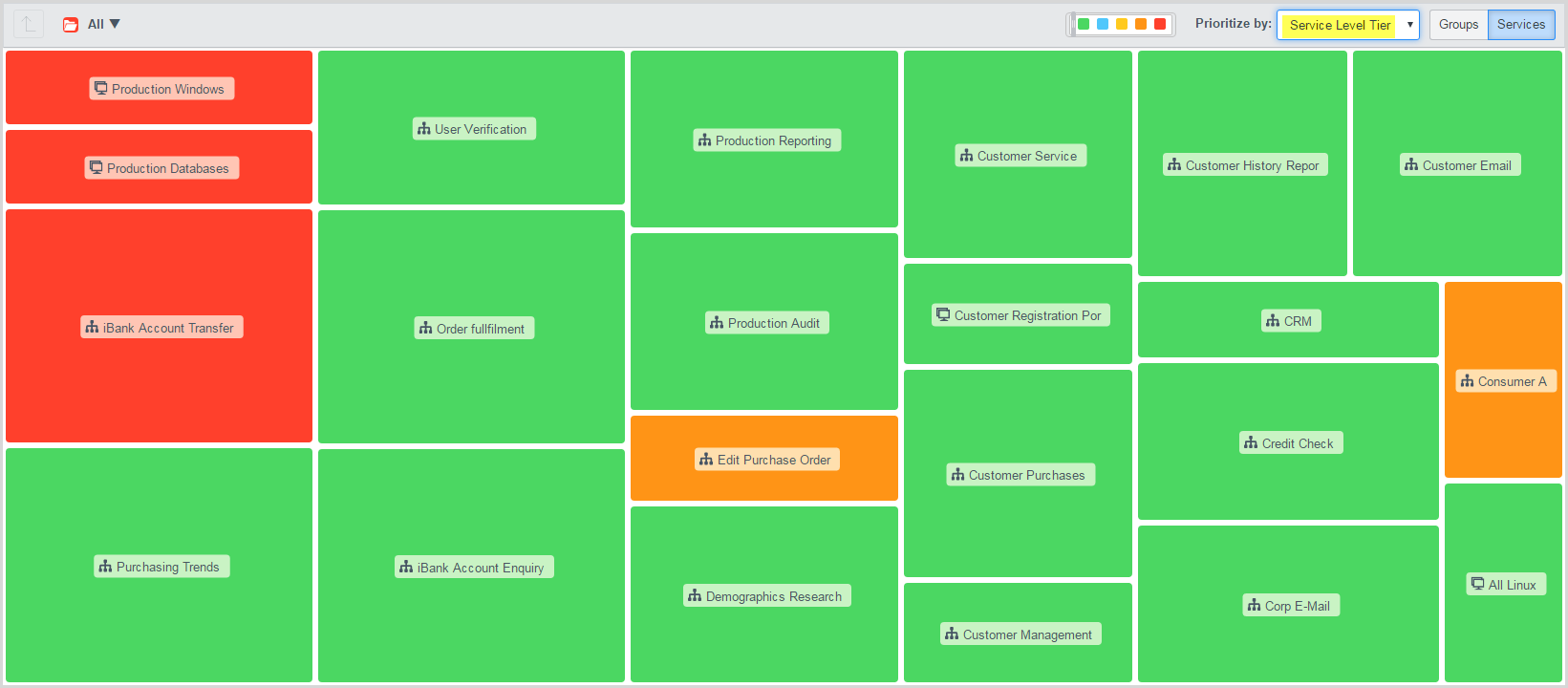
One of these is the Event Management Dashboard which has various tiles representing the health of your IT business services. The tiles are dynamically maintained by the Event Management application, each tile able to represent one of the following:
- Business service or application transaction
- Logical grouping of application or business services representing a line-of-business, service offering or geographic location
- Technical service representing a logical grouping of CI's — e.g. web or database servers
- Alert group showing all those alerts matching certain filter criteria — e.g. network alerts or those from SCOM
Each tile's color is dynamically updated to reflect the highest severity of alerts raised against the CI's it encapsulates. E.g. Red is the highest (critical) severity and Green is the normal operation state (no open alerts).
Whilst you can't control a tile's position on the dashboard (as its dynamic), you do have some control over its size.
So, you may be thinking "why would you want to do that"?
If you think about the purpose of the Event dashboard, fundamentally it's to show someone there's a problem with IT service delivery which needs their attention. It's all about providing useful information quickly to help the viewer filter out extraneous event "noise", understand what services are degraded (or broken), why they are impacted (root cause) and who the issue should be escalated to. The quicker and more efficiently this process can be achieved, the less impact to the service's consumers and impact to the business (financial, reputation, competitive).
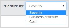
Different users of the dashboard will have different requirements. They'll need views highlighting what is important to them. They may want to see certain services as larger tiles based on a different criterion. Some examples are cost to the business, severity of active alerts, number of open incidents, number of users or service offering rating (e.g. Gold, Silver or Bronze). These individualized views can be defined via the customization setting "Prioritize Alerts". This is described in the Event Management documentation here.
The specific steps to set it up are described below.
By default, the Event dashboard tiles can be prioritized by:
- Severity — the relative "severity" of the alerts impacting the CIs
- Cost — the "cost" assigned to the defined business service
- Business Criticality — a rating from 1 (most important) to 4 (not important)
Luckily the Event Management product team thought of this when building the application and provided an ability to define your own prioritization criteria. Through the use of a specific CMDB Dictionary attribute, you can use fields from the cmdb_ci_service or cmdb_ci tables as prioritization options. You can use an existing field or create your own additional fields on the table. These will then appear in the "Prioritize by" drop-down field in the Event dashboard.
Here's how to set it up:
- Decide which fields make sense to use for prioritization. Keep in mind that you can only impact the tile size. We're not filtering which services appear on the dashboard — use Business or Technical service groups for that. If required, add a new field to the appropriate table (per above). Numeric fields work best.
- Ensure there are values in the table so that different services can be sized differently. Higher numeric values will cause larger tiles to be shown.
You may need to create a business rule and write a script to populate the custom prioritization fields with useful data. E.g. Count the number of open alerts, incidents or determine your own weighting metric. - Configure the dictionary settings for the field.
Add an attribute called "Dashboard filter".
Set it to "True" and save the changes. Now when you view the Event Dashboard you'll see additional options in the "Prioritize by" field.
Select the preferred view and the tiles will resize appropriately.
When we build and deploy monitoring dashboards we need to keep in mind who will be using them. The objective is to provide a real-time view of service health which makes sense and provides guidance in identifying and "triaging" service delivery issues. One way to help achieve this is via custom prioritization.
In the next ITOM event management blog I'll talk about building out a different sort of dashboard — one focused on map-based health monitoring.
If you'd like to learn more about ServiceNow's Event Management capabilities, please see the Learning Library here.
Labels:
- 5,409 Views
6 Comments
You must be a registered user to add a comment. If you've already registered, sign in. Otherwise, register and sign in.

