- Subscribe to RSS Feed
- Mark as New
- Mark as Read
- Bookmark
- Subscribe
- Printer Friendly Page
- Report Inappropriate Content
And we're off! The first lab session on reporting and Performance Analytics is happening right now with (appropriately) Reporting 101: Getting Value From Your Data. Through this lab, Matt Dodd (ServiceNow Solution Consultant) and Pieter Goris (ServiceNow Developer) are providing students with an introduction to the reporting engine.
This fits in rather well with our overall approach to getting proactive. Reports are a primary way to create visibility into your process and its performance. Reports help you understand what is happening operationally (day-to-day) in your organization.
With ServiceNow, you have a simple and intuitive reporting engine you can use to present data in any data table in your instance. This engine is natively integrated into every list. This native integration also allows you to enforce your data security model seamlessly because the reporting engine respects the underlying security structure you have already set up. In other words, people will only see the data they have the rights to see. This is a good thing!
Improved Reporting in Fuji
ServiceNow also continues to invest in developing the reporting engine, as evidenced in this scientifically accurate ServiceNow Reporting Awesomeness Index:

OK, maybe it's not completely based in science, but it does show that the functionality and capabilities of reporting have been improving significantly with each version release of the ServiceNow platform. Fuji is no exception. In fact, Fuji represents the biggest jump in useability and features in a platform release. You will find many new reporting features in Fuji that you should explore:
- Improved report navigation and searching: You will LOVE the new reporting homepage because it allows you to quickly find reports including those that are most frequently run and least frequently run. You can also view which reports take the longest to run, which could be an indicator of a badly constructed report.

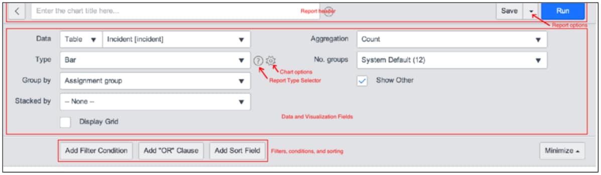
- New report designer layout: Do you feel overwhelmed by the amount of knobs and whistles on the report designer? You won't anymore in Fuji. The report designer layout is more streamlined and takes up less screen space. You can even minimize the design area of you want to focus on the report results as you are designing your visualization.

- Additional visualizations to drive insight: Go way beyond lists, lines, and pie charts with new types of reports including Column, Donut, Funnel, and Pyramid charts. Fuji reporting includes eight (8) new types of charts to display data in a way meaningful to you and your audience.
As you start to explore the reporting engine and create visibility into your process, Matt and Pieter would give you the following advice:
- Start with the reports that come with the platform. Look to see if there is already a report that meets your needs. Use that report instead of having to design one from scratch!
- Use existing reports as a model for your reporting needs. If a packaged report does not give you the visualization you need, find one of the reports that is close to what you need and modify it. Use techniques like "dot-walking" to display data from different tables in your report. Change the chart type to achieve a different visualization. Most times you really can "tweak" an existing report instead of creating one from scratch.
- Create new reports that fit the needs of your audience. If you need to create reports from scratch, use the report designer to find the data you need. But also make sure you use the best chart type to present your data. Pay attention to colors, gridlines, and other report controls that can help the consumers of the data get that insight you are presenting.
- Publish your report. Reports do no good if they are not used. Make sure people are aware of where to find the formatted data! Share your reports with defined groups, publish your report as a public URL, and schedule report delivery so that the people who need the data have ready access to it! Dashboards are also a great way to aggregate meaningful data across different reports to drive even greater visibility.
If you had a chance to attend the lab, take the knowledge you learned and see how you can apply it in your environment when you return to work. If you have not, you can easily play with the reporting engine in your platform and explore its power. The ServiceNow Wiki is a great resource to get started on what the reporting engine can do.
You must be a registered user to add a comment. If you've already registered, sign in. Otherwise, register and sign in.
