Knowledge Article Design/Layout
- Mark as New
- Bookmark
- Subscribe
- Mute
- Subscribe to RSS Feed
- Permalink
- Report Inappropriate Content
02-08-2024 11:01 AM - edited 02-08-2024 11:15 AM
Hello Everyone,
I create technical articles for an IT department. And sometimes I come across a situation where I need to explain the same process for different platforms (Windows, macOS and mobile devices).
Is there a way or piece of code I can use to design a "tab" structure in an article?
So I can list the different processes in each section.
If I use anchors it will just make the article too busy/full
Basically Windows process in the "Windows tab", Mac process in the "macOS tab", etc.
I've started using the collapsible drawer code (that I found in this working group) in a couple different situations.
I'm trying be be concise and not have users search through multiple articles to find the steps for their platform.
Thanks so much in advance
- Mark as New
- Bookmark
- Subscribe
- Mute
- Subscribe to RSS Feed
- Permalink
- Report Inappropriate Content
02-20-2024 11:11 AM
Hi. I have just answered another question about collapsing sections, this might help you here.
I've added CSS in <style></style> tags at the bottom of my articles. I created a standard template and had people always use that, included in the CSS was some styling applied when the Summary/Details tags are used to easily create collapsing sections, We only use Edge and Chrome and it's works fine for us.
Here is what it looks like;
Here is the code I use (I use :root to set my colours, change the color variables to hex values of your own)

<style>
details > summary {
  list-style: none;
  color: var(--blue);
  font-size:1.2em;
  text-decoration: none;
  text-transform: capitalize;
  font-weight: 1000;
  padding: 12px 15px 10px 15px;
  margin-bottom: 0px;
  background-color: var(--platinum);
  border: 1px solid #e5e5e5;
  border-radius: 4px;
  }
summary:hover {
  color: var(--white);
  background-color: var(--blue);
  }
summary > open {
  color: var(--black);
  background-color: var(--blue);
  }
summary:after {
float: right;
  content: " ✙";
}
details[open] > summary:after {
float: right;
  content: " ⚊";
}

details {
  margin-top: 5px;
  margin-bottom: 10px;
  }
details > div {
  border: 1px solid #f3f3f3;
  border-radius: 4px;
  margin-top: 0;
  padding: 1rem;
  animation: fadeIn 0.5s;
}

@keyframes fadeIn {
  0% { opacity: 0; }
  100% { opacity: 1; }
}
</style>
Note that in my case, I add a <div></div> to wrap the paragraph - this adds the text border and spacing;
<details>
<summary>Epcot Center</summary>
<div><p>Epcot is a theme park at Walt Disney World Resort featuring exciting attractions, international pavilions, award-winning fireworks and seasonal special events.</p></div>
</details>
Recently, I have discovered that I can include all my CSS in the Default Value of the Dictionary for Article Body, so even if someone doesn't apply a template, it will use these settings. The aesthetics of the articles in my knowledge base are now so much better.
Hope this helps. It took me a long time figuring this stuff out. 🙂
- Mark as New
- Bookmark
- Subscribe
- Mute
- Subscribe to RSS Feed
- Permalink
- Report Inappropriate Content
02-21-2024 10:19 AM
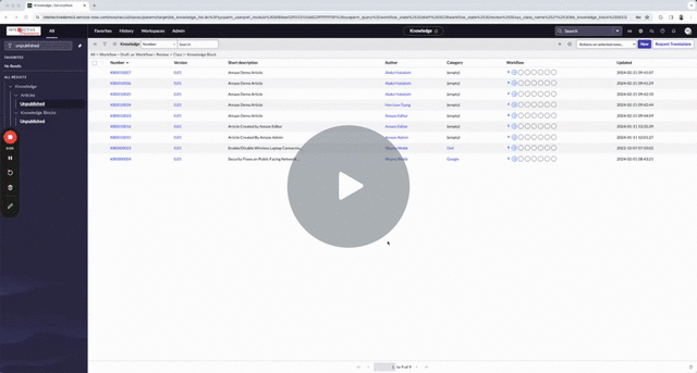
Here is a demo of Expand-Collapse in KB Articles
- Mark as New
- Bookmark
- Subscribe
- Mute
- Subscribe to RSS Feed
- Permalink
- Report Inappropriate Content
02-21-2024 11:08 AM
@wow-on-now Thanks for sharing this AMAZEing tool....LOL
- Mark as New
- Bookmark
- Subscribe
- Mute
- Subscribe to RSS Feed
- Permalink
- Report Inappropriate Content
02-21-2024 11:45 AM
Thanks @John Regalado for your kind words!
We have a total of five certified solutions on ServiceNow that are not only AMAZEing, but also WONDERful and MARVELous and aim to ELEVATE and TRANSFORM your ServiceNow experience
Here are some webinars that show the benefits customers are seeing
Webinar: How BESTBUY created an AMAZEing Knowledge Experience
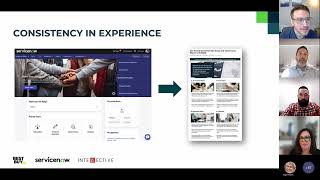
Webinar: How NextEra Energy transformed the knowledge experience
