Which UX Theme Property determines the background color of the application picker?
- Mark as New
- Bookmark
- Subscribe
- Mute
- Subscribe to RSS Feed
- Permalink
- Report Inappropriate Content
09-06-2022 06:40 PM
We have tried using the color generator to rebrand the next experience per our company colors. However, it is not doing what we expect it to do and so have therefore reverted to overriding specific properties in our styles.
However, we cannot work out which variable determines the background color of the application picker.
- Mark as New
- Bookmark
- Subscribe
- Mute
- Subscribe to RSS Feed
- Permalink
- Report Inappropriate Content
09-08-2022 05:46 AM
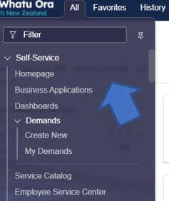
Could you post a screenshot of exactly what you're trying to style? The app and update set menus should have the same backgrounds as the other header menus (all, favorites, history, etc.).
- Mark as New
- Bookmark
- Subscribe
- Mute
- Subscribe to RSS Feed
- Permalink
- Report Inappropriate Content
09-12-2022 02:30 PM

- Mark as New
- Bookmark
- Subscribe
- Mute
- Subscribe to RSS Feed
- Permalink
- Report Inappropriate Content
03-17-2023 07:37 AM
Hi @Sandra Clendon ,
Since this post is some months old I want to know if you already found your answer?
Otherwise I'll be able to help you here.
- Mark as New
- Bookmark
- Subscribe
- Mute
- Subscribe to RSS Feed
- Permalink
- Report Inappropriate Content
04-10-2023 02:03 PM
Thanks Jeroen. No I never did find the answer. Might be helpful for others.
- Mark as New
- Bookmark
- Subscribe
- Mute
- Subscribe to RSS Feed
- Permalink
- Report Inappropriate Content
04-11-2023 05:53 AM - edited 04-11-2023 06:43 AM
Hi @Sandra Clendon ,
You can find this (at least in chrome) by doing a right click on the color you wish to change and choosing "Inspect".

For the filter you can use:
--now-unified-nav_menu-filter--background-color
--now-unified-nav_menu-filter--background-color--hover
--now-unified-nav_menu-filter--background-color--opened
For the background color you can use:
--now-unified-nav_menu--background-color
You have three options, based on your requirements you should choose one of them before starting your development:
a. Override certain colors of the existing Polaris Theme.
b. Create Variant colors to the existing Polaris Theme.
c. Create an entirely new Theme.
I took the following steps on my PDI to get this working:
Option a.
1. Create a new UX Style "Colors override" with type "Core" and the properties you wish to override:

2. Go to m2m_theme_style.list and click "New" to add your "Colors override" to the Polaris Theme.
3. Refresh the browser to see the changes.
Option b.
1. Copy the OOB UX Style "Colors": /nav_to.do?uri=sys_ux_style.do?sys_id=a197a38107b03010e03948f78ad30059
2. Rename your copy to "Custom Colors", set type to "Variant" and change the CSS variables mentioned above:

3. Go to m2m_theme_style.list and click "New" to add your Custom Colors as a Variant to the Polaris Theme.
4. Select the Custom Colors theme in your preferences. If not already done you should first set the property "glide.ui.polaris.dark_themes_enabled" to TRUE:

Option c.
1. Copy the OOB UX Style "Colors": /nav_to.do?uri=sys_ux_style.do?sys_id=a197a38107b03010e03948f78ad30059
2. Rename your copy to "Custom Colors", set type to "Core" and change the CSS variables mentioned above:
3. Create a new UX Theme and add "Custom Colors" to the UX Theme Styles

4. Create the property "glide.ui.polaris.theme.custom" with the sysID of the UX Theme created in step 3.
5. Refresh the browser to see the changes.
Here is my beautiful result:

More information:
Understanding themes: https://support.servicenow.com/kb?id=kb_article_view&sysparm_article=KB1120004
Themes in UI Builder: https://docs.servicenow.com/bundle/sandiego-application-development/page/administer/ui-builder/conce...
Configuring your own Theme: https://docs.servicenow.com/bundle/utah-platform-user-interface/page/administer/navigation-and-ui/ta...
Theme Builder store app: https://docs.servicenow.com/bundle/utah-platform-user-interface/page/administer/navigation-and-ui/ta...
