- Post History
- Subscribe to RSS Feed
- Mark as New
- Mark as Read
- Bookmark
- Subscribe
- Printer Friendly Page
- Report Inappropriate Content
on 02-07-2019 12:03 PM
Matrix Report Dashboard
I had to create matrix dashboards.
I share them as it may interest people who require the same type of reporting.
I made this reusable as much as I could, but this requires a minimum of technical skills and knowledge of HTML, CSS and Javascript.
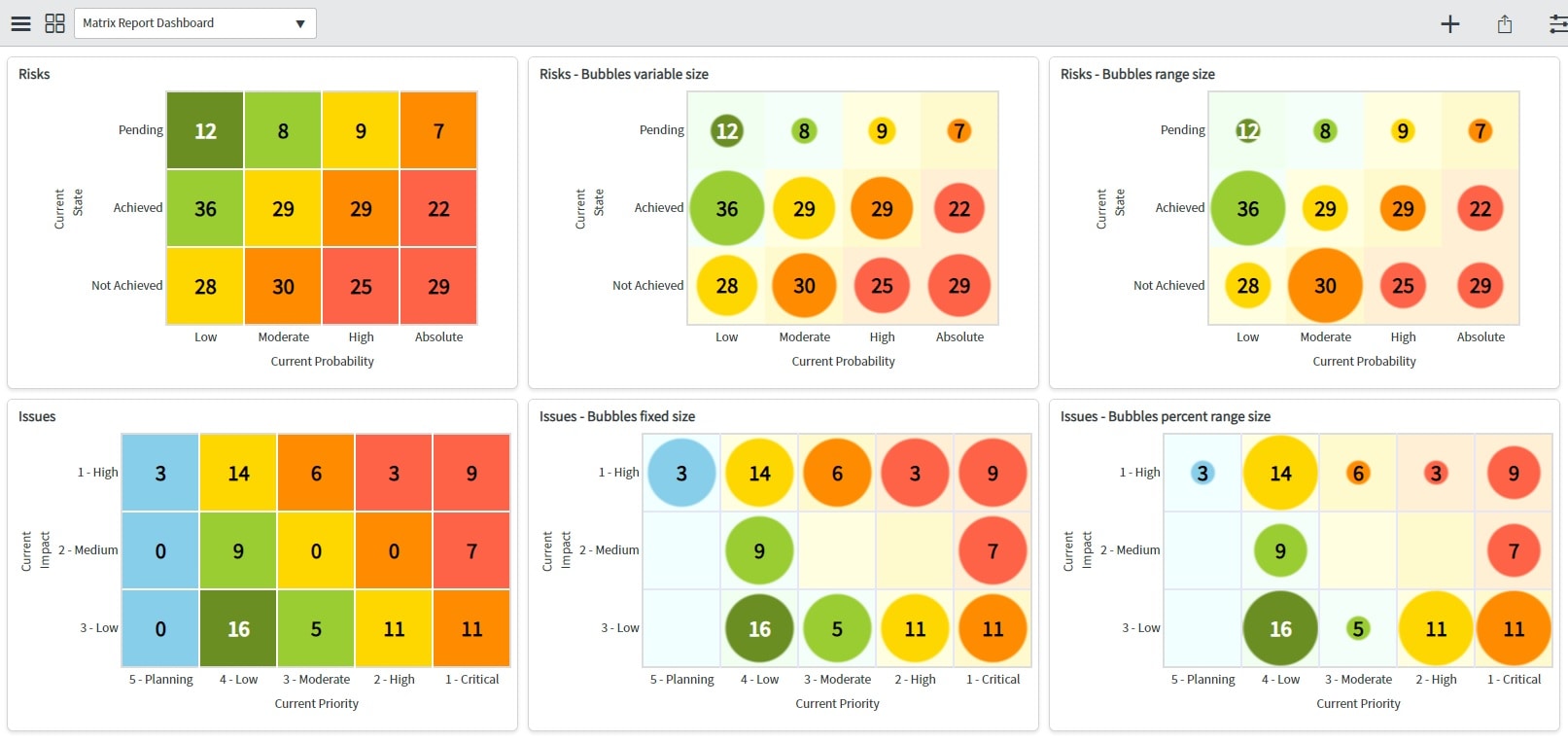
Matrix is 2 dimensions report, which count records against 2 criteria.
The sample I share works with String fields for X and Y axis, count records, display clickable number which drills down to the filtered table list to display source records.
The reports natively follow the interactive filters, it works at least with "Reference" interactive filters, I didn't try with other filters.
Numbers are display with colors, and can be displayed with bubbles having fixed or variable size based on percentage or within range values:

Two elements are involved: a Dynamic Content which displays the report in a dashboard widget, and a client callable Script Include which is called by the Dynamic Content and which calculate all values and return the final HTML table to the report.
A new Dynamic Content report must be created for each matrix, and they will be created as much as different matrix are required.
The Script Include remains unique, unchanged and untouched: this is the "engine" which is common and reused by all Dynamic Content reports.
The attached update set contains the Script Include and the 6 sample reports shown in the screen shot.
It should work on any instance as it uses the "risk" and "issue" tables which are common tables.
At the end of this post are the operations to apply to manage the matrix report using a UI Widget and a UI Macro instead of a Dynamic Content, to be compliant with next versions where CMS will be deactivated.
Tips:
Ctrl+F5 to refresh a dashboard after updating a dynamic content report
If blank widget => this means the dynamic content has an issue => review it
Usage:
To create a new report matrix, go to menu: Menu > Content Management > Blocks > Dynamic.
Or type in the navigation filter "dynamic" to show the module.
After all created, in the dashboard "Add Widgets" and select "Content Blocks".
Configuration:
When creating a new matrix, always copy/paste an existing one and modify it to your needs.
The first and most important thing is first to make the report unique.
This is done in two places in the dynamic content script.
1. Give a unique name in the variable jvar_name:
<j:set var="jvar_name" value="myUniqueMatrixName" />
2. Give a unique acronym to CSS entries, I give a short sample which takes the first letter of each word of jvar_name here:
matrix.cssClassLetter = 'MUMN';
But longer names are also perfectly valid, for sample:
matrix.cssClassLetter = 'myUniqueMatrixName';
3. There is CSS section in the script, update all CSS entries having the cssClassLetter as prefix with the acronym you set in point 2, for sample as:
.MUMNbox
.MUMNborderTop
.MUMNborderLeft
.MUMNborderRight
.MUMNborderBottom
.MUMNleftCol
.MUMNbottomRow
.MUMNa
.MUMNtable
.MUMNvertical-text
4. Now the report is unique, you can add it in a dashboard, and you can update it to show the matrix you want.
5. Update the content defiiniton of the matrix, all this is defined in the first script function.
5.1. Source Data to count
The source table name.
This is this table which must be filtered in an Interactive Filter.
matrix.table = 'issue';
The two table fields which will be used as criteria to calculate counts.
matrix.xField = 'priority';
matrix.yField = 'impact';
The initial filter which will allways apply before any calculation, any encoded query can be set here.
matrix.tableFilter = 'active=true^stateNOT IN3,4,7';
5.2 Axis X and Y definition, all based on sys_choice table
Definitions have the same options for X and Y.
Set table and field to get the values to show on axis X, extracted from sys_choice table.
matrix.xChoiceTable = 'task';
matrix.xChoiceField = 'priority';
Set a filter to display only some values.
matrix.xChoiceFilterField = 'inactive';
matrix.xChoiceFilterValue = false;
Set the field attributes which will be used to count the records of the source data table.
matrix.xFieldValue = 'value';
Set the field to display the label in the dashboard.
matrix.xFieldLabel = 'label';
Set the order of values to display on axis, sort order is DESC, any other value will sort ascending (as ASC for sample).
matrix.xSort = 'sequence';
matrix.xSortOrder = 'DESC';
Free text string to show the axis label.
matrix.xTitle = 'Current Priority';
5.3 Display options
Language of axis values to read from sys_choice table.
matrix.language = 'en';
The unique acronym to use for the report CSS.
matrix.cssClassLetter = 'IPIBPR';
Option to show or hide the 0 values in the matrix.
matrix.showZero = false;
Option to show bubbles or not. If false then 3 further bubbleSizeXXX option are ignored.
If true then bubbleColors, bubbleSize and bubbleSizeBorder must be set.
matrix.showBubble = true;
Set if bubbles are of fixed size, if true then next 2 bubbleSizeUseRangeYYY are ignored.
matrix.bubbleSizeFixe = false;
Set if range array is used to calculate the bubble sizes.
If false then size is dynamic and proportional to the count for each cell, the max count will have 100% size and the min count will have 30% size.
If true then size is set using the bubbleSizeRange and bubbleSizePercent arrays.
matrix.bubbleSizeUseRange = true;
Set how are used the bubbleSizeRange array.
If false then the size is calculated using the bubbleSizeRange values as fixed threshold amounts.
If true then the size is calculated using the bubbleSizeRange as percentages from 0 to 100.
matrix.bubbleSizeUseRangePercent = true;
5.4 Define colors
Colors are defined cell by cell, they are set in a way which maps the matrix itself.
If for any reason the axis X or axis Y values go over the array size, then the last value of the array is used. This works for the 3 arrays.
Colors can be set using names (https://www.w3schools.com/colors/colors_names.asp) or using hexa as #123456.
cellColors array sets the background colors of the cells.
matrix.cellColors
fontColors array sets the font colors for each cell.
matrix.fontColors
bubbleColors array set the bubble color for each cell.
matrix.bubbleColors
5.5 Define bubble size
The bubble size is set in "em". There are two sizes, the bubbleSize is the main one, bubbleSizeBorder is a little bigger as it will draw border using a gradient.
The border size should always be equal or bigger than the main size, the code behinds the scene create an image as for sample:
background-image: -webkit-radial-gradient( circle, Tomato, Tomato 1.65em, transparent 1.75em );';
matrix.bubbleSize = '1.65';
matrix.bubbleSizeBorder = '1.75';
5.6 Define ranges to calculate bubble size, used only when matrix.bubbleSizeUseRange = true
Ranges are used to draw different bubble sizes where we can see the change.
For sample we can define 3 sizes to show small/medium/big bubbles, instead of continuous growing size that the eye can't differentiate.
Gives the list of thresholds. When matrix counts <= array value then it gives the index to use in array bubbleSizePercent, if not then test the next index.
The number of values is free.
If matrix.bubbleSizeUseRangePercent is missing or false, the range numbers are fixed values.
If matrix.bubbleSizeUseRangePercent is true, the range numbers are percents between 0 and 100, and they are calculated depending of the min and max values of matric counts.
If the matrix count is bigger than the highest range, then the full size bubbleSize is set for the cell.
matrix.bubbleSizeRange = [ 30, 50, 75 ];
For each range, gives a percentage size of matrix.bubbleSize, the between 0 and 100, to draw the bubble.
The array length must match the array length of previous array bubbleSizeRange.
matrix.bubbleSizePercent = [ 30, 70, 100 ];
6. Update the report CSS
All CSS values are all free, but they should be set to have a nice look.
The styles here after are examples, all set with the cssClassLetter = 'IPIBPR'.
6.1 Define the <td> style of the matrix cells only. The height and width should be in "px" to have fixed size, but "em" can also be used.
.IPIBPRbox {
height: 80px;
width: 80px;
border: 2px solid Lavender;
font-size: 1.7em;
font-weight: bold;
text-align: center;
}
6.2 The border of the matrix area
.IPIBPRborderTop { border-top: 2px solid Gainsboro; }
.IPIBPRborderLeft { border-left: 2px solid Gainsboro; }
.IPIBPRborderRight { border-right: 2px solid Gainsboro; }
.IPIBPRborderBottom { border-bottom: 2px solid Gainsboro; }
6.3 The <td> cells of the column of the Y axis values
.IPIBPRleftCol {
<!-- width: 70px; -->
text-align: right;
padding-right: 3px;
}
6.4 The <td> cell for the row of the X axis title
.IPIBPRbottomRow {
height: 25px;
}
6.5 The <a> anchor style, to display the clickable link on matrix numbers to drill down to the source list
.IPIBPRa {
color: inherit;
display: block;
}
6.6 The whole report table <table>
.IPIBPRtable {
margin-right:auto;
margin-left:auto;
<!-- table-layout: fixed; -->
<!-- border: 1px solid red; -->
<!-- width: 100%;
height: 480px; -->
}
6.7 The <td> cell for the column of the Y axis title
.IPIBPRvertical-text {
transform: rotate(-90deg);
width: 15px;
<!-- white-space: nowrap; -->
}
7. The code after the comment " You should not touch anything after this point" should not be updated.
8. Enjoy!
Manage UI Widget and UI Macro:
In future version, CMS won't be activated and dynamic content shouldn't work.
Then UI Widget and UI Macro can be used to display the Matrix reports in a dashboard.
Here after is the easier method to move from dynamic content to widgets:
- Create a UI Macro for each matrix dynamic content, give the "jvar_name" unique name to the UI Macro name
- Copy paste the dynamic content code to the new UI Macros
- In the UI Macros, remove two lines of code:
Remove the jvar_name declaration which is now passed by the widget:
<j:set var="jvar_name" value="riskProbabilityState" />
Remove the isInCanvas variable which fails in a UI Macro:
var isInCanvas = typeof window.SNC !== "undefined" && blablabla
- Create a Widget with the following code
- Repeat the objects as many reports you have to move to the widget
- Give the dashboard widget title in the section name
- Set the matrix unique name in the name property
- Set the UI Macro name in the ui_macro property
| /* 29 November 2019 François Schneider ServiceNow ITBM Consultant */ function sections() { return { 'Project Risks' : { 'name' : 'projectRiskMatrix', 'ui_macro' : 'Risk_Matrix_UI_Macro', }, 'Project Risks number 2' : { 'name' : 'projectRiskMatrix2', 'ui_macro' : 'Risk_Matrix_UI_Macro2', } }; } function render() { var jr = new GlideJellyRunner(); renderer.getRenderProperties().setDeferInlineScripts(false); jr.setRenderProperties(renderer.getRenderProperties()); jr.setTwoPhase(true); // Can set here a unique name using a random number which will change at every display/refresh to allow multiple same "section" on the same dashboard jr.setVariable('jvar_name',renderer.getPreferences().get("name") + randInt(100000, 999999) + '' + randInt(100000, 999999)); // Call the System UI > UI Macro, to render the dashboard widget var ui_macro = renderer.getPreferences().get("ui_macro"); return jr.runFromTemplate(ui_macro); } function getEditLink() { if (!gs.hasRole('admin')) return ''; return "sys_widgets.do?sysparm_query=name=Gantts Custom"; } function randInt(min, max) { return Math.floor(Math.random() * (max - min + 1)) + min; } |
This is the most simple move.
The full move would be to set all matrix properties into widget(s), and to have only one UI Macro for all matrix. But it needs more changes.
- 5,336 Views
- Mark as Read
- Mark as New
- Bookmark
- Permalink
- Report Inappropriate Content
In regard to this proposed solution, CMS is no longer active by default from New York onwards, and it seems the preference from ServiceNow is to use Service Portal technology.
Is this approach still the recommended ServiceNow approach to provide this reporting requirement or is there an alternative with use of Angular technology instead of CMS?
The concern with this approach is activation of CMS to deliver the requirement, but at the same time introducing functionality which appears to be discouraged as standard from ServiceNow.
Thank you
- Mark as Read
- Mark as New
- Bookmark
- Permalink
- Report Inappropriate Content
How to use Angular technology to display a graph in a dashboard? As far as I know, portal pages can't display in a dashboard.
It would be better to include the UI Macro into a UI Widget to continue to use it in New York.
By the way, be aware that Google will stop Angular support by June 30, 2021.