- Mark as New
- Bookmark
- Subscribe
- Mute
- Subscribe to RSS Feed
- Permalink
- Report Inappropriate Content
07-20-2015 02:33 PM
For example, we track the number of phone calls we receive from each of our clients.
Its quite easy to create a bar graph or something similar that shows the top 10 or 20 clients that call the most.
But I am trying to get some good quick data on who uses us the lease. So sorting the report acceding by group count rather than descending.
It may be easy to do, but I can see to Google the right question to find my answer.
Thanks for any input you may have.
Thanks, John
Solved! Go to Solution.
- Labels:
-
Enterprise Release Management
- Mark as New
- Bookmark
- Subscribe
- Mute
- Subscribe to RSS Feed
- Permalink
- Report Inappropriate Content
07-23-2015 07:18 AM
Hi John, here goes just an example of a script which display the 5 user names that has the less assigned incidents. You can leverage this script to accomplish your goal by setting it as part of a scheduled job and then firing an event that will take care of triggering a notification. Please let me know if you also need help on triggering the event/notification if that's a route you will like to take.
Here goes the script. Run it as a Background Script (System Definition >> Scripts Background) first so that you can see how it works:
var results = [];

var gr = new GlideAggregate('incident');

gr.addAggregate('COUNT','assigned_to');

gr.orderByAggregate('count','assigned_to');

gr.query();

while(gr.next()){

   if (JSUtil.notNil(gr.assigned_to)) {

       results.push(gr.assigned_to.name.toString() + ' has ' + gr.getAggregate('COUNT','assigned_to') + ' assigned ');

       var eva = gr.getAggregate('COUNT','assigned_to');

       gs.print(gr.assigned_to.name.toString() + ': ' + eva + ' ' + gr.getTotal());

   }

}


var last_results = 5;

gs.print ('******** COUNT for Last ' + last_results + ' ********');


var starting_point = results.length - last_results;

for (var i = starting_point; i < results.length; i++){

   gs.print ('**** ' + results[i]);

}
I hope it's helpful!
Thanks,
Berny
- Mark as New
- Bookmark
- Subscribe
- Mute
- Subscribe to RSS Feed
- Permalink
- Report Inappropriate Content
07-20-2015 10:58 PM
Hi John,
Indeed it can be done,
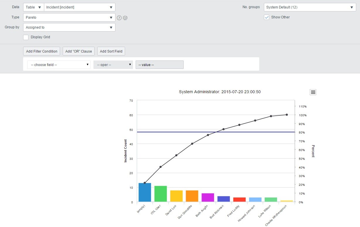
1) navigate to Reports >> Create New
2) select the table from where your data resides
3) select the type of graph. I will recommend you start with type "bar" or "pareto"
4) select the field on the one you want to group_by
5) select the Number of groups (Field labeled as No. Groups. The default is 12, but you may want to change it to 10 or 20 depending on what you want)
The graph will then allow you to select the series and access a list with the records if you're interested in the detail.
Thanks,
Berny
- Mark as New
- Bookmark
- Subscribe
- Mute
- Subscribe to RSS Feed
- Permalink
- Report Inappropriate Content
07-20-2015 11:00 PM

- Mark as New
- Bookmark
- Subscribe
- Mute
- Subscribe to RSS Feed
- Permalink
- Report Inappropriate Content
07-20-2015 11:02 PM

- Mark as New
- Bookmark
- Subscribe
- Mute
- Subscribe to RSS Feed
- Permalink
- Report Inappropriate Content
07-21-2015 04:15 PM
Berny, Thanks for your response!
However, I dont this this what I'm looking for. This will give me the top 12(10 or 20) items in the selected group.
I would like to see the bottom 10-20.
I'm trying to determine who is not using our services rather than who is using them the most. So this report, but in reverse.
I hope this makes sense.
Thanks!