How to create a report comparing Actual Hours vs. Planned Hours in Resource Management
- Mark as New
- Bookmark
- Subscribe
- Mute
- Subscribe to RSS Feed
- Permalink
- Report Inappropriate Content
02-22-2017 01:53 PM
We are trying to create some sort of report that shows a graph/chart with the Actual Hours worked per resource in a group vs the Allocated Hours per resource in a group all for a specific Resource Plan.
For example, 3 resources are allocated to Group A and we want to show how many hours those three resources actually worked vs. the amount of hours they were allocated to work.
Any ideas?
- Mark as New
- Bookmark
- Subscribe
- Mute
- Subscribe to RSS Feed
- Permalink
- Report Inappropriate Content
02-23-2017 05:35 AM
Hi Matt,
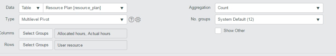
How about using a multi-level pivot?

if you'd rather want it in a different chart, you could try using Custom Charts as well. http://wiki.servicenow.com/index.php?title=Custom_Chart_Data_Generation#gsc.tab=0
Thanks,
Mandar
- Mark as New
- Bookmark
- Subscribe
- Mute
- Subscribe to RSS Feed
- Permalink
- Report Inappropriate Content
08-01-2018 08:12 AM
The suggestion that Mandar provided is close, but won't work -- when you switch the aggregation to sum, it'll ask for the specific field you want to aggregate on (actual or allocated hours). This is more of a platform limitation -- there isn't a (1) multi-dimensional (2) time phased pivot table capability to run an actual vs allocated report. There are some chart type reports (see Portfolio Workbench > Tracking), but won't get to the nitty gritties of whom. This is where an industry specific app like Clarity, Planview, OpenAir would do better, but I've seen customers pipe the information to a data warehouse and run this report there.
- Mark as New
- Bookmark
- Subscribe
- Mute
- Subscribe to RSS Feed
- Permalink
- Report Inappropriate Content
01-09-2025 08:37 AM
Is this still a limitation in the system? I am also trying to run a report that shows Allocated vs. Actual. We want to be able to create baselines for our projects and make sure that we are estimating the time for each project/resource plan appropriately.
- Mark as New
- Bookmark
- Subscribe
- Mute
- Subscribe to RSS Feed
- Permalink
- Report Inappropriate Content
04-02-2025 12:20 PM
Likewise - looking to report on planned effort vs. actual effort for projects (over time). @Kminatel - ever figure anything out on this?