- Post History
- Subscribe to RSS Feed
- Mark as New
- Mark as Read
- Bookmark
- Subscribe
- Printer Friendly Page
- Report Inappropriate Content
on 09-02-2020 06:47 PM
Widget Creation Articles
- How To: Create an Infinite Scroll in the Service Portal - Article - Share
- How To: Create a simple radial score indicator - Article - Share
Preamble
Sometimes it is useful to know how to display scores in your portal without having to rely on some large reporting libraries. In this tutorial I will show how to create a simple score widget that takes a score from 0 - 100 and displays it as a radial indicator.
End Result

Begin
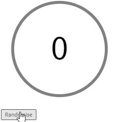
The radial score will be created as an angular directive rather than a widget as it is something that will complement other widgets rather than it being the sole use on a page. In order to do this lets create a demo widget that will just display this directive with a few additions such as a randomiser button.
Create a new widget and name it "Radial Display". This is the only field we will enter for now so hit submit.

Next scroll to the related lists at the bottom of the new widgets page and click New in the angular providers tab.

For now we will just enter a basic template for what we need and we will add the specifics as we go. Below is the template of what we need:
function radialScore() {

  var template = '<div>{{score}}</div>'; // Test template to make sure our directive works

  // Main calculation function we will be using
  function Link(scope, element, attr) {

  }

  return {
    restrict: 'E', // Our directive will be found as an element
    scope: {
      score: '=' // The score that will be passed in
    },
    template: template,
    link: Link
  };
}
Hit submit and then open up the widget editor for our display widget. This is where all the work will be done from now on.
Widget Code
As we are just using the widget for testing we will add in two things. First is the radial directive, and the next is a button so we can randomise the data to make sure it is working. For this we will create our score variable on c.score and our function c.randomise.
HTML Template
<div>
  <radial-score score="c.score" />
  <button ng-click="c.randomise()">Randomise</button>
</div>
Client Script
api.controller = function () {
  var c = this;
  c.score = 0;

  c.randomise = function () {
    c.score = Math.floor(Math.random() * 100);
  }
};
If you enable the preview now you should see that our directive is working and shows the randomised score and button.

Making the Directive
Now it is time to create the actual radial score. There are two parts to this that I will walk through. The first is the template html that will be used to render the visuals, and the second is the calculations that are required to get the radial to have the correct distance.
Template
In this template we are going to use an SVG image to display the circles and text. This simplifies what we need to do as it has inbuilt elements that we can leverage. These are the circle and text elements.
A few considerations first though. When working with SVGs it is easiest to add a view box so that we have standard dimensions no matter the end size of our SVG. We will also want to define a standard stoke size for our circle so we can calculate it to be the maximum width possible while still showing the whole circle.
Lets set these defaults at the top of our directive. After a bit of tinkering I have found that a diameter of 40 and a stroke size of 2 works pretty well.
function radialScore() {
  // Defaults
  var diameter = 40;
  var stroke = 2;

  // ...
}
Now we can add in our svg element. It uses the viewBox default of '0 0 40 40' due to out default above. It also has the score text centered in the image.
// SVG Element is added with the viewBox that was mentioned earlier
var template =
  '<svg class="progress-ring" style="width: 100%; height: 100%;" viewBox="0 0 ' + diameter + ' ' +  diameter + '">' +
    '<text class="progress-ring__text" x="50%" y="50%" text-anchor="middle" dy=".3em">{{score}}</text>' +
  '</svg>';
It should look like the following:

Making the Circles
In order to make the circles we are going to use the circle element for an SVG. There are a few key attributes that will be used that I will explain here:
- stroke-width: The width of the line the circle is made from. This is the stroke default we set earlier.
- fill: the fill colour of the circle. This is transparent in this example.
- cx: The x position. This will be half the diameter to center it horizontally.
- cy: the y position. This will be half the diameter to center it vertically.
- r: The radius of the circle. Calculation shown below.
Most of those are simply defined from our previous decisions but the r calculation is a bit more complex. This is because the radius of the circle will need to factor in the stroke widths we have defined. The stroke at the left, right, top and bottom will need to be factored in to shrink the circle so there is no clipping. The calculation is:
(Diameter / 2) - (2*stroke)
Now we have these we can add the circles to our image. We are actually using two circles though, one for the grey background and one for the green foreground. Our new template is shown below. There is some styling that has been added to allow the circles to be visible and there are some variables that do not exist yet that we will define in out Link function next.
var template =
  // Added some styling to allow the circles to be visible
  '<style>' +
    '.progress-ring__circle-skeleton { stroke: lightgrey; stroke-width:' + stroke/2 + '; fill: transparent; }' +
    '.progress-ring__circle { stroke: green; stroke-width:' + stroke + '; fill: transparent; }' +
  '</style>' +
  '<svg class="progress-ring" style="width: 100%; height: 100%;" viewBox="0 0 ' + diameter + ' ' + diameter + '">' +
    '<circle class="progress-ring__circle-skeleton" stroke-width="{{stroke/2}}" fill="transparent" r="{{::radiusStroke}}" cx="{{::radius}}" cy="{{::radius}}" />' +
    '<circle class="progress-ring__circle" stroke-width="{{stroke}}" fill="transparent" r="{{::radiusStroke}}" cx="{{::radius}}" cy="{{::radius}}" />' +
    '<text class="progress-ring__text" x="50%" y="50%" text-anchor="middle" dy=".3em">{{score}}</text>' +
  '</svg>';
Link
The first thing to do with the link function is to add the variables that are shown in the template. Once these are added our template will appear with circles for the first time!
function Link(scope, element, attr) {
  scope.diameter = diameter;
  scope.radius = scope.diameter / 2;
  scope.stroke = stroke;
  scope.radiusStroke = scope.radius - stroke*2;
}
If you view the preview now you will see things are finally coming together!

Okay, well at least they are appearing, although we still need to do something about making the green circle only cover the distance required. For this we are going to use a trick with dashed lines. The last of the code to add to the Link function is shown below.
// Make sure we update the circle if the score changes
scope.$watch(function () {
  return scope.score;
}, CalculateScore);

// Dashed calculation
function CalculateScore(newValue) {
  if (!newValue) {
    newValue = 0;
  }

  // Element whose style we will update
  var circle = element.find(".progress-ring__circle")[0];

  var circumference = scope.radiusStroke * 2 * Math.PI;

  // Sets the dash length to be one full circle, and the space between dashes to be one full circle.
  circle.style.strokeDasharray = circumference + ' ' + circumference;

  // Move the start of the dash to the correct spot
  var offset = circumference - newValue / 100 * circumference;
  circle.style.strokeDashoffset = offset;
}
Now lets check out the preview:

Okay so it is working! although it is a little clunky. Lets add some extra styling to smooth it out a bit. We can also make the circle start at the top rather than the right by transforming it.
// Added transitions and made the circle start at the top
var template =
  '<style>' +
    '.progress-ring__circle-skeleton { stroke: lightgrey; stroke-width:' + stroke/2 + '; fill: transparent; }' +
    '.progress-ring__circle { stroke: green; stroke-width:' + stroke + '; fill: transparent; transition: stroke-dashoffset 0.35s; transform: rotate(-90deg); transform-origin: center; }' +
  '</style>'
And that is it. You now have a reusable, smoothed out radial directive that can have it's styles overridden in a widget.

Lets add some extra HTML and CSS to our widget to show this.
HTML
<div>
  <radial-score score="c.score1" />
  <radial-score score="c.score2" />
  <radial-score score="c.score3" />
  <button ng-click="c.randomise()">Randomise</button>
</div>
CSS
div {
  display: flex;
}

radial-score:first-child {
  .progress-ring__circle {
  	stroke: red;
  }

  .progress-ring__text {
    fill: red;
  }
}

radial-score:nth-child(2) {
  .progress-ring__circle {
  	stroke: gold;
  }
}
Result

Example Usage
You can really use this anywhere you want to show a score. For instance you may want to display the health of a ticket/knowledge article or some form of progress. The chart will scale nicely into forms/lists such as the Incidents list below.

- 4,211 Views
- Mark as Read
- Mark as New
- Bookmark
- Permalink
- Report Inappropriate Content
This will come in handy for sure. Nice one Ben Knight.
