- Mark as New
- Bookmark
- Subscribe
- Mute
- Subscribe to RSS Feed
- Permalink
- Report Inappropriate Content
11-30-2017 04:46 AM

- Mark as New
- Bookmark
- Subscribe
- Mute
- Subscribe to RSS Feed
- Permalink
- Report Inappropriate Content
11-30-2017 05:57 AM

- Mark as New
- Bookmark
- Subscribe
- Mute
- Subscribe to RSS Feed
- Permalink
- Report Inappropriate Content
11-30-2017 05:57 AM
- Mark as New
- Bookmark
- Subscribe
- Mute
- Subscribe to RSS Feed
- Permalink
- Report Inappropriate Content
11-30-2017 06:15 AM
Working so nice, thank you very much, just love this fourm
- Mark as New
- Bookmark
- Subscribe
- Mute
- Subscribe to RSS Feed
- Permalink
- Report Inappropriate Content
11-30-2017 06:19 AM

- Mark as New
- Bookmark
- Subscribe
- Mute
- Subscribe to RSS Feed
- Permalink
- Report Inappropriate Content
12-01-2017 04:41 AM
Hi Kristian,
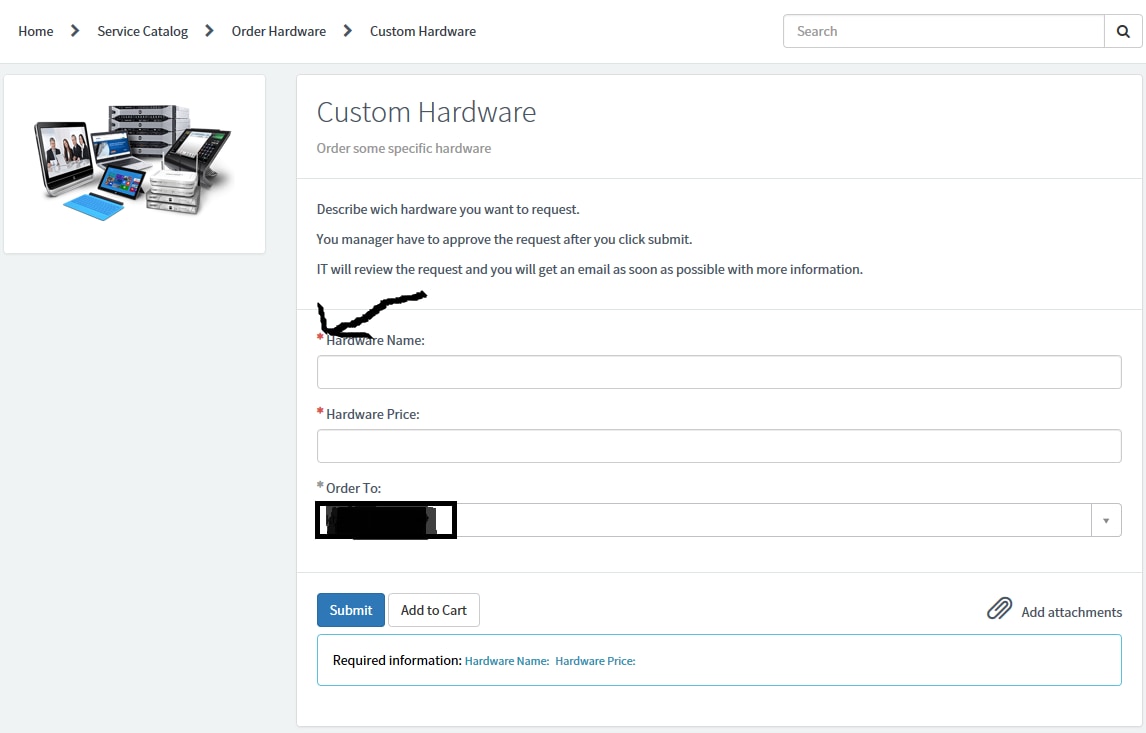
I'm glad you got your question answered. FWIW, from a design/UX standpoint, the red looks better. It pops a bit more and catches the eye. While blue may go with your theme, the point of mandatory asterisks is to get attention, not blend in to the background of the theme. Furthermore, blue is very close to grey so it may not be easily identifiable to those with even mild color blindness to discern if it is blue or grey.
Just making a note, in case you need to do some testing on either of those two scenarios.