Header Menu with muli-level sub menus
- Mark as New
- Bookmark
- Subscribe
- Mute
- Subscribe to RSS Feed
- Permalink
- Report Inappropriate Content
10-21-2019 11:38 AM
I am trying to figure out how to configure the header menu widget so that it has two sub levels, like a cascading drop-down menu. For example I have 10 links, 5 of which fall under a sub category. I want to display the first 5 links under the main heading, then the next 5 links under a sub-heading.
For example:
MainHeader
-- Link1
-- Link2
-- Sub-header
-- Link3
-- Link4
-- Link5
-- Link6
-- Sub-header
-- Link7
-- Link8
- Mark as New
- Bookmark
- Subscribe
- Mute
- Subscribe to RSS Feed
- Permalink
- Report Inappropriate Content
10-21-2019 12:01 PM


- Mark as New
- Bookmark
- Subscribe
- Mute
- Subscribe to RSS Feed
- Permalink
- Report Inappropriate Content
10-22-2019 05:45 AM
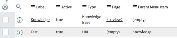
Thanks for your response Upender, but that is not what I am referring to. What I would like to know is if there is a way to create a third level on the header menu widget drop-down menu. So, in your picture, "Test" would be another header under Knowledge that, when you click on Test, another list of links appears.
In the Header Menu widget, the top category links, such as "Knowledge" are of type "Page" when you create them. This allows you then to create links and reference them as the parent menu. When you do that, the link is then placed under that category, such as your example.
However, if I were to try to make "Test" of type page and create links that reference "Test" as their parent menu, Test shows as a header with an arrow like it will expand. But, when you click on it, the page simply refreshes.
See my screen shot to clarify things.

- Mark as New
- Bookmark
- Subscribe
- Mute
- Subscribe to RSS Feed
- Permalink
- Report Inappropriate Content
02-28-2020 11:00 AM
SOLVED!!!!
I was able to figure out how to create a multi-level drop-down menu for my Service Portal header.
1) Clone the Header Menu Widget
2) In the HTML section, the following is all you will need:
<ul ng-class="{dropdown: item.items.length > 0, 'header-menu-item': true}" role="menu" aria-labelledby="dropdownMenu" class="header-menu-item" >
<div class="header-loader" ng-show="loadingIndicator">
<div class="hidden-xs sp-loading-indicator la-sm">
<div></div>
<div></div>
<div></div>
</div>
</div>
<li ng-repeat="item in visibleItems" role="presentation" ng-class="{dropdown: item.items.length > 0, 'header-menu-item': true}" ng-include="'nameOfYourTemplateGoesHere'">
<a href="{{::item.url}}" ng-href="{{::item.url}}" target="{{::item.url_target}}" role="menuitem" ng-class="{dropdown-toggle: item.items.length > 0, 'sp-menu-has-items': true}" aria-haspopup="true"
ng-if="item.items.length > 0" data-toggle="dropdown"
aria-controls="{{::item.label.split(' ').join('')}}" aria-haspopup="true"
title="{{::item.hint}}">
<fa ng-if="::item.glyph" name="{{::item.glyph}}"></fa>
<span ng-bind-html="::item.label"></span><span class="caret"></span>
</a>
<ul class="dropdown-menu" ng-app="Application">
<li class="menu-item dropdown dropdown-submenu" ng-repeat="item in item.items" ng-include="'nameOfYourTemplateGoesHere'"></li>
</ul>
</li>
</ul>
3) Add the following CSS and configure as needed:
.dropdown{
cursor: pointer;
}
.dropdown-toggle{
color:#fff;
}
.header-menu-item{
float: right;
display: block;
text-align: left;
position: relative;
margin-bottom: 5px;
margin-right: 35px;
margin-left: -13px;
margin-top: 10px;
*width: 180px;
}
.dropdown-submenu {
position: relative;
}
.dropdown-submenu>.dropdown-menu {
top: 0;
left: 100%;
margin-top: -6px;
margin-left: -1px;
background-color: #97cccc;
/* -webkit-border-radius: 0 2px 2px 2px;
-moz-border-radius: 0 2px 2px 2px;
border-radius: 0 6px 6px 6px;*/
}
.dropdown-submenu:hover>.dropdown-menu {
display: block;
}
.dropdown-submenu>a:after {
display: block;
content: " ";
float: right;
width: 0;
height: 0;
border-color: transparent;
border-style: solid;
border-width: 5px 0 5px 5px;
border-left-color: #cccccc;
margin-top: 5px;
margin-right: -10px;
}
.dropdown-submenu:hover>a:after {
border-left-color: #ffffff;
}
.dropdown-submenu.pull-left {
float: none;
}
.dropdown-submenu.pull-left>.dropdown-menu {
left: -100%;
margin-left: 10px;
/*-webkit-border-radius: 6px 0 6px 6px;
-moz-border-radius: 6px 0 6px 6px;
border-radius: 6px 0 6px 6px;*/
}
4) Create an Angular Template at the bottom of the page under the Angular ng-templates section. name it what you want to and add the following html:
<a ng-if="item.items.length != 0" href="{{::item.url}}" ng-href="{{::item.url}}" target="{{::item.url_target}}" class="dropdown-toggle" data-toggle="dropdown">{{::item.label}}</a>
<a ng-if="item.items.length == 0" href="{{::item.url}}" ng-href="{{::item.url}}" target="{{::item.url_target}}" class="menu-item" >{{::item.label}}</a>
<ul class="dropdown-menu" id="{{::item.label.split(' ').join('')}}">
<li ng-if="item.items.length != 0" role="menu" class="menu-item dropdown dropdown-submenu" ng-repeat="item in item.items" ng-include="'nameOfYourTemplateGoesHere'"></li>
<li ng-repeat="item in item.items" ng-if="item.items.length == 0" class="menu-item" ng-include="'nameOfYourTemplateGoesHere'"></li>
</ul>
5) In order to add sub menu links, you have to disable a UI policy on the table where you add your links. That policy is the "If item has a 'Parent menu Item', hide the 'Parent Menu' field and related list".
How to do this:
- find the Instance with Menu you are using
- Scroll to the bottom of the form to the "Menu Items" table/view
- Right click on one of the column headers and choose "configure -> all"
- Go to the UI Policies tab and find the one labeled / titled "If item has a 'Parent menu Item', hide the 'Parent Menu' field and related list"
- Open that policy and un-check the "active" box, then click "update"
- Mark as New
- Bookmark
- Subscribe
- Mute
- Subscribe to RSS Feed
- Permalink
- Report Inappropriate Content
02-14-2023 08:44 PM
Your code is not possible to include in the Employee centre header,
Anyways this is really helpful. Thank you.