
dturchin
Tera Contributor
Options
- Subscribe to RSS Feed
- Mark as New
- Mark as Read
- Bookmark
- Subscribe
- Printer Friendly Page
- Report Inappropriate Content
05-14-2013
05:41 AM
[Written earlier, posting now to coincide with today's launch of ServiceNow for iPad]

Dutch people are proud. And quirky. They design ridiculous buildings. They wear orange. They grow tulips. They combine old and new, are unafraid to fail, and never question why being different is ok. Three examples took me to geek nirvana during my short stay: self-check baggage robots at the airport, fast food vending machines with live chefs, and taxi meters embedded in rearview mirrors.
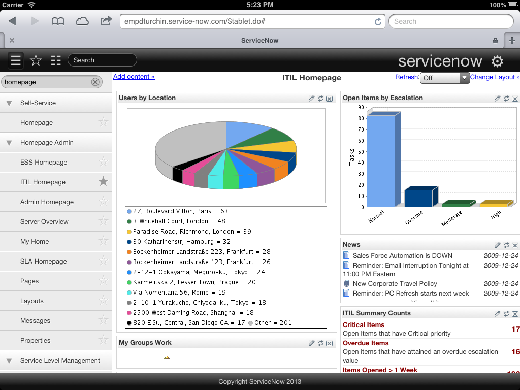
It all got me thinking about a product we're launching today,  ServiceNow for iPad. Never thought of it until now but we designed it the Dutch way. We could have been lazy. We could have copied what's out there - native without device capabilities or local storage, separate mobile server without two-way sync, mobile-only workflow without support for platform customizations. But we didn't.
Instead, we turned what could have been a minor tweak for scrolling into a re-imagined mobile experience that's faster and more intuitive than our web UI. It incorporates the best HTML5 has to offer, is touch-optimized for iPad, and styled using jQuery Mobile. It's a full platform integration that supports UI policies, role-based views, and even most client scripts. It's what happens when Fred (Luddy, our founder) gets inspired. His vision (and code!) drove the effort and he deserves all the  credit along with his battery mates.
You'll notice three things when you use the new ServiceNow for iPad:
•Less clicking. Check out the new favorites menu by clicking the star to the right of the navigator in the header. It's automatically updated as you access modules. Check out the new card view that eliminates the need for browser tab sprawl by consolidating everything that matters into one view.
•Less typing. Check out the preview pane that adds a form-view column with one click from any row in a list or from any card. From the preview pane update work notes or comments without navigating away to the full form. You can also create custom decks of cards by labeling records for quick access.
•Less clutter. Check out the multi-column filter feature that lets you find what you're looking for faster by entering query text right into the header row of any columns. Also, you can select multiple items from a reference picker with a single click to do things like add users to Watch lists.
The interface is light. It loads fast. It's easy to navigate. The best feedback I've heard so far is from a CIO who said "it's so good we're buying iPads for help desk agents so they don't have to use the web." Perhaps a preview of coming attractions. Wink wink.
Most of all, the new iPad interface is a reminder that we're as paranoid as ever. We're constantly trying to out-innovate ourselves. We're passionate about trying new things even though they sometimes fail. We're committed to being the next ServiceNow that disrupts ServiceNow.
To keep innovating, we need to hear from you. What did we get right? Where can we improve? Join me for a live demo of the iPad interface and a preview of what's next with other mobile and social enthusiasts at Knowledge13 Wednesday, May 15 at 6:00 PM in the ServiceNow booth in the expo hall.
You must be a registered user to add a comment. If you've already registered, sign in. Otherwise, register and sign in.

