- Post History
- Subscribe to RSS Feed
- Mark as New
- Mark as Read
- Bookmark
- Subscribe
- Printer Friendly Page
- Report Inappropriate Content
on 07-23-2022 03:18 AM
If you are building your custom page on UI builder and want to show a message based on certain conditions then here are the ways to do it.
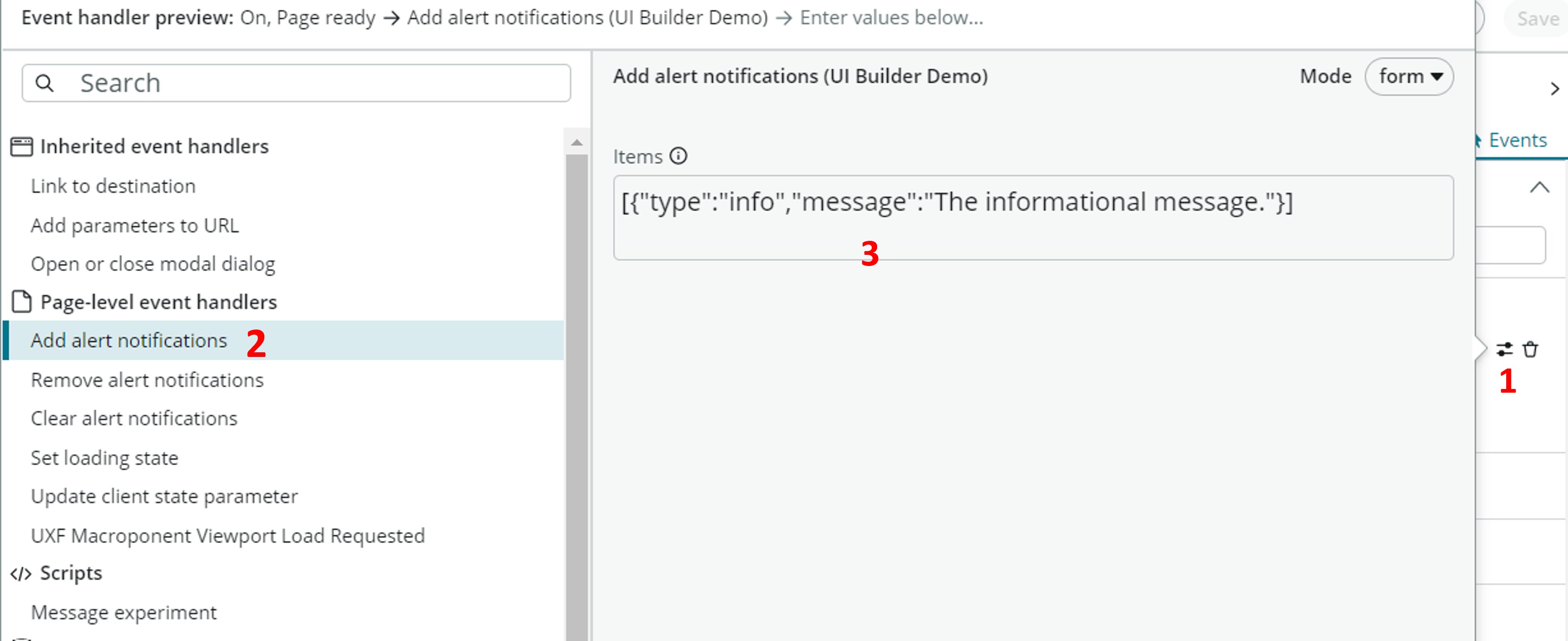
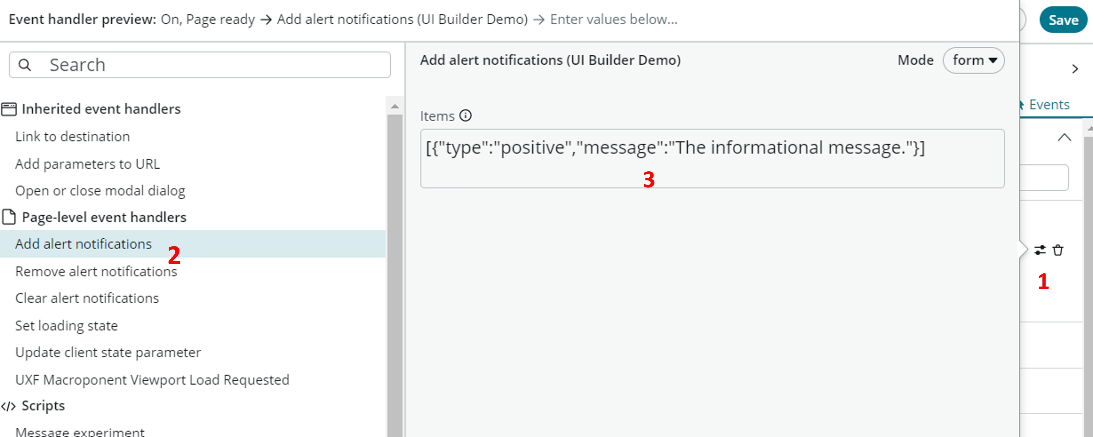
1. From "Add alert notifications" event:
The page event handler "Add alert notifications" can be used to show the message. The event can be triggered from page events, page component events or from data sources.

See here if you want to know what are events and how to use them.
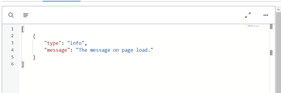
Below is the sample payload to show a info message from "Add alert notifications" event. It accepts two parameters.

The type property accepts info, warning and error values. Message should be a string.
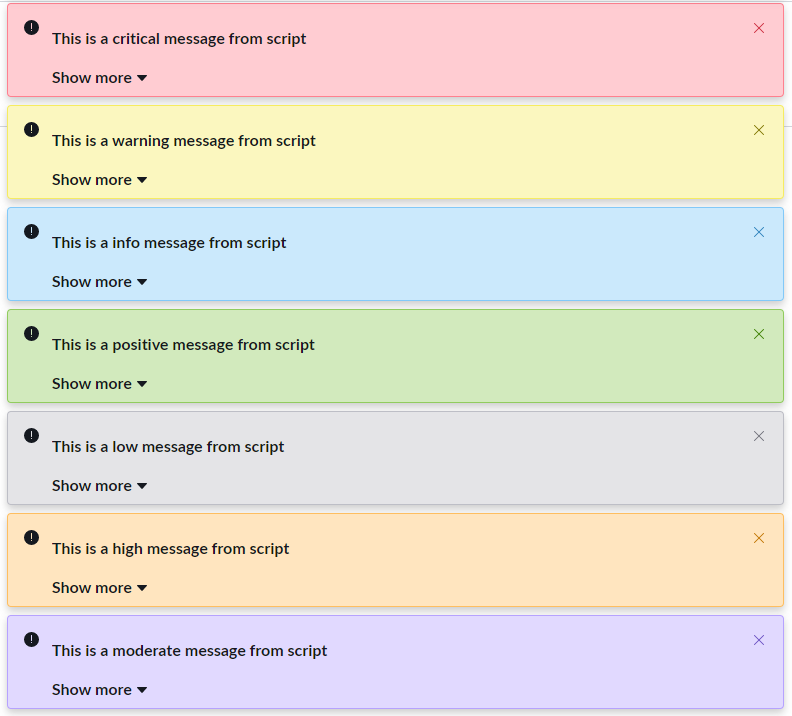
Info Message

Warning Message

Error Message

2. From page script
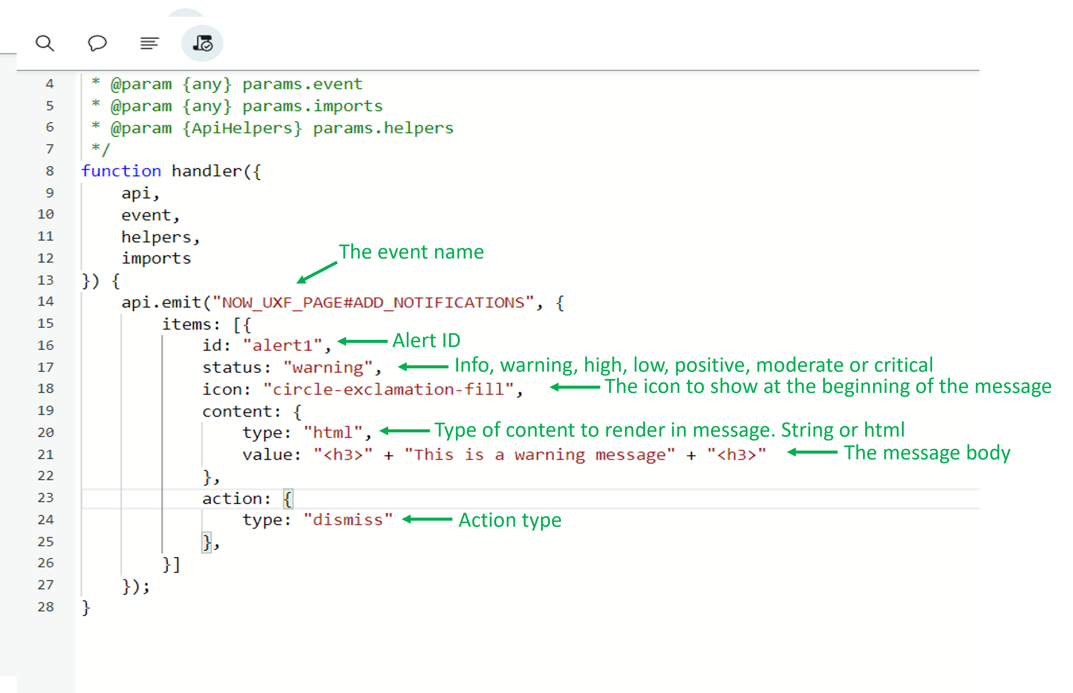
You can show more detailed and html enabled messages from the page scripts. Below is an example of the warning message which is triggered from page script. (The page script can be triggered from the events)

api.emit("NOW_UXF_PAGE#ADD_NOTIFICATIONS", {
        items: [{
            id: "alert1",
            status: "critical",
            icon: "circle-check-outline",
            content: {
                type: "html",
                value: "<h4>" + "This is a critical message from script" + "<h4>"
            },
            action: {
                type: "dismiss"
            },
        }]
    });
"api.emit" is used to trigger the events on page. The syntax is: api.emit("EVENT_NAME", {EVENT_PARAMETERS});
In above example:

Thank you for taking time to check it out. 🙂
- 19,419 Views
- Mark as Read
- Mark as New
- Bookmark
- Permalink
- Report Inappropriate Content
Other types of action would be `acknowledge`, which shows an OK button, and `open`.
This even seems to be documented in Alert Overview & API.
- Mark as Read
- Mark as New
- Bookmark
- Permalink
- Report Inappropriate Content
Thanks for adding it Martin. 🙂
- Mark as Read
- Mark as New
- Bookmark
- Permalink
- Report Inappropriate Content
Hi everyone,
Does anyone know if these messages can contain multiple lines? I've tried using option 2 (the page script), with html. But for some reason the box doesn't expand, and it doesn't show the remaining text. It is not even showing the "Show more" action.
This is the code I'm using:
api.emit("NOW_UXF_PAGE#ADD_NOTIFICATIONS", {
        items: [{
            id: "alert1",
            status: "info",
            icon: "circle-check-outline",
            content: {
                type: "html",
                value: "<p>This is the first line</p><p>This is the second line.</p>"
            },
            action: {
                type: "dismiss"
            },
        }]
    });
This is what I get:

Any ideias?
Cheers,
Jefferson
- Mark as Read
- Mark as New
- Bookmark
- Permalink
- Report Inappropriate Content
Wrap it in div's: "<div><p>This is the first line</p><p>This is the second line.</p></div>"
- Mark as Read
- Mark as New
- Bookmark
- Permalink
- Report Inappropriate Content
I appreciate you brother. Well done, and thank you.
- Mark as Read
- Mark as New
- Bookmark
- Permalink
- Report Inappropriate Content
Hi @JagjeetSingh,
Thank you so much for the post, it is immensely helpful.
But I want to ask about how did you come across this information ?
As in what values to provide for each of the property, while I am glad to have found the answers for the Alert Notification event handler, would you please help me in becoming able to reverse engineer this information on my own.
- Mark as Read
- Mark as New
- Bookmark
- Permalink
- Report Inappropriate Content
@Tanmay9 One way I do it is to go over the out of the box UX Client scripts in my instance and check the code itself for example going here : https://X.service-now.com/sys_ux_client_script_list.do?sysparm_query=scriptLIKEADD_NOTIFICATIONS
From there you can see what is already used in the system.
On top of that, we have this article in the docs: https://www.servicenow.com/docs/bundle/zurich-application-development/page/administer/ui-builder/con... it has a JSON example at the bottom of the page with the different examples.
And you can also check out the documentation from the component itself, somtimes you also have available info there : https://developer.servicenow.com/dev.do#!/reference/next-experience/zurich/now-components/now-alert/...
This is what I normally do, hope it helps 🙂