- Post History
- Subscribe to RSS Feed
- Mark as New
- Mark as Read
- Bookmark
- Subscribe
- Printer Friendly Page
- Report Inappropriate Content
on 02-05-2022 07:12 PM

|
With the San Diego release, ServiceNow introduces the "Next Experience" which delivers a next generation, intuitive, personalized experience to drive productivity, improve engagement, and surface insights across the Now Platform. In this article I will compare the current UI16 interface with the New Experience. |
|
Activating the Next Experience
Consistent for all users
New customers starting with the San Diego release automatically have Next Experience enabled.
Existing instances upgrading from a previous release have to enable the Next Experience manually by setting the system property glide.ui.polaris.experience to "true".
Let the users decide
it is possible to offer a button which allows the user to switch to the Next Experience UI. Read my article Allow users to switch between Next Experience UI and UI16 to see how this can be done.
| UI16 | Next Experience |
 |  |
|
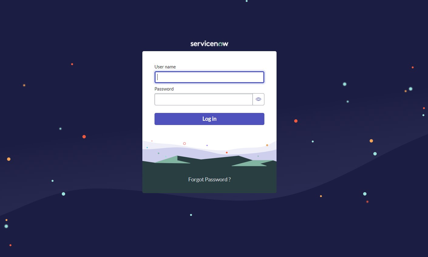
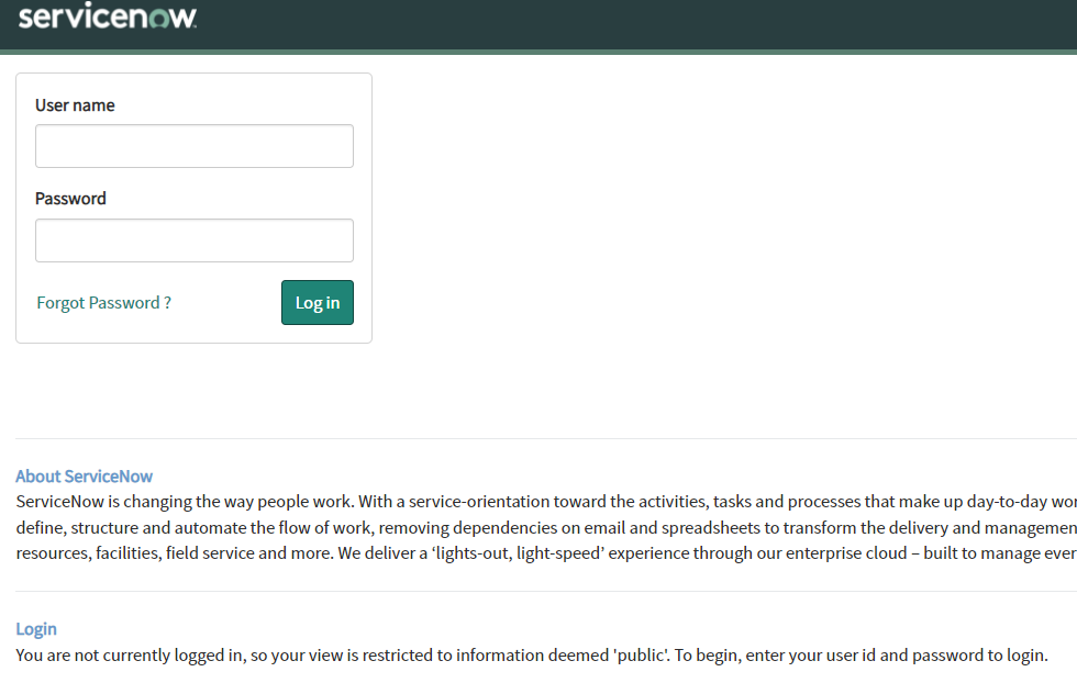
The login page got a nice space look and the login box is centered now. By default, the contents from table sys_home_list (text blocks at the bottom in UI16) are not considered anymore, which is not a great loss in my eyes. If you want them back, you can find the instructions on page Edit login theming in Next Experience. Cool effect: The stars in the background will follow your mouse. And clicking on the eye icon reveals the entered password. |
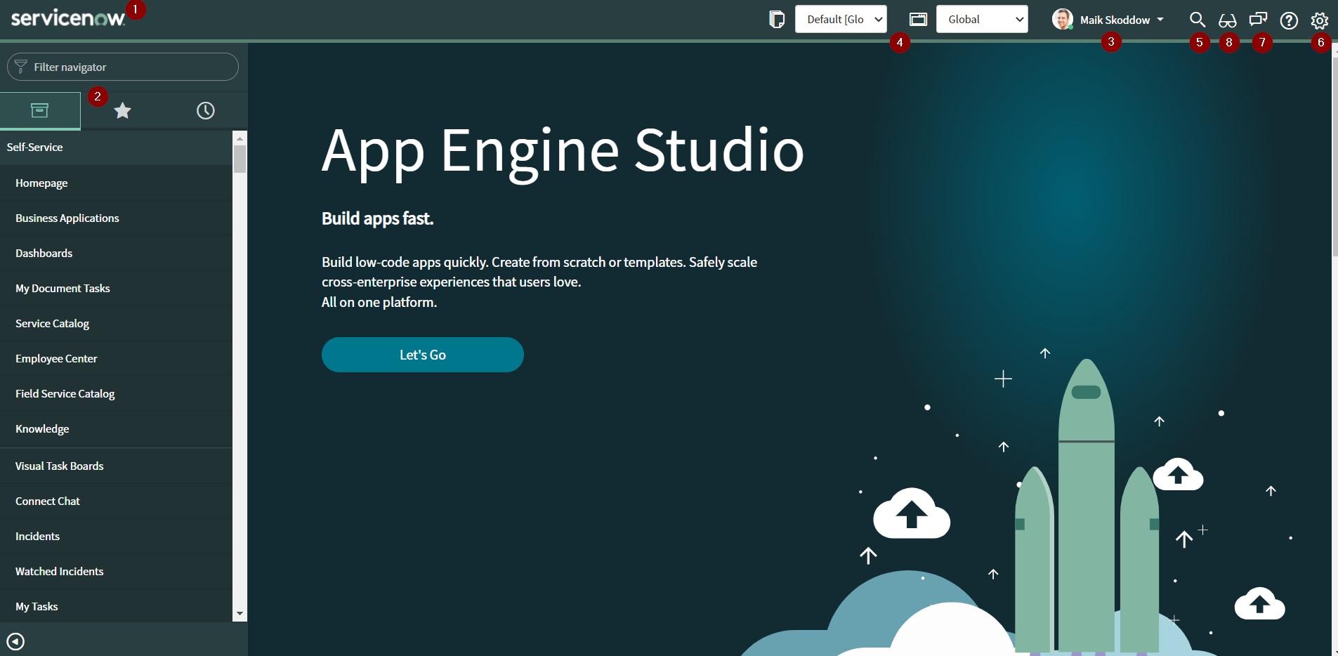
The Next Experience Unified Navigation runs across the top of every page and contains controls that assist you in navigating your instance. Easily access your workspaces and classic UI, search your instance, and receive notifications.
| UI16 | Next Experience |
 |  |
|
(1) Different Logo | |
|
(2) (3) (4) (7) (8) |
(2) (3) (4) (5) (6) (7) (8) |


| UI16 | Next Experience |
 |  |
|
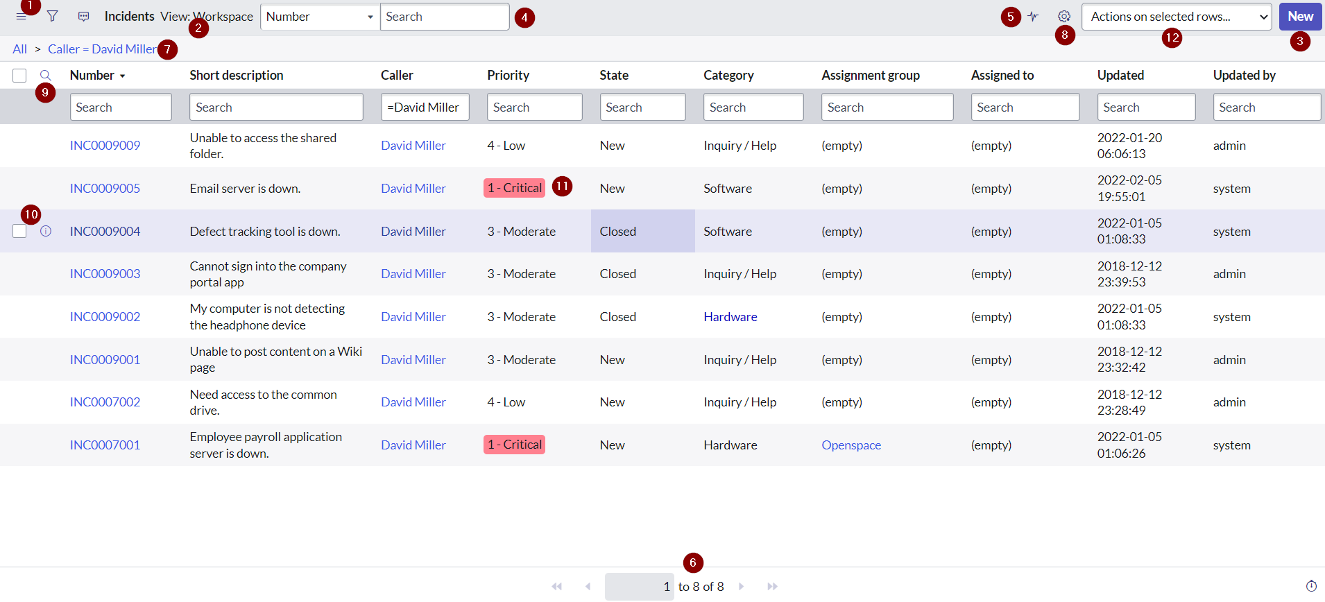
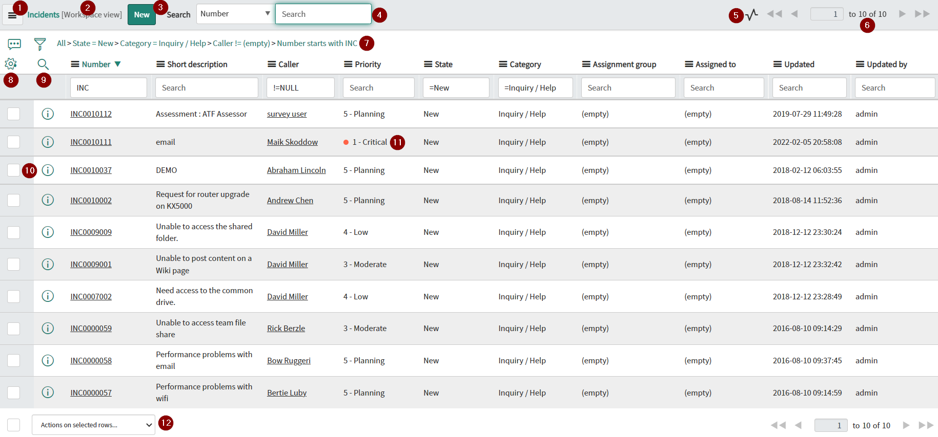
(1) List Menu (2) Selected View (3) UI Action Buttons (4) List Search (5) Activities (6) List Navigator (7) Applied Filters (8) List Preferences (9) Column Search (10) Row Selection & Preview Icon (11) Applied Style (12) List Actions |
(3) I think the location of the UI action buttons is quite inconvenient. (5) / (8) These icons should be larger to be more recognizable (6) Finally the page navigator is placed where it should be (10) The row selection and the preview icon are only visible when hovering the row. (11) The field styles are now displayed as in the Workspaces. (12) Finally you don't have to scroll to the end of the list to select the list actions. |
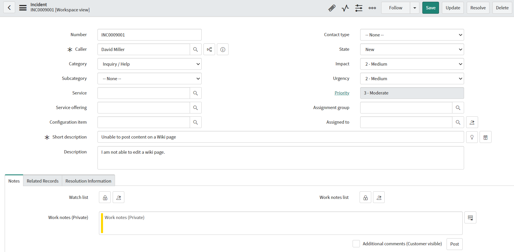
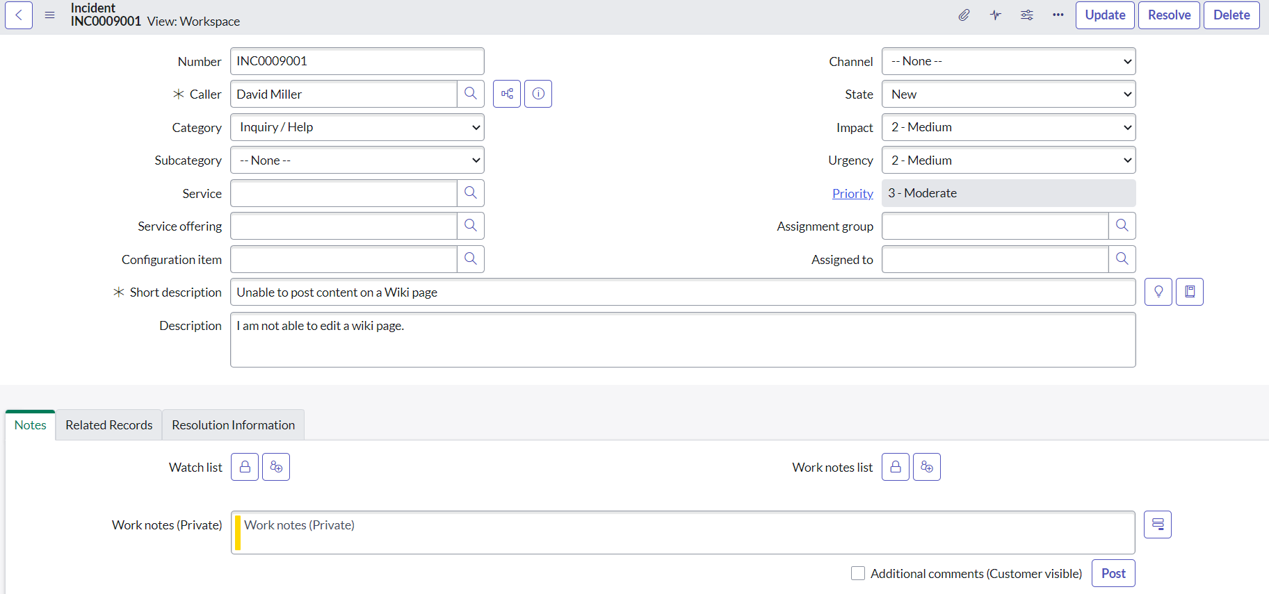
The record view is nearly the same as before. Some style adjustments have been performed to emphasize the fields.
| UI16 | Next Experience |
 |  |
| UI16 | Next Experience |
 |  |
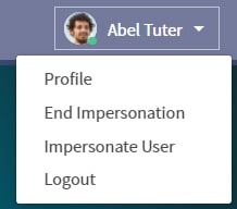
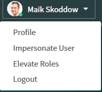
|
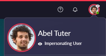
The only way to know that an impersonation is in progress is via the "End Impersonation" menu item. |
Four new indications clearly point out an impersonation session:
|
| 🛈 |
If this article was helpful to you, I would appreciate it if you would mark it accordingly. If you want to read more from me, you can go to the list of all my articles. |
- 42,413 Views
- Mark as Read
- Mark as New
- Bookmark
- Permalink
- Report Inappropriate Content
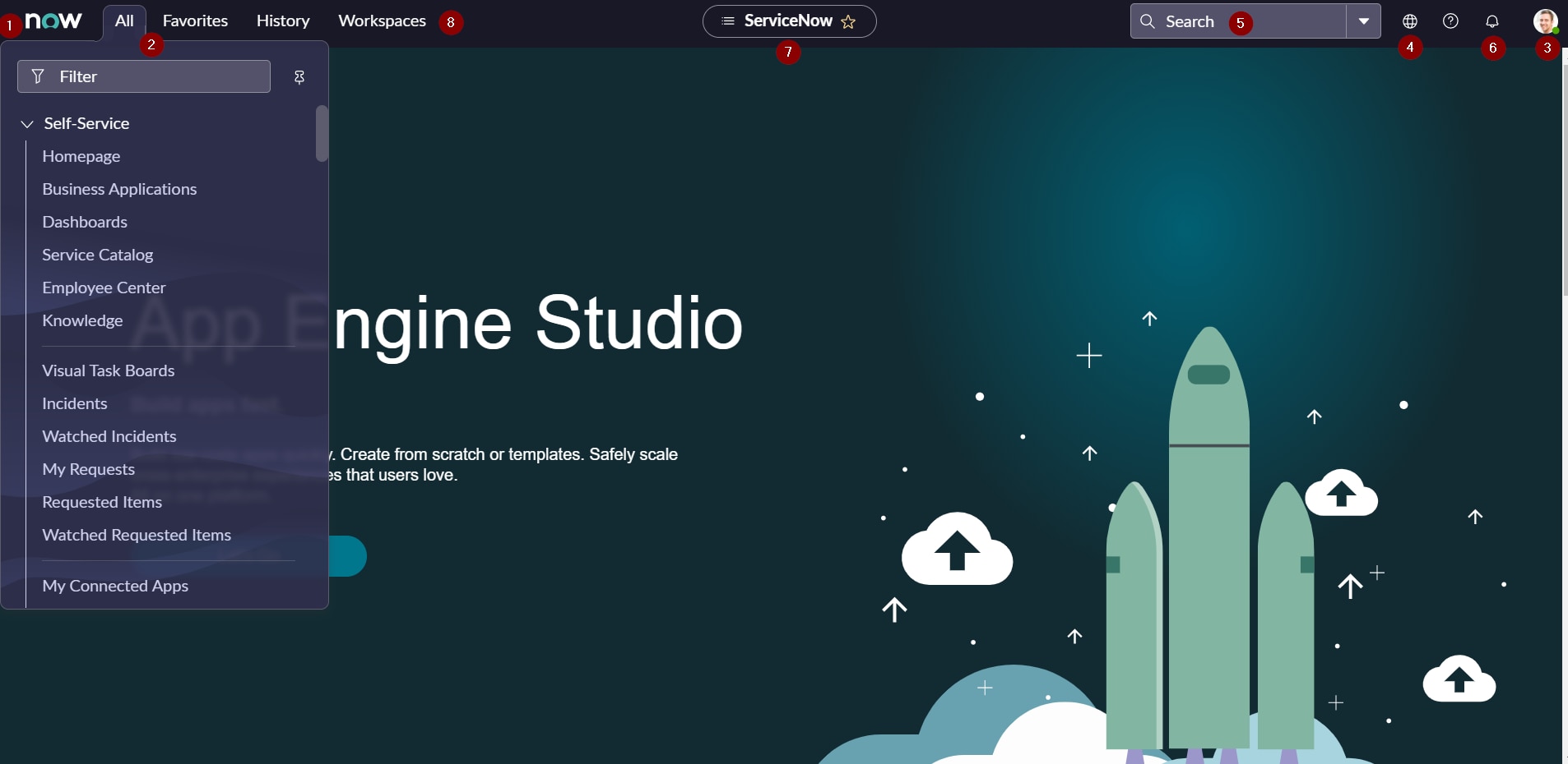
If I'm clicking on Servicenow logo which is in left top corner it is showing the dashboards or some other stuff in the homepage(which is taking more time to settle the browser) instead of that I want to set the App engine homepage(like above screenshots). Is that possible?
- Mark as Read
- Mark as New
- Bookmark
- Permalink
- Report Inappropriate Content
Hi
for the banner logo link, the same system property is taken as before. If you want to redirect the user to the App Engine Home page you have to set the value "ui_page.do?sys_id=0ea46d8b07010110522ff7108c1ed097" for the system property "glide.banner.image.url"

Maik
- Mark as Read
- Mark as New
- Bookmark
- Permalink
- Report Inappropriate Content
New isn’t always better and I must say I’m seriously unimpressed by the lack of connect chat, JavaScript console log, guided tour support. Hopefully these matters will be resolved in coming updates, but until they are I doubt many existing companies will welcome this, it feels like it needs further development before any release.
- Mark as Read
- Mark as New
- Bookmark
- Permalink
- Report Inappropriate Content
This is great, thank you. There are a lot of features to like about this, but one I haven't figure out yet is breadcrumb drop to favorites. Doesn't' seem to work, even if favorites is pinned.
- Mark as Read
- Mark as New
- Bookmark
- Permalink
- Report Inappropriate Content
Found it. You can use the pre-existing menu option for create favorites, or just use the star (favorites toggle) on the new header bar. If you use the second option, you can still go manually change the favorite name, icon, color etc. like you may have done previously with a breadcrumb drop.
- Mark as Read
- Mark as New
- Bookmark
- Permalink
- Report Inappropriate Content
Good spot! Same thing was bothering me. This also works for Reports as well which I sometimes do rather than have to go into the App to view a particular Report.
- Mark as Read
- Mark as New
- Bookmark
- Permalink
- Report Inappropriate Content
I noticed the ITIL Homepage is different regardless of whether the new UI is enabled. But if you "Edit ITIL Homepage" it shows the correct page. Anyone know offhand more around this?
- Mark as Read
- Mark as New
- Bookmark
- Permalink
- Report Inappropriate Content
the time out notification is new. is it possible to disable that? i personally like it but some support staff are used to UI16 working with SSO to just refresh the page
- Mark as Read
- Mark as New
- Bookmark
- Permalink
- Report Inappropriate Content
Hi @CL2 The timeout is controlled by a system property in sys_properties.list which we have extended to 2 hours (120): glide.ui.session_timeout
It is not recommended to allow idle sessions for too long and it also consumes memory.
- Mark as Read
- Mark as New
- Bookmark
- Permalink
- Report Inappropriate Content
Hi @Maik Skoddow ,
Could you tell me if there is a configuration for the higlight fields in list view like in workspace ?
(n°11) :

I have posted my question here but have no real clue.
I still have the dots for priority in my PDI Tokyo.

Regards,
- Mark as Read
- Mark as New
- Bookmark
- Permalink
- Report Inappropriate Content
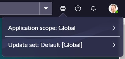
From Developer perspective, the earlier version has much more accessibility to the Update Set tab , which shows the active update set for the ongoing work. Which is not the case now.
- Mark as Read
- Mark as New
- Bookmark
- Permalink
- Report Inappropriate Content
If you have SN Utils installed in your browser, it can be set to show you the update set and scope info in the header:

- Mark as Read
- Mark as New
- Bookmark
- Permalink
- Report Inappropriate Content
Will the new UI next gen work with task mining or screen scraping or RPA tools
I see lot of cryptic way and the components are not identifiable in the new UIs
is the /x represent as new UI vs mycompany.service-now.com/now/nav/ui/classic/
sometimes it still /classic but does it have next Gen iframes embedded ?
can someone help here explain . what to expect