


Suzanne Smith

ServiceNow Employee
Options
- Subscribe to RSS Feed
- Mark as New
- Mark as Read
- Bookmark
- Subscribe
- Printer Friendly Page
- Report Inappropriate Content
12-24-2014
11:31 AM
"There is no harm in repeating a good thing."
-Plato
My blog post last week about viewing your visual task boards seemed to be quite popular, so, in the spirit of Plato, I'd like to bring you another post about the same subject. Let's talk about changing and customizing the appearance of visual task boards.
There is a lot of magic in the Board Configuration icon in the upper right corner of a visual task board:
Click the icon to see the options:
Background color
Click any of the colored squares to apply the background color and see how your board will look. Currently there are twelve available colors. All board members can see the background color.
Switches
For the view and label options, click the switch to toggle an option on or off. In the screenshot below, the Show Labels option is turned on and the Label Names option is turned off (think "green means go!").
Configure View
Any changes you make to the view options can only be seen by you, not other board members. You have several view options:
- Compact Lanes: Decreases lane width. This is useful if you have a good number of lanes and want as many lanes as possible to fit on the screen without having to scroll horizontally.
- Compact Tasks: Hides task details and decreases card vertical length. This is useful if you have many cards in a lane and want to view as many as possible without having to scroll vertically.
- Cover Image: Displays the first image attached to that card as a cover image. This is an easy way to quickly see if a card has supplemental screenshots or other visuals attached.
- Previous Activity: Displays the Activity stream showing the previous value for values that changed. This can give you a quick idea of what is happening with a task. For example, in the screenshot below, the Incident state changed from Closed to Active, the Priority changed from High to Critical, and the State changed from Closed to Active. This incident is hot.
- Member Names: Displays board member names next to their avatars in the Labels & Members toolbar. This is useful if board members insist on using comic book characters as their avatar instead of photos of themselves.
Labels
Labels color-code and organize cards on the board. The label names and colors appear on the Labels & Members toolbar. Colored dots representing the labels appear on cards. For example, in the screenshot below, the Unknown source of SAP outage card is labeled with a blue and a red dot indicating that it is a high priority defect.
Any configuration changes you make to labels can be seen by all board members. There are several label options:
- Show Labels: Displays labels on cards and in the Labels & Members toolbar. This is useful if you want to organize and group cards.
- Label Names: Displays the label name next to the label icon in the Labels & Members toolbar. The names define the color-coded circles for board members.
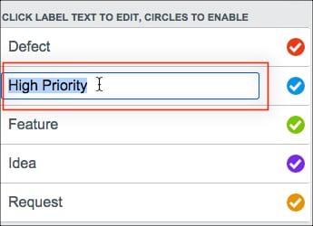
- Edit label text by double-clicking a label name and typing a new name.
- Enable or Disable labels by clicking the circle next to a label name. Circles containing a check mark are enabled. At this time, there are five labels to work with. You can disable some if you need less than five. We have had requests for making more than five labels available and that may happen in a future release.
This has been a quick tour through the look and feel options for visual task boards. There is more information about visual task boards in the product documentation:
- 10,746 Views
2 Comments
You must be a registered user to add a comment. If you've already registered, sign in. Otherwise, register and sign in.