After Vancouver Upgrade UI (Report and Incident) have few misalignments
- Mark as New
- Bookmark
- Subscribe
- Mute
- Subscribe to RSS Feed
- Permalink
- Report Inappropriate Content
10-27-2023 07:19 AM
Hello,
after Vancouver upgrade I observed few issues with UI in instance (please see screenshots).
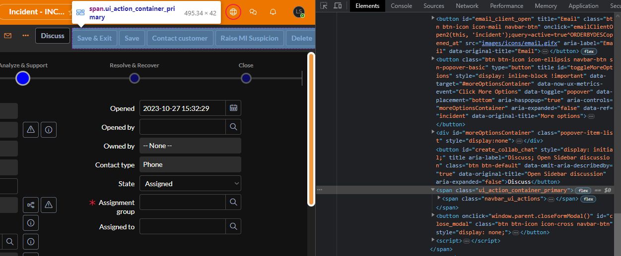
First Error is that Button "Discuss" seems to be out of container which is holding all buttons at one place. (see "For First Issue Inspection" to see what i mean).
Second Error is that when the Report condition is long "OR" is getting misalignment with filters. It seems like "or" shouldn't be in the container. (see "For Second issue inspection before" - this is before i removed it from container and then "For second issue inspection after" - where i put it above container and it looks good.
My question is how to fix these issues ?
I think the last thing to do is to change OOTB Styles.
Did anyone else experience similar issues ?
