- Mark as New
- Bookmark
- Subscribe
- Mute
- Subscribe to RSS Feed
- Permalink
- Report Inappropriate Content
3 weeks ago - last edited 3 weeks ago
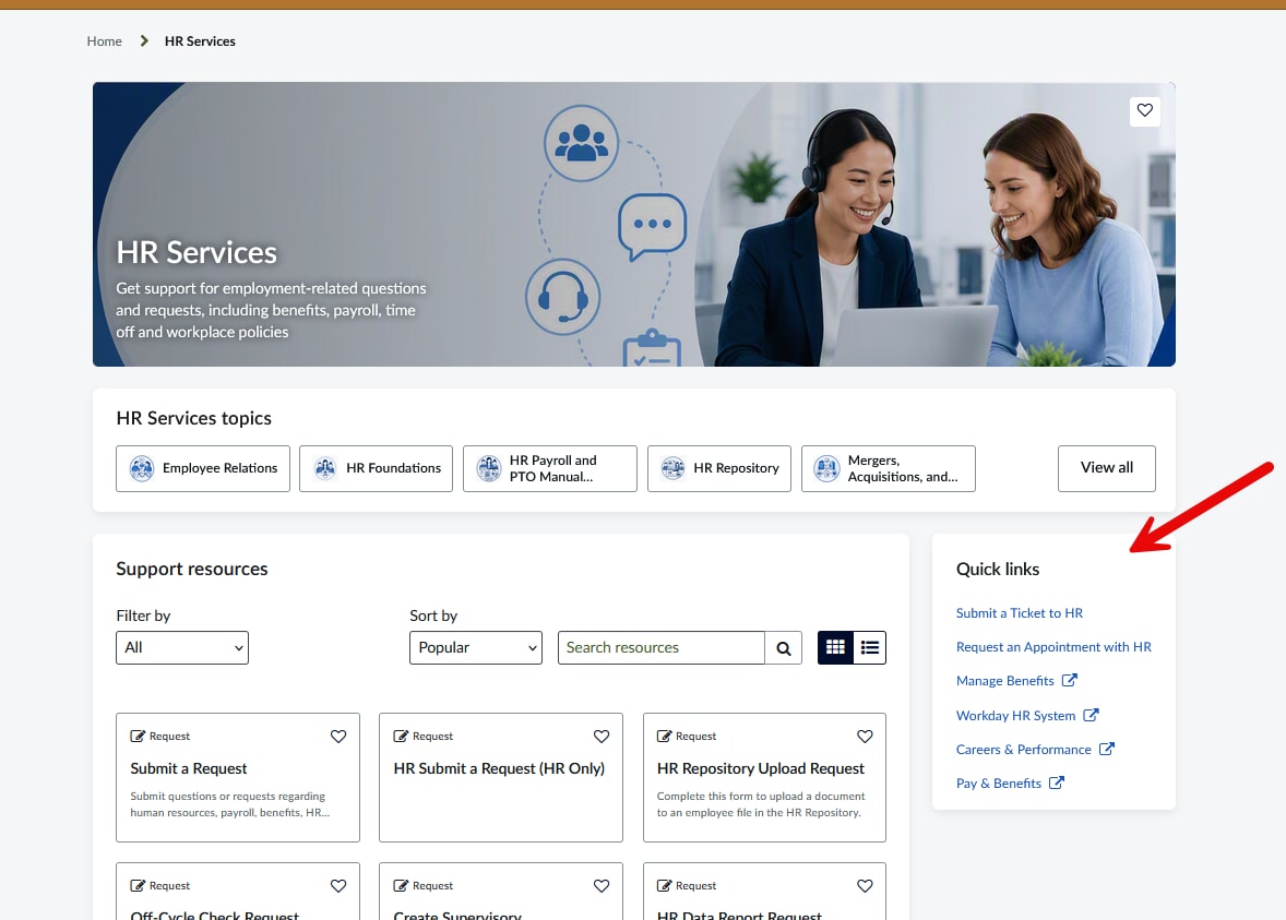
Currently today we are not making use fully for Employee Center. Each of the Different units with Quick Links want them more prominent with an ICON. I have icons attached to each of them but they are not showing. Any idea on how to get these to show up with the ICON? TIA - See Attachment - Sorry but this is all new to me and I am clueless.

Solved! Go to Solution.
- Mark as New
- Bookmark
- Subscribe
- Mute
- Subscribe to RSS Feed
- Permalink
- Report Inappropriate Content
3 weeks ago
Hi @wpeterson ,
Below are the steps to clone the OOTB Quick Links widget and customize it to display icons.
1.Navigate to sp_widget.list and search for the widget with the following name: Quick Links on Topic Page
2.Switch scope to Employee Center and Click on clone widget button.

3.Update the following fields in the cloned widget:
Name = Quick Links on Topic Page (Icons)
ID = quick_links_on_topic_page_icons
HTML = use the following
<div ng-class="data.isMobileApp ? 'link-container-mobile': 'link-container'"
     ng-if="data.json_data && data.json_data.length > 0 && (!data.isMobileApp || hasNonGuidedQuickLinks())">
  <div ng-bind-html="widgetTitleHtml"></div>
  <div class="all-link-container">

    <!-- DESKTOP VIEW -->
    <a class="quick-link"
       ng-style="item.type == 'guided_help' && {'cursor': 'pointer'}"
       ng-if="!data.isMobileApp"
       ng-repeat="item in data.json_data"
       ng-href="{{item.url}}"
       ng-click="clicked(item, $event)"
       data-toggle="tooltip"
       data-container="body"
       aria-labelledby="{{data.instanceId}}-item-{{$index}}"
       id="{{data.instanceId}}-item-{{$index}}"
       title="{{item.title}}"
       ng-attr-target="{{item.target}}">
      <div class="content">
        <div class="icon-wrap">
          <div class="quick-link-icon"
               role="img"
               aria-hidden="true"
               ng-style="{'background-image': 'url(' + (item.icon || defaultIcon) + ')'}"></div>
        </div>
        <div class="content-container">
          <span class="card-title">{{item.title}}</span>
          <div class="icon-container" ng-if="(item.target == '_blank')">
            <i class="fa fa-external-link"></i>
          </div>
        </div>
      </div>
      <span class="sr-only"
            id="{{data.instanceId}}-ext-link-{{$index}}"
            ng-if="(item.target == '_blank')">${, opens in a new window}
      </span>
    </a>

    <!-- MESP VIEW -->
    <a class="quick-link"
       ng-if="data.isMobileApp && item.type != 'guided_help'"
       ng-repeat="item in data.json_data"
       ng-href="{{item.url}}{{item.target == '_blank' ? '' : '&view=mobile'}}"
       data-toggle="tooltip"
       data-container="body"
       aria-labelledby="{{data.instanceId}}-item-{{$index}}"
       id="{{data.instanceId}}-item-{{$index}}"
       title="{{item.title}}"
       ng-attr-target="{{item.target}}">
      <div class="content">
        <div class="icon-wrap">
          <div class="quick-link-icon"
               role="img"
               aria-hidden="true"
               ng-style="{'background-image': 'url(' + (item.icon || defaultIcon) + ')'}"></div>
        </div>
        <div class="content-container container-mobile">
          <span class="view-mobile card-title">{{item.title}}</span>
          <div class="icon-container" ng-if="(item.target == '_blank')">
            <i class="fa fa-external-link"></i>
          </div>
        </div>
      </div>
      <div class="line"></div>
      <span class="sr-only"
            id="{{data.instanceId}}-ext-link-{{$index}}"
            ng-if="(item.target == '_blank')">${, opens in a new window}
      </span>
    </a>
  </div>
</div>
- CSS = Use the following
$background-primary: #ffffff !default;
$sp-panel-box-shadow: 0 4px 8px 0 rgba(23, 40, 52, 0.08) !default;
$icon-size: 56px;
$rm: 2px;
$link-hover-color: #354ECA !default;
$link-color: #3C59E7 !default;
$sp-space--xl: 24px !default;
$sp-space--lg: 16px !default;
$sp-space--md: 12px !default;
$sp-space--sm: 8px !default;
$divider: #F6F7F7 !default;

.title {
  min-width: 200px;
  padding-bottom: $sp-space--xl;
  word-wrap: break-word;
}

.all-link-container {
  background-color: $background-primary;
  display: flex;
  flex-wrap: wrap;
  gap: $sp-space--md;
}

.link-container {
  margin: 24px 15px;
  background-color: $background-primary;
  border: 1px solid $background-primary;
  border-radius: $border-radius-large;
  box-shadow: $sp-panel-box-shadow;
  min-width: 200px;
  padding: $sp-space--xl;

  .all-link-container { flex-direction: row; }

  .quick-link {
    display: flex;
    flex-direction: column;
    align-items: center;
    text-align: center;
    width: 110px;
    border-radius: $border-radius-large;
    padding: $sp-space--sm;
    transition: background-color 0.15s ease, box-shadow 0.15s ease;
  }

  .quick-link:hover {
    background-color: #F7F8FC;
    box-shadow: 0 2px 6px rgba(23,40,52,0.08);
    text-decoration: none;
  }

  .quick-link:focus > div {
    box-shadow: 0 0 0 0.2rem $brand-primary;
    border-radius: $border-radius-large;
  }
  .quick-link:focus { box-shadow: none; }
}

.link-container-mobile {
  padding: $sp-space--lg;
  border-bottom: 12px solid $divider;
  box-sizing: border-box;

  .title { font-weight: bold; font-size: 20px !important; padding-bottom: 0; margin: 0; }

  .quick-link {
    display: flex;
    flex-direction: row;
    align-items: center;
    padding: $sp-space--lg 0;
  }
}

.content {
  display: flex;
  flex-direction: column;
  align-items: center;
  width: 100%;
}

.link-container-mobile .content {
  flex-direction: row;
  align-items: center;
}

.icon-wrap {
  display: flex;
  justify-content: center;
  margin-bottom: $sp-space--sm;
}

.link-container-mobile .icon-wrap {
  margin-bottom: 0;
  margin-right: $sp-space--md;
}

.quick-link-icon {
  width: $icon-size;
  height: $icon-size;
  border-radius: 50%;
  background-color: #F0F2FA;
  background-size: 60%;
  background-position: center;
  background-repeat: no-repeat;
  box-shadow: inset 0 0 0 1px rgba(23,40,52,0.06);
}

.content-container {
  display: flex;
  align-items: center;
  flex-direction: column;
  max-width: 130px;
  word-break: break-word;
  text-align: center;

  .card-title {
    display: inline-block;
    color: $link-color;
    font-weight: 500;
    font-size: 14px;
    line-height: 1.3;
    white-space: normal;
  }

  .quick-link:hover .card-title { color: $link-hover-color; }
}

.link-container-mobile .content-container {
  flex-direction: row;
  max-width: 100%;
  text-align: left;

  .card-title { font-size: 16px; }
}

.icon-container {
  display: flex;
  padding-top: 4px;
  justify-content: center;
}

.line {
  width: 100%;
  border: none;
  border-bottom: 1px solid #EAEAEA;
}

@media (max-width: 768px) {
  .link-container { margin-top: 0; padding: $sp-space--lg; }
}
Add the following line at the top of the client script controller, after var c = this;
This provides a fallback icon when a Quick Link does not have an icon configured.
$scope.defaultIcon = "topic_default_icon.png"; // or your own uploaded placeholder 
4.Now replace this widget with OOTB widget on emp_taxonomy_topic page.

You can further update the HTML and CSS based on your requirements.
- Mark as New
- Bookmark
- Subscribe
- Mute
- Subscribe to RSS Feed
- Permalink
- Report Inappropriate Content
3 weeks ago - last edited 3 weeks ago
It's the side menu they want icons. The Widget is 'Quick Links on Topic Page' they want like a prominent Icon to display instead of just names.
- Mark as New
- Bookmark
- Subscribe
- Mute
- Subscribe to RSS Feed
- Permalink
- Report Inappropriate Content
3 weeks ago
Hi @wpeterson ,
Below are the steps to clone the OOTB Quick Links widget and customize it to display icons.
1.Navigate to sp_widget.list and search for the widget with the following name: Quick Links on Topic Page
2.Switch scope to Employee Center and Click on clone widget button.
3.Update the following fields in the cloned widget:
Name = Quick Links on Topic Page (Icons)
ID = quick_links_on_topic_page_icons
HTML = use the following
<div ng-class="data.isMobileApp ? 'link-container-mobile': 'link-container'"
     ng-if="data.json_data && data.json_data.length > 0 && (!data.isMobileApp || hasNonGuidedQuickLinks())">
  <div ng-bind-html="widgetTitleHtml"></div>
  <div class="all-link-container">

    <!-- DESKTOP VIEW -->
    <a class="quick-link"
       ng-style="item.type == 'guided_help' && {'cursor': 'pointer'}"
       ng-if="!data.isMobileApp"
       ng-repeat="item in data.json_data"
       ng-href="{{item.url}}"
       ng-click="clicked(item, $event)"
       data-toggle="tooltip"
       data-container="body"
       aria-labelledby="{{data.instanceId}}-item-{{$index}}"
       id="{{data.instanceId}}-item-{{$index}}"
       title="{{item.title}}"
       ng-attr-target="{{item.target}}">
      <div class="content">
        <div class="icon-wrap">
          <div class="quick-link-icon"
               role="img"
               aria-hidden="true"
               ng-style="{'background-image': 'url(' + (item.icon || defaultIcon) + ')'}"></div>
        </div>
        <div class="content-container">
          <span class="card-title">{{item.title}}</span>
          <div class="icon-container" ng-if="(item.target == '_blank')">
            <i class="fa fa-external-link"></i>
          </div>
        </div>
      </div>
      <span class="sr-only"
            id="{{data.instanceId}}-ext-link-{{$index}}"
            ng-if="(item.target == '_blank')">${, opens in a new window}
      </span>
    </a>

    <!-- MESP VIEW -->
    <a class="quick-link"
       ng-if="data.isMobileApp && item.type != 'guided_help'"
       ng-repeat="item in data.json_data"
       ng-href="{{item.url}}{{item.target == '_blank' ? '' : '&view=mobile'}}"
       data-toggle="tooltip"
       data-container="body"
       aria-labelledby="{{data.instanceId}}-item-{{$index}}"
       id="{{data.instanceId}}-item-{{$index}}"
       title="{{item.title}}"
       ng-attr-target="{{item.target}}">
      <div class="content">
        <div class="icon-wrap">
          <div class="quick-link-icon"
               role="img"
               aria-hidden="true"
               ng-style="{'background-image': 'url(' + (item.icon || defaultIcon) + ')'}"></div>
        </div>
        <div class="content-container container-mobile">
          <span class="view-mobile card-title">{{item.title}}</span>
          <div class="icon-container" ng-if="(item.target == '_blank')">
            <i class="fa fa-external-link"></i>
          </div>
        </div>
      </div>
      <div class="line"></div>
      <span class="sr-only"
            id="{{data.instanceId}}-ext-link-{{$index}}"
            ng-if="(item.target == '_blank')">${, opens in a new window}
      </span>
    </a>
  </div>
</div>
- CSS = Use the following
$background-primary: #ffffff !default;
$sp-panel-box-shadow: 0 4px 8px 0 rgba(23, 40, 52, 0.08) !default;
$icon-size: 56px;
$rm: 2px;
$link-hover-color: #354ECA !default;
$link-color: #3C59E7 !default;
$sp-space--xl: 24px !default;
$sp-space--lg: 16px !default;
$sp-space--md: 12px !default;
$sp-space--sm: 8px !default;
$divider: #F6F7F7 !default;

.title {
  min-width: 200px;
  padding-bottom: $sp-space--xl;
  word-wrap: break-word;
}

.all-link-container {
  background-color: $background-primary;
  display: flex;
  flex-wrap: wrap;
  gap: $sp-space--md;
}

.link-container {
  margin: 24px 15px;
  background-color: $background-primary;
  border: 1px solid $background-primary;
  border-radius: $border-radius-large;
  box-shadow: $sp-panel-box-shadow;
  min-width: 200px;
  padding: $sp-space--xl;

  .all-link-container { flex-direction: row; }

  .quick-link {
    display: flex;
    flex-direction: column;
    align-items: center;
    text-align: center;
    width: 110px;
    border-radius: $border-radius-large;
    padding: $sp-space--sm;
    transition: background-color 0.15s ease, box-shadow 0.15s ease;
  }

  .quick-link:hover {
    background-color: #F7F8FC;
    box-shadow: 0 2px 6px rgba(23,40,52,0.08);
    text-decoration: none;
  }

  .quick-link:focus > div {
    box-shadow: 0 0 0 0.2rem $brand-primary;
    border-radius: $border-radius-large;
  }
  .quick-link:focus { box-shadow: none; }
}

.link-container-mobile {
  padding: $sp-space--lg;
  border-bottom: 12px solid $divider;
  box-sizing: border-box;

  .title { font-weight: bold; font-size: 20px !important; padding-bottom: 0; margin: 0; }

  .quick-link {
    display: flex;
    flex-direction: row;
    align-items: center;
    padding: $sp-space--lg 0;
  }
}

.content {
  display: flex;
  flex-direction: column;
  align-items: center;
  width: 100%;
}

.link-container-mobile .content {
  flex-direction: row;
  align-items: center;
}

.icon-wrap {
  display: flex;
  justify-content: center;
  margin-bottom: $sp-space--sm;
}

.link-container-mobile .icon-wrap {
  margin-bottom: 0;
  margin-right: $sp-space--md;
}

.quick-link-icon {
  width: $icon-size;
  height: $icon-size;
  border-radius: 50%;
  background-color: #F0F2FA;
  background-size: 60%;
  background-position: center;
  background-repeat: no-repeat;
  box-shadow: inset 0 0 0 1px rgba(23,40,52,0.06);
}

.content-container {
  display: flex;
  align-items: center;
  flex-direction: column;
  max-width: 130px;
  word-break: break-word;
  text-align: center;

  .card-title {
    display: inline-block;
    color: $link-color;
    font-weight: 500;
    font-size: 14px;
    line-height: 1.3;
    white-space: normal;
  }

  .quick-link:hover .card-title { color: $link-hover-color; }
}

.link-container-mobile .content-container {
  flex-direction: row;
  max-width: 100%;
  text-align: left;

  .card-title { font-size: 16px; }
}

.icon-container {
  display: flex;
  padding-top: 4px;
  justify-content: center;
}

.line {
  width: 100%;
  border: none;
  border-bottom: 1px solid #EAEAEA;
}

@media (max-width: 768px) {
  .link-container { margin-top: 0; padding: $sp-space--lg; }
}
Add the following line at the top of the client script controller, after var c = this;
This provides a fallback icon when a Quick Link does not have an icon configured.
$scope.defaultIcon = "topic_default_icon.png"; // or your own uploaded placeholder
4.Now replace this widget with OOTB widget on emp_taxonomy_topic page.
You can further update the HTML and CSS based on your requirements.
- Mark as New
- Bookmark
- Subscribe
- Mute
- Subscribe to RSS Feed
- Permalink
- Report Inappropriate Content
3 weeks ago
OMG you are AWESOME! Thanks so much they are going to love this!!