Service Portal - need help with panels
- Mark as New
- Bookmark
- Subscribe
- Mute
- Subscribe to RSS Feed
- Permalink
- Report Inappropriate Content
08-22-2017 08:12 AM
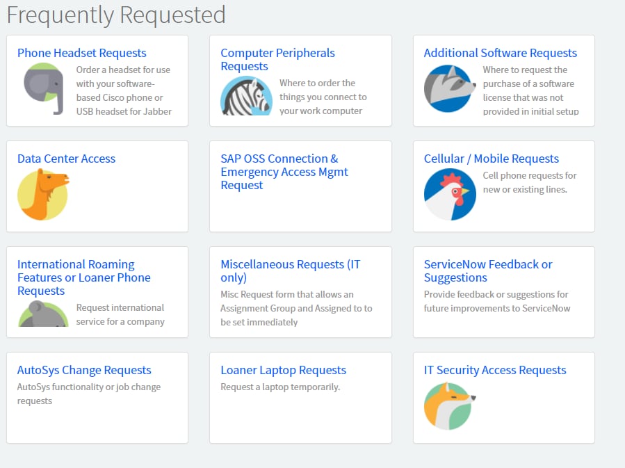
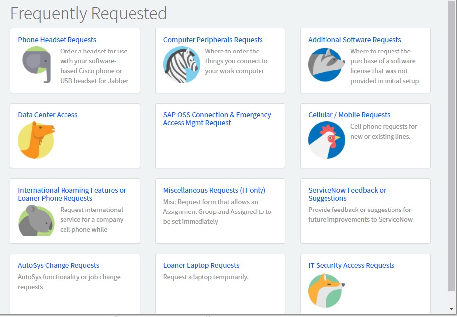
I'm trying to modify the SC Popular Items widget so it sucks less. See below for what I'm getting when I try to take advantage of pictures:

Cutoff pics depending on the length of the title. I'm not sure what I can do to prevent this, without throwing off the entire layout. Any advice here?
Here is the HTML from the widget:
<h1 class="font-thin m-t-none">{{::options.title}}</h1>
<div class="row" >
<div class="col-sm-6 col-md-4" ng-repeat="item in data.items">
<div class="panel panel-default">
<a href="?id={{item.type}}&sys_id={{item.sys_id}}" class="panel-body block">
<div class="overflow-100">
<h4 class="m-t-none m-b-xs">{{::item.name}}</h4>
<img ng-src="{{item.picture}}" ng-if="item.picture" class="m-r-sm m-b-sm item-image pull-left" />
<div class="text-muted item-short-desc">{{::item.short_description}}</div>
</div>
</a>
<!-- <div class="panel-footer">
<a href="?id={{item.type}}&sys_id={{item.sys_id}}" class="pull-left text-muted">${View Details}</a> <span ng-if="data.showPrices && item.price != '$0.00'" class="pull-right item-price font-bold">{{::item.price}}</span>
</div> -->
</div>
</div>
</div>
- Mark as New
- Bookmark
- Subscribe
- Mute
- Subscribe to RSS Feed
- Permalink
- Report Inappropriate Content
08-22-2017 10:41 AM
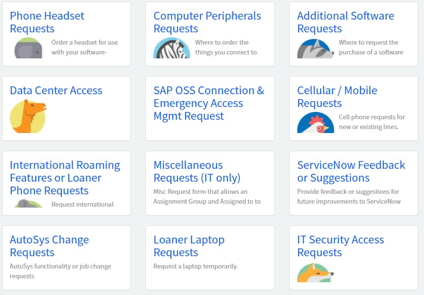
That certainly had an impact, but now the title gets cutoff, which looks weird and isn't customer friendly. Is there a way to have the text in the title dynamically change size instead of the pic?
- Mark as New
- Bookmark
- Subscribe
- Mute
- Subscribe to RSS Feed
- Permalink
- Report Inappropriate Content
08-22-2017 10:52 AM
it could, but it would have to be based on screen size... There's 2 ways that I can think of that you can do that.
Option 1
you could use VW as your font size units which stands for (Vertical Width) and is based on screen size.
A link for more info on that: https://css-tricks.com/viewport-sized-typography/
.panel h4 {
font-size: 1.25vw;
}
Option 2
Or you could use media queries and "hard code" certain stop points for certain sizes.
<!-- Here is your base font size -->
.panel h4 {
 font-size: 18px;
}
<!-- this font size overrides the above font size UP UNTIL the screen is 600px wide-->
@media (max-width: 600px) {
.panel h4 {
font-size: 12px;
}
}
- Mark as New
- Bookmark
- Subscribe
- Mute
- Subscribe to RSS Feed
- Permalink
- Report Inappropriate Content
08-22-2017 11:04 AM
I'm not entirely sure how it's deciding to resize the text when I use the 'vw' option:
Full window (the text pushes stuff out of view):

Half:

Third:

It actually gets better the more crushed the window is (which isn't how most people will view it).
That second set of code you offered up didn't seem to do much of anything, like the max-width wasn't applying.
- Mark as New
- Bookmark
- Subscribe
- Mute
- Subscribe to RSS Feed
- Permalink
- Report Inappropriate Content
08-22-2017 12:20 PM
the vw is basically a percentage of the windows width, so the bigger the width the bigger the text, the smaller the width the smaller the text.
the second code i gave that 600px might be way too small, try setting it 1000px. Also the media query part typically goes at the end of your css, and the base part goes somewhere above it.
- Mark as New
- Bookmark
- Subscribe
- Mute
- Subscribe to RSS Feed
- Permalink
- Report Inappropriate Content
01-20-2020 11:24 PM
Does the issue fixed? Even i have the same issue..
Please help me if the fixed