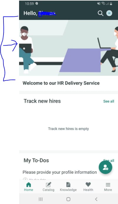
Hero image (Banner image) on home page of Now mobile app in cutting from the sides on android but looks good on Iphone.
- Mark as New
- Bookmark
- Subscribe
- Mute
- Subscribe to RSS Feed
- Permalink
- Report Inappropriate Content
04-19-2021 10:02 AM
Here is the image on my android phone on Now Mobile app. Its looks good on IPhone. Its cutting from both sides. Can anyone help me in how can I solve the image issue. Any help will be appreciated.

- Labels:
-
Now Mobile
- Mark as New
- Bookmark
- Subscribe
- Mute
- Subscribe to RSS Feed
- Permalink
- Report Inappropriate Content
04-19-2021 08:38 PM
Hi Simran,
This will be a tricky one to solve as the banner image will be automatically centered on the device but the screen width can vary greatly between devices. If you download the default ServiceNow banner image you'll see that they are very wide at 4098px to allow for phones and tables.
To address your question, you could edit the image that is stored in the media section of your applet launcher. You would need to experiment by resizing the image in an image editor and then test it on various devices until you reach a happy compromise.
Joël
- Mark as New
- Bookmark
- Subscribe
- Mute
- Subscribe to RSS Feed
- Permalink
- Report Inappropriate Content
04-19-2021 09:25 PM
Indeed, Android display images in slight distorted way. i have edite the images in 600 * 160 , so it becomes easy to view in both andriod and IoS
PaulSylo
To be is to do. To do is to be.
- Mark as New
- Bookmark
- Subscribe
- Mute
- Subscribe to RSS Feed
- Permalink
- Report Inappropriate Content
04-19-2021 10:11 PM
Hi Simran,
try with a image size of height 600px and width 1200px. I tried with this and its working.
- Mark as New
- Bookmark
- Subscribe
- Mute
- Subscribe to RSS Feed
- Permalink
- Report Inappropriate Content
04-22-2021 08:54 AM
Hi Simran,
Please refer to the Mobile Prod Docs for guidance:
https://docs.servicenow.com/bundle/quebec-mobile/page/administer/tablet-mobile-ui/task/sg-ui-section-config-media.html
'If your users primarily use iPhones, use a height of 160px and a width of 375px to 600px.'
Best,
David