- Post History
- Subscribe to RSS Feed
- Mark as New
- Mark as Read
- Bookmark
- Subscribe
- Printer Friendly Page
- Report Inappropriate Content
on 03-24-2021 12:08 PM
Hi everyone!
We all want to create dashboards that visualize data in a great looking, but still clear and understandable way. The standard color schemes are good for this, but sometimes you want your dashboard to stand out or just have a different look. I recently created a series of color schemes, and I thought I'd share them with you all. I've included all the schemes and colors in update sets attached to this post.
Each "theme" comes with a main scheme consisting of 8 colors as well as 3 extending schemes consisting of 5 shades/variations of the scheme's main colors, and finally a scheme for a matching 3 color traffic light.
The extending schemes can be used for things like stacked bar charts, pie charts or other kinds of breakdown widgets. They are limited to 5 variations of the same color as studies have shown that once you start to go beyond that, people have a hard time telling the elements apart.
If you have more than 5 elements in a widget, use the main scheme in the breakdown. If you have more than 8, either extend the main scheme with additional colors or use a scorecard widget instead. Too many elements will always be confusing presented visually, even if the colors are distinct.
Reference
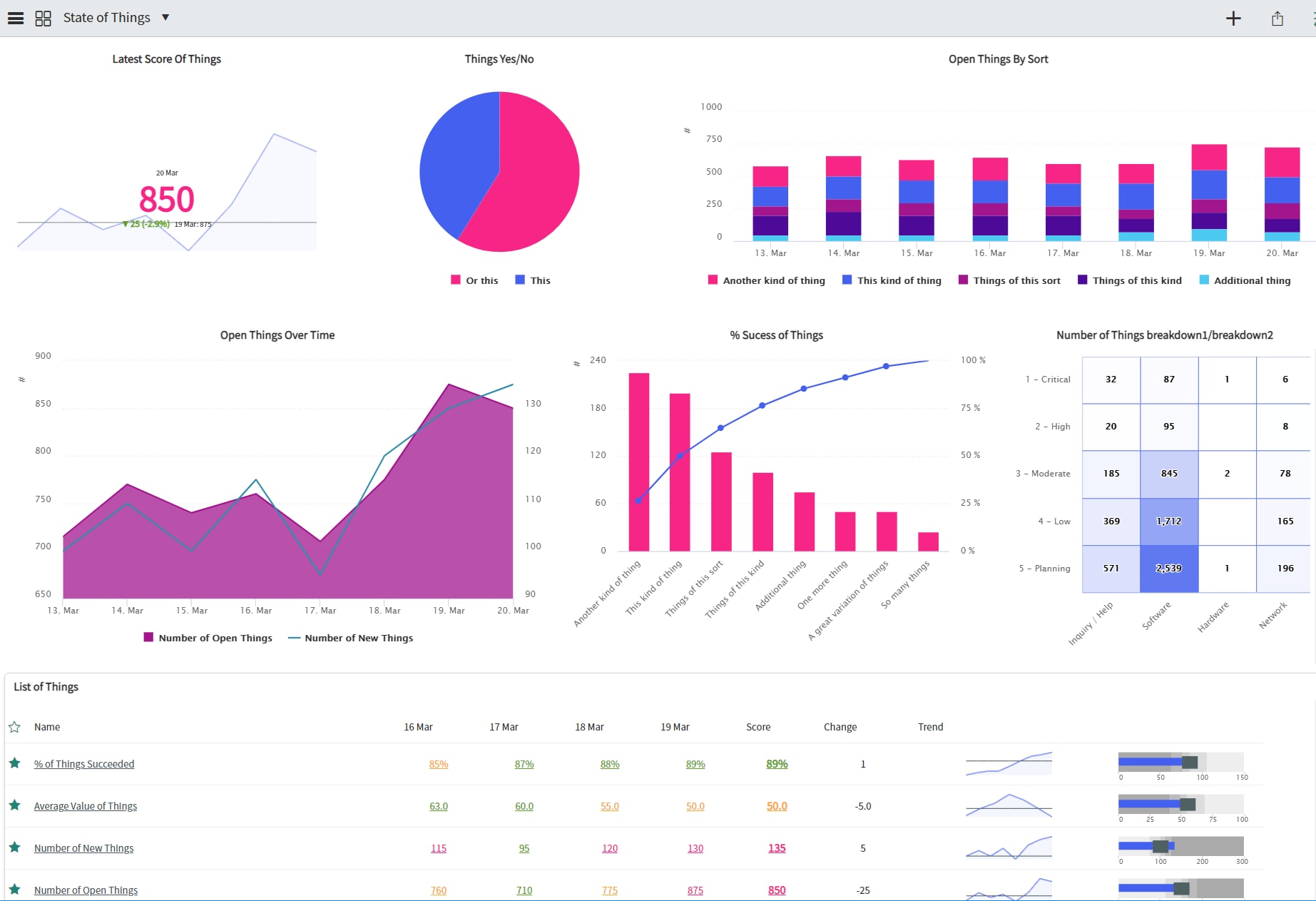
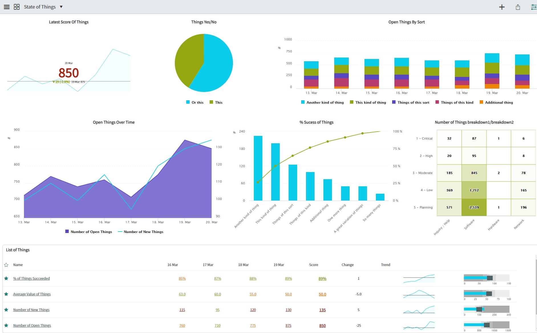
First lets start with a reference image of a dashboard using the default UI14 theme:

Ui14 Muted
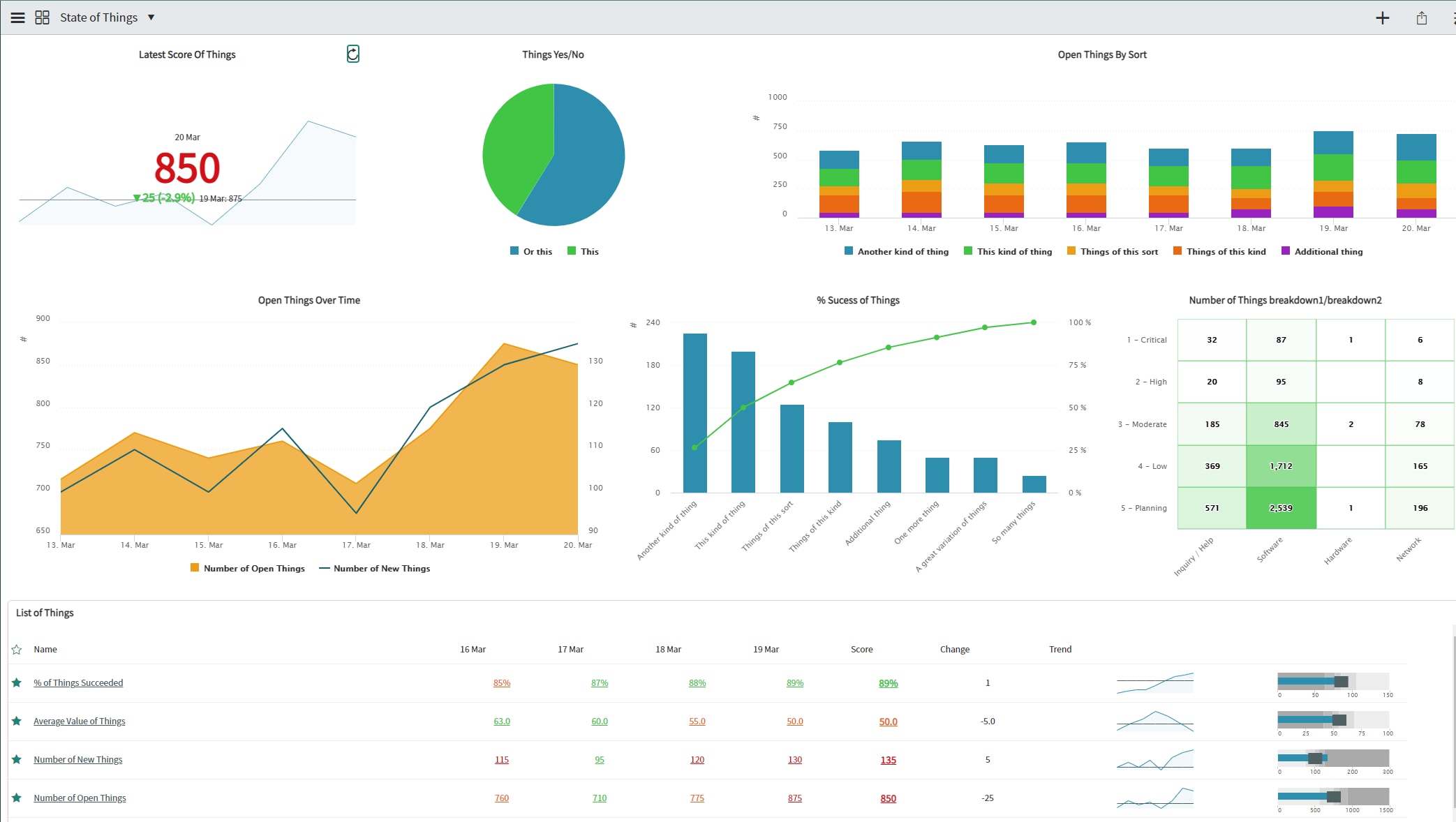
While the default theme is nice, it might be too bright for some. So my first theme is a version of the default scheme with slightly muted colors. The difference isn't huge, but enough to be noticeable in a dashboard. I think it gives a more "serious" look.

Here is the color scheme, it covers the first 10 colors of the default theme.

And for comparison, the original colors:

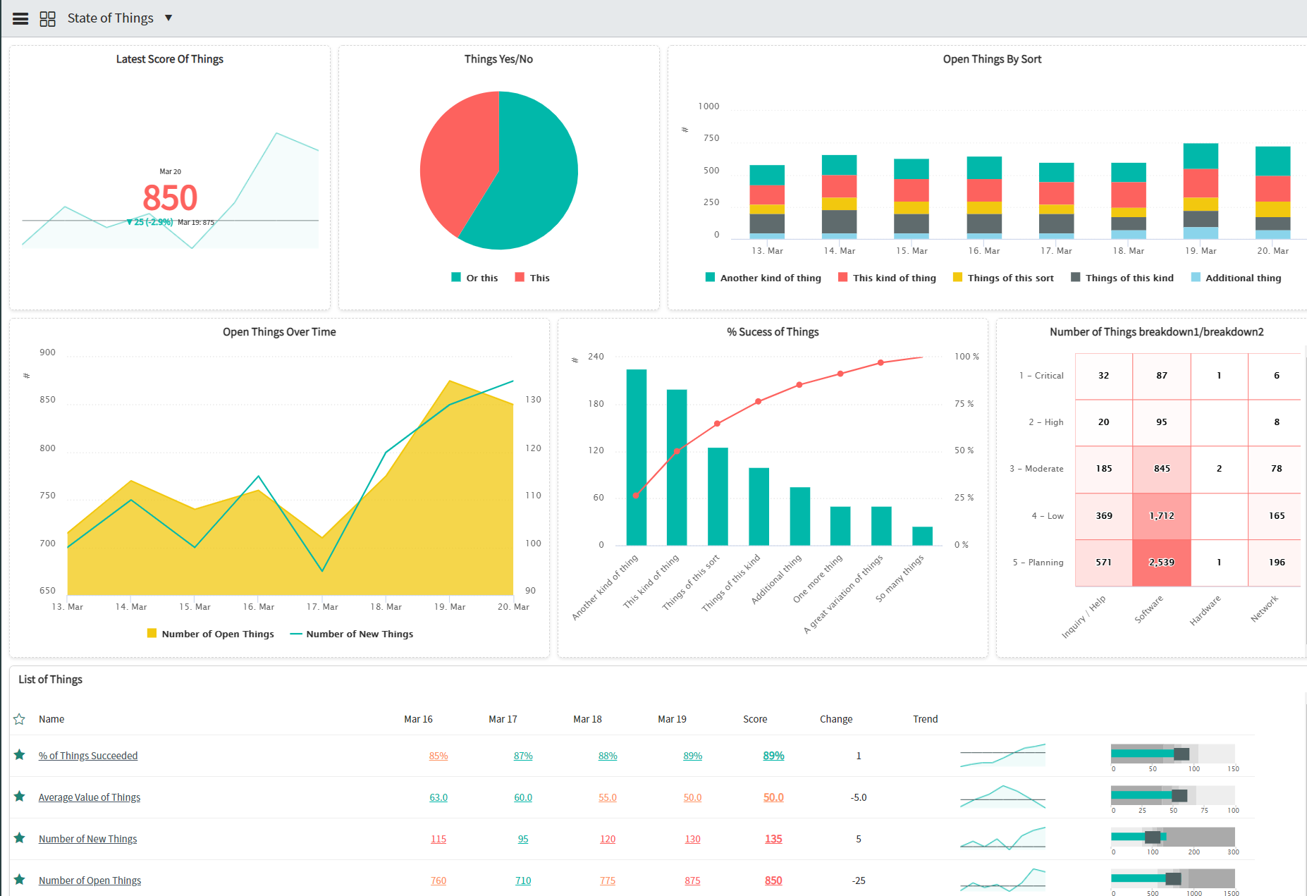
Ripe
The next theme consists of some lively yet harmoniously colors. The main ones are a bright blue and green and a darker purple. Making up names for abstract things like themes can be a bit of a challenge, but this one reminded me of cartoony fruits and berries. So "Ripe" it was.

The main color scheme:

Extending schemes:
Ripe Blues:

Ripe Greens:

Ripe Purples:

Ripe 3 Color Traffic Light Scheme:

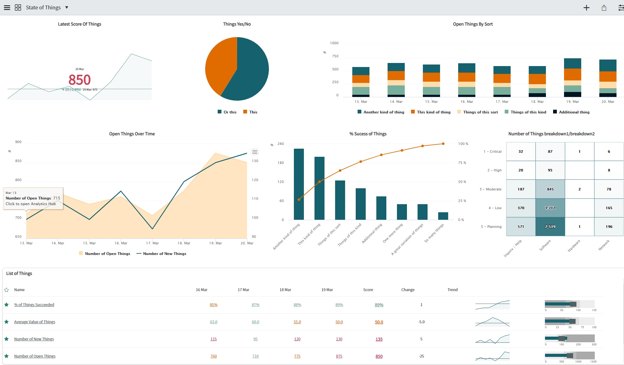
PowerPA
Next we have a scheme that draws its colors from another popular business intelligence application. The colors are bright and desaturated, giving it a modern look:

The main colors are a greenish blue, red and yellow:

And the extending schemes:
PowerPA Blues:

PowerPA Reds:

PowerPA Yellows:

PowerPA 3 Color Traffic Light Scheme:

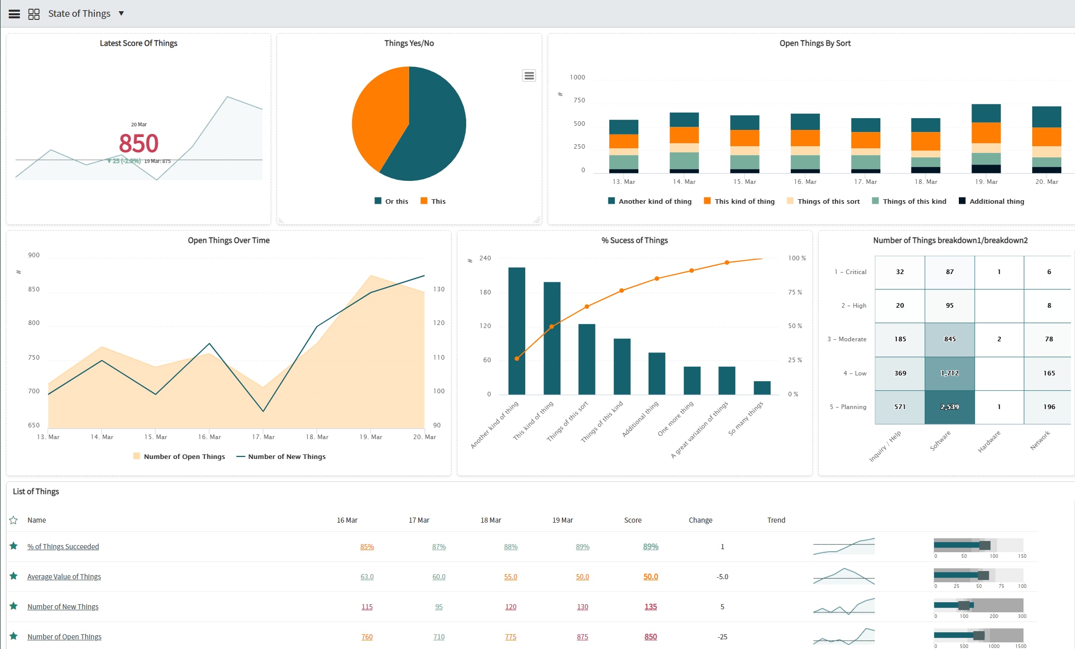
Highlighter
This is a bold theme using hot pink as its main color, complemented by blue and purple. It's not for every use case, but it's a bit different and more fun than your average dashboard:

Main colors scheme:

And the extending ones:
Highlighter Pinks:

Highlighter Blues:

Highlighter Purples:

Highlighter 3 Color Traffic Light Scheme:
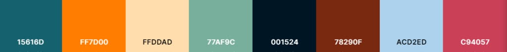
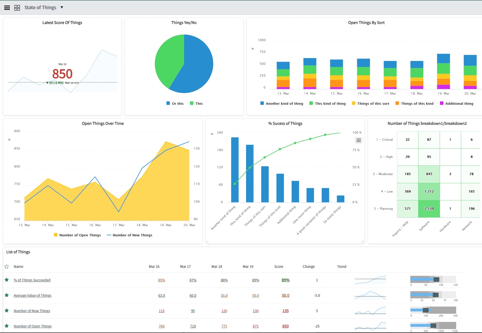
Casual
The opposite of the highlighter scheme, Casual consists of a dark blue complemented by a warm orange. It’s corporate friendly yet elegant.

The main colors are a dark green blue, orange and a beige with hints of orange and brown.

The three main colors are extended in their own schemes.
Casual Dark Blues:

Casual Oranges:

Casual Beiges:

And of course, a 3-color traffic light to go with your targets:

Mints
Mints is a scheme which uses a complementing orange and blue as the main colors, with a green mint making the dashboard a bit more interesting.

The main colors:

And the extended schemes:
Mints Oranges:

Mints Blues:

Mints Mints:

And the traffic light based on the main scheme’s colors:

And that's it. Maybe you found one of my color schemes to be good looking enough to try it yourself? If so, download the update sets and try them out. They include all the colors and scheme definitions so it's plug and play. And you can always change individual colors, their order, or extend them if you want.
Some good sites to generate you own colors are:
Have a great day!
Niklas Engren | performinganalytics.com
- 33,078 Views
- Mark as Read
- Mark as New
- Bookmark
- Permalink
- Report Inappropriate Content
- Mark as Read
- Mark as New
- Bookmark
- Permalink
- Report Inappropriate Content
Thank you Jon, glad to hear you liked it.
- Mark as Read
- Mark as New
- Bookmark
- Permalink
- Report Inappropriate Content
will these work on Dark theme? that's where I am struggling...