Change the default "group by" for a report
- Mark as New
- Bookmark
- Subscribe
- Mute
- Subscribe to RSS Feed
- Permalink
- Report Inappropriate Content
07-27-2017 02:39 AM
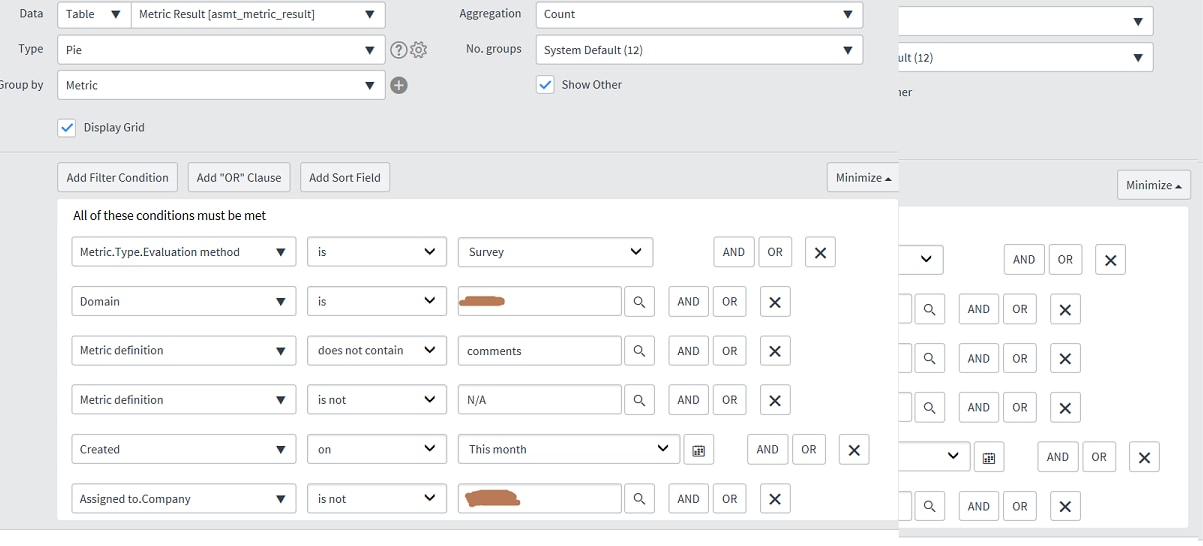
On our Helsinki system, we have a report on our customer satisfaction surveys which is defined as follows:

When we run the report, we see our pie chart, as expected:

In the box below the graph as shown, is a drop-down list with two options in it, "Metric" (the default) and "String value". Selecting the "String value" option gives us the data we really want, which is the percentage of "Strongly agree", "Agree", etc, answers to the survey questions:

This works fine when we run the report manually, but what we actually want to do is to schedule the report, and email the chart as a PDF. Obviously when we do this, what we get is the default grouping option of "Metric". We need to have "String value" as the default grouping option, but "String value" does not appear in the list of grouping options in the "Group By" list in the report definition!
Can anyone help us obtain the result we want, and get a report which is grouped by "String value" by default, please?
Many thanks,
Chris
- Mark as New
- Bookmark
- Subscribe
- Mute
- Subscribe to RSS Feed
- Permalink
- Report Inappropriate Content
07-27-2017 04:21 AM
Okay, so this is one of these "satisfy customer requirements, no matter how odd they may sound" situations. Yup, familiar with that one, Chris!
I'll have to admit, I've not seen that drop-down box before - and in re-reading your problem I can understand what you're talking about now (apologies, I was a bit hasty in misinterpreting the question): the "Group By" value you seek doesn't appear as something selectable for the report definition.
What does "String Value" actually represent? it looks like a 1-5 scale. What kind of data type is it? It seems an odd name for a field.
(I'm convinced somewhere there's a table with those drop-down options and an order field that you could change)
- Mark as New
- Bookmark
- Subscribe
- Mute
- Subscribe to RSS Feed
- Permalink
- Report Inappropriate Content
07-27-2017 05:23 AM
Hi Dave,
This report is analysing the answers in customer satisfaction survey responses. When an incident is resolved, a survey is sent out, with a set of questions asking the user to rate their experience with the IT Service Desk. The answers to each question are a five value scale from "Strongly Agree" (1) through to "Strongly Disagree" (5). The customer wants to know what proportion of their users are happy with the service provided by the Service Desk, This report is analysing those responses, but the default grouping of "Metric" is essentially meaningless. When the grouping is changed to "String value", the pie chart then shows the percentage of answers that contain each of the five possible answers to the survey questions, and that's what the customer wants to see. The problem is that we can find no way of getting this to appear by default: the graph has to be displayed, and then the grouping option manually changed from "Metric" to "String value" in order to show the information that's needed.
If it can't be done, then fair enough, that's the answer I'll give. It's annoying, though, that "String value", which appears in the drop-down list below the chart, does not appear in the "Group by" list in the report definition.
Hope this clarifies it?
Cheers,
Chris
- Mark as New
- Bookmark
- Subscribe
- Mute
- Subscribe to RSS Feed
- Permalink
- Report Inappropriate Content
07-27-2017 09:37 AM
... the default grouping of "Metric" is essentially meaningless. When the grouping is changed to "String value", the pie chart then shows the percentage of answers that contain each of the five possible answers to the survey questions, and that's what the customer wants to see.
Yeah... no idea what that field is, but ultimately it shows the right report.
The problem is that we can find no way of getting this to appear by default: the graph has to be displayed, and then the grouping option manually changed from "Metric" to "String value" in order to show the information that's needed.

If it can't be done, then fair enough, that's the answer I'll give. It's annoying, though, that "String value", which appears in the drop-down list below the chart, does not appear in the "Group by" list in the report definition.

Hope this clarifies it?
It certainly does.
I've just tried to rebuild the same report on [asmt_metric_result] under Istanbul but don't get the drop-down appearing (is this in your drill-down control?)
Also, looking at the table structure for asmt_metric_result, I see a field called "Actual Value" that seems to be a numerical version of the "String Value". Could you try grouping on this instead?
- Mark as New
- Bookmark
- Subscribe
- Mute
- Subscribe to RSS Feed
- Permalink
- Report Inappropriate Content
07-28-2017 12:49 AM
I've discovered what's making the drop-down below the chart appear: looking at the report definition more closely, there's a "+" button to the right of the "Group By" field. Clicking that allows you to add additional group by options, and that's where "String value" has been added. For some reason it's available as an "additional" group by option, but not as the default one.
Looks as if we're going to have to give up on this one. Thank you for your kind attempts to assist; they are appreciated.
We've tried grouping by actual value - what ServiceNow does in that case is just to add up all the numerical values, which is not helpful .
Cheers,
Chris
- Mark as New
- Bookmark
- Subscribe
- Mute
- Subscribe to RSS Feed
- Permalink
- Report Inappropriate Content
07-28-2017 03:27 AM
I've discovered what's making the drop-down below the chart appear: looking at the report definition more closely, there's a "+" button to the right of the "Group By" field. Clicking that allows you to add additional group by options, and that's where "String value" has been added. For some reason it's available as an "additional" group by option, but not as the default one.
Weird. Perhaps it's a derived field of some kind (I didn't look into the underlying data structures too closely)
Looks as if we're going to have to give up on this one. Thank you for your kind attempts to assist; they are appreciated.
You're welcome. I'd recommend opening a ticket on Hi, since this appears to be a simple problem with an elusive solution. The report you desire is perfectly normal; why it's not that way by design feels odd to me.
We've tried grouping by actual value - what ServiceNow does in that case is just to add up all the numerical values, which is not helpful .
Check you've got Aggregation set to count and not sum - you're interested in the frequency, rather than totals.
