- Mark as New
- Bookmark
- Subscribe
- Mute
- Subscribe to RSS Feed
- Permalink
- Report Inappropriate Content
09-25-2024 05:32 AM
Hi.
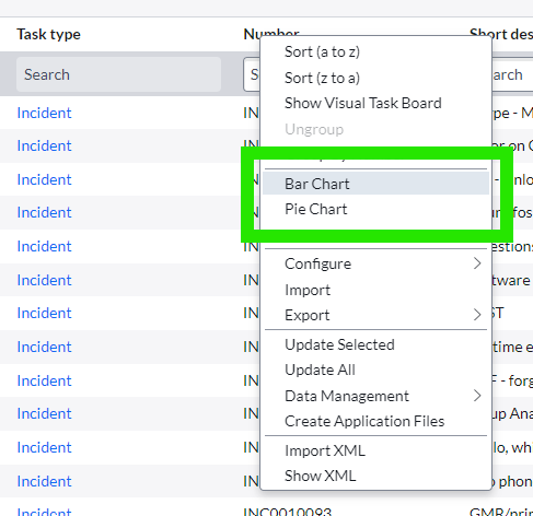
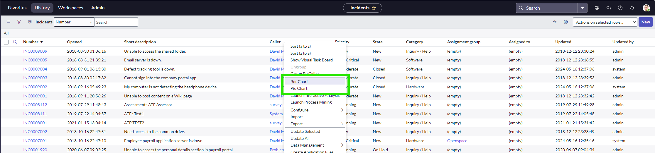
When looking at a list in ServiceNow, I can in most cases right click on one of the column headings and choose "Bar Chart" and "Pie Chart". But that takes me to the old reporting tool and not platform analytics. Any way to change this, so it's possible to create a data visualization from a list?
/Julie.
Solved! Go to Solution.
- Mark as New
- Bookmark
- Subscribe
- Mute
- Subscribe to RSS Feed
- Permalink
- Report Inappropriate Content
09-26-2024 04:33 AM
Hi @Julie21,
I have tried on an internal testing instance on net new Xanadu code and when I click on Create Bar/Pie, I am redirected to the Visualization designer.
Could you check on your instance which is the value of the property: com.glide.par.unified_analytics.enabled? If is set to true and you are on Xanadu you should be redirected to the Visualization designer, if is not working we might need to take a look into the instance and you can raise a support case.
Thanks
- Mark as New
- Bookmark
- Subscribe
- Mute
- Subscribe to RSS Feed
- Permalink
- Report Inappropriate Content
09-25-2024 06:05 AM
HI @Julie21,
the functionality to create Bar/Pie in the new Platform Analytics visualization designer is supported since Xanadu.
We are looking at the possibility to backport the feature fix into Washington patches.
Thanks.
- Mark as New
- Bookmark
- Subscribe
- Mute
- Subscribe to RSS Feed
- Permalink
- Report Inappropriate Content
09-25-2024 10:50 PM
Hi @martapenzo
Thanks for your reply. Could you elaborate a bit? When I open a developer instance on Xanadu, I'm still transferred to the old reporting tool when trying to create a pie chart from e.g. the incident table?
- Mark as New
- Bookmark
- Subscribe
- Mute
- Subscribe to RSS Feed
- Permalink
- Report Inappropriate Content
09-26-2024 04:33 AM
Hi @Julie21,
I have tried on an internal testing instance on net new Xanadu code and when I click on Create Bar/Pie, I am redirected to the Visualization designer.
Could you check on your instance which is the value of the property: com.glide.par.unified_analytics.enabled? If is set to true and you are on Xanadu you should be redirected to the Visualization designer, if is not working we might need to take a look into the instance and you can raise a support case.
Thanks