Create answer-rate percentage Timeline graph through UI builder
- Mark as New
- Bookmark
- Subscribe
- Mute
- Subscribe to RSS Feed
- Permalink
- Report Inappropriate Content
01-31-2024 07:39 AM
Hello
In a workspace we have a Line graph which shows 2 values, one being surveys sent out and the other being surveys completed, both being over a 6 month period, grouped by each month. I have now gotten the request to also display percentages of the answerrate for each month.
Playing around some with Performance analytics i have been able to get the total percentage of the answerrate for all surveys sent out during 6 months, but i am having issues getting this to show per month. As an example, if Novembers answerrate is 50%, that should not impact the statistics for December.
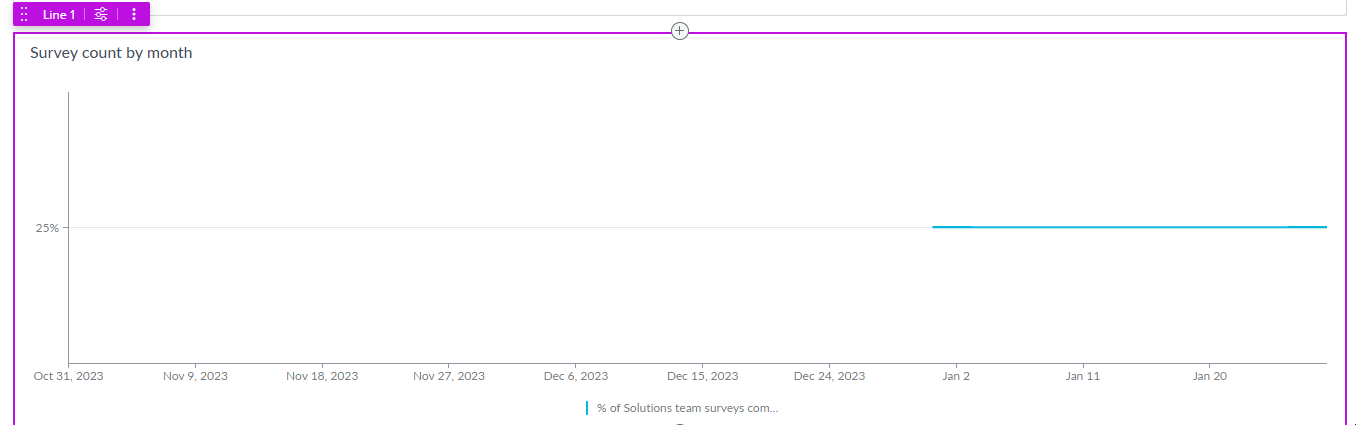
See attached image (test data is only 4 examples and shows correctly 25% as answered), but grouping these by time i am having issues with.
- Labels:
-
Dashboard
-
Performance Analytics
- Mark as New
- Bookmark
- Subscribe
- Mute
- Subscribe to RSS Feed
- Permalink
- Report Inappropriate Content
02-10-2024 02:16 AM
It seems like you're grappling with the display of percentages for the answer rate per month in the Line graph. While you've successfully obtained the total percentage of the answer rate for all surveys sent out over six months, the challenge lies in breaking this down on a monthly basis without the data from one month impacting another. This means each month's answer rate should be independent of others, ensuring accurate statistics. I recommend delving deeper into the Performance analytics settings to configure the graph to reflect the answer rates on a month-by-month basis. This might involve refining the data grouping parameters or adjusting the calculation logic to ensure the desired outcome. Keep experimenting like 1winapp, and you'll likely find the right configuration to achieve the desired visualization.