- Mark as New
- Bookmark
- Subscribe
- Mute
- Subscribe to RSS Feed
- Permalink
- Report Inappropriate Content
11-24-2025 02:20 AM - edited 11-24-2025 03:33 AM
Hello everyone,
After upgrading to the Zurich release, we have noticed that the layout of visualizations in several of our existing platform analytics dashboards has changed unexpectedly. Has anyone else experienced this issue?
We have a large number of dashboards, and I am concerned that we may need to review each one individually as part of the upgrade. Any insights or recommendations would be greatly appreciated
Solved! Go to Solution.
- Mark as New
- Bookmark
- Subscribe
- Mute
- Subscribe to RSS Feed
- Permalink
- Report Inappropriate Content
11-25-2025 04:40 AM
This is the reply I got from ServiceNow Support:
--------------------------
After reviewing the issue, we found that it matches PRB1952631.
This PRB is currently in a Fixed state, and the fix will be available in Platform Analytics version 7.2, which is scheduled for release on December 4th, 2025.
Unfortunately, there is no available workaround for this issue at the moment.
--------------------------
- Mark as New
- Bookmark
- Subscribe
- Mute
- Subscribe to RSS Feed
- Permalink
- Report Inappropriate Content
11-24-2025 02:26 AM
Hi @Niels Aksel
Any screenshot to understand more?
Regards
Dr. Atul G. - Learn N Grow Together
ServiceNow Techno - Functional Trainer
LinkedIn: https://www.linkedin.com/in/dratulgrover
YouTube: https://www.youtube.com/@LearnNGrowTogetherwithAtulG
****************************************************************************************************************
- Mark as New
- Bookmark
- Subscribe
- Mute
- Subscribe to RSS Feed
- Permalink
- Report Inappropriate Content
11-24-2025 03:35 AM
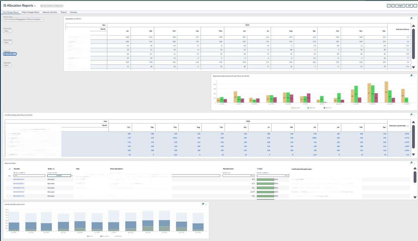
Thanks Atul. I have added screenshot as example.
I know it looks like a small issue, but we have 200+ dashboards and I'm just wondering if others see the same
- Mark as New
- Bookmark
- Subscribe
- Mute
- Subscribe to RSS Feed
- Permalink
- Report Inappropriate Content
11-24-2025 03:39 AM
Hi @Niels Aksel
"Did you use the legacy reporting before the update and now use Platform Analytics? It looks like the migration didn’t happen correctly. I’m not sure if there’s a direct or easy fix. You can try repairing the Platform Analytics plugin, but if that still doesn’t resolve it, it’s better to log a case and ask ServiceNow Support for an easier way to fix it instead of troubleshooting issues one by one.
Regards
Dr. Atul G. - Learn N Grow Together
ServiceNow Techno - Functional Trainer
LinkedIn: https://www.linkedin.com/in/dratulgrover
YouTube: https://www.youtube.com/@LearnNGrowTogetherwithAtulG
****************************************************************************************************************
- Mark as New
- Bookmark
- Subscribe
- Mute
- Subscribe to RSS Feed
- Permalink
- Report Inappropriate Content
11-24-2025 03:57 AM
The dashboards was migrated to platform analytics before the upgrade. Its only after the upgrade we see the difference in the layout on how the visualizations are placed on the dashboard - as you can see on the screenshots, some reports has been moved around
I will ask ServiceNow Support, thank you