How do you fix a broken dashboard layout (does not display as indicated)
- Mark as New
- Bookmark
- Subscribe
- Mute
- Subscribe to RSS Feed
- Permalink
- Report Inappropriate Content
06-12-2018 07:53 AM
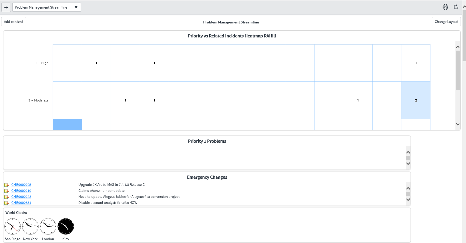
What do you do when ServiceNow won't display your dashboards correctly? I had a nice, pretty 2-column dashboard with a header and a footer. On the left were reports, on the right were reports, and all was well. But one day when experimenting with other layouts, when I tried to go back to the 2 equal-width columns layout, it wouldn't go. And now none of them appear right.
It should look like this:

Instead it looks like this:

It's a super-wide left column, then a narrow right column. As of THIS MORNING without making any changes since yesterday, the top header section also now expands past the width of the entire page. Why would it behave this way? What can I do to fix it?
My browser is set to 100% zoom magnification, so it isn't that (in case you're thinking of this). It appears this way in Chrome and Edge browsers.
In IE it appears this way, slightly different:

Notice the header content is zoomed way in. Same element.
- Labels:
-
User Experience and Design
- Mark as New
- Bookmark
- Subscribe
- Mute
- Subscribe to RSS Feed
- Permalink
- Report Inappropriate Content
06-20-2018 09:30 AM
Update: I was able to resolve my issue by creating a new dashboard page with the layout I wanted, and adding elements to it.
So it looks like something just got messed up with that particular dashboard. I am done spending time on it so I won't find out why, just keep the note for the future if it happens again! 🙂
Thanks to whoever suggested making a new dashboard. I don't see the comment on here so it could have been a coworker, but either way it worked.