Usability Improvement Suggestion: Handling Short Screens with Multiple Scroll Bars
- Mark as New
- Bookmark
- Subscribe
- Mute
- Subscribe to RSS Feed
- Permalink
- Report Inappropriate Content
10-01-2024 12:23 AM
Hello ServiceNow Community,
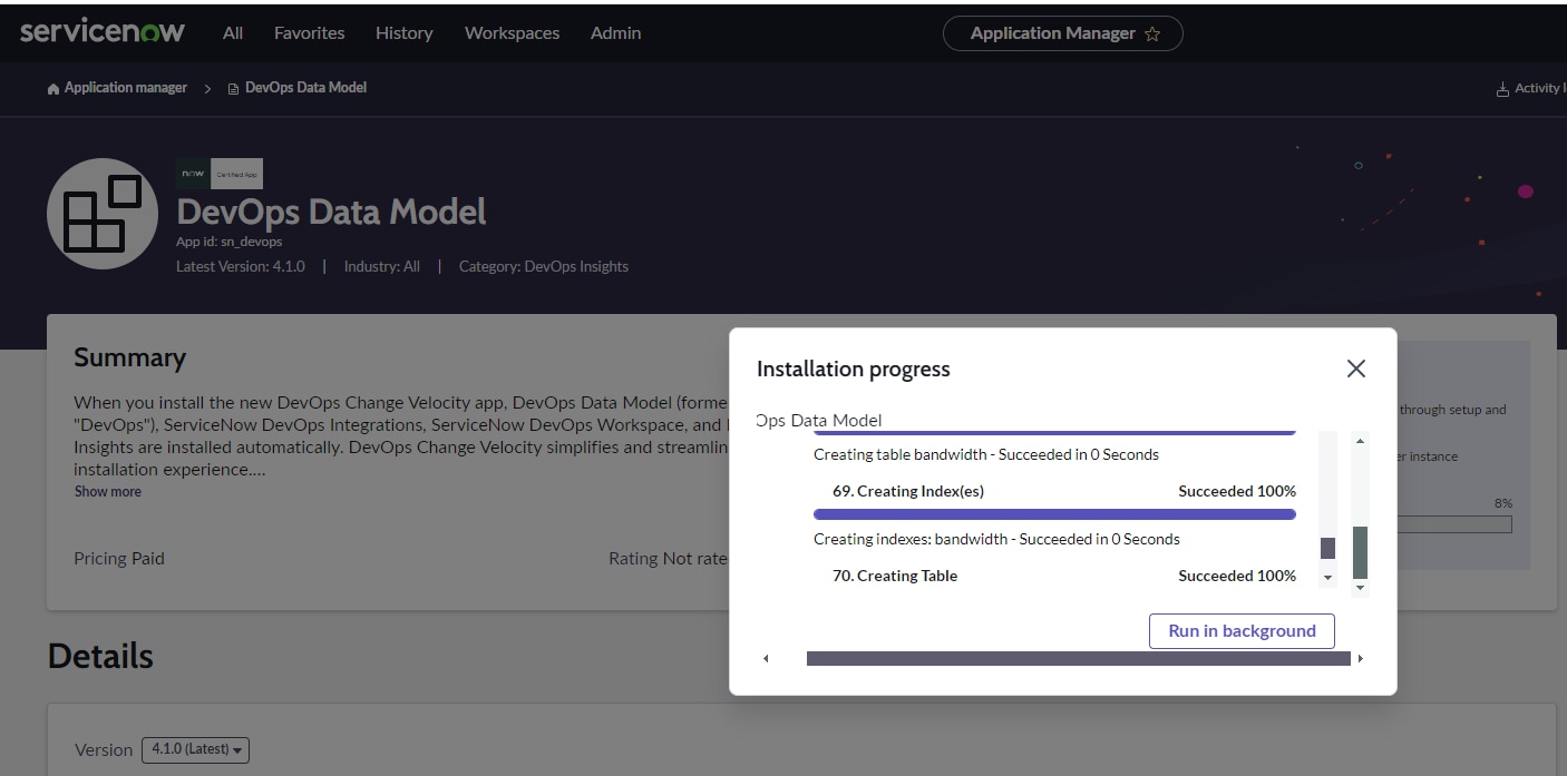
I wanted to raise an issue I’ve come across while working with some progress screens in ServiceNow, specifically the one shown in the attached image.
In scenarios like this, the screen space for progress tracking is quite short, making it difficult to monitor the installation or task progress clearly. Additionally, there are multiple scroll bars (both vertical and horizontal), which adds to the frustration. This design, unfortunately, leads to an inefficient experience when trying to get an overview of the progress or navigate through long tasks.
The main concerns I’d like to highlight are:
- Limited screen space – The height allocated for displaying important progress details is too small.
- Multiple scrolls – The presence of multiple scroll bars further complicates navigation, making the experience less user-friendly.
It would be great if the UI could be enhanced by:
- Increasing the visible screen area to allow users to track progress without excessive scrolling.
- Reducing or eliminating the need for multiple scroll bars in short screen spaces.
- Providing more dynamic resizing options to optimize the view for larger tasks.
Improving these aspects would greatly enhance the user experience, especially for users frequently working with installations or similar processes.
Refer to the plugin progress screen as attached.
Looking forward to hearing feedback and suggestions from the community!
✅ Issue resolved? → Mark as Correct
Found value? → Mark as Helpful
- Labels:
-
Architect
- Mark as New
- Bookmark
- Subscribe
- Mute
- Subscribe to RSS Feed
- Permalink
- Report Inappropriate Content
10-01-2024 01:05 AM
If you ask me, studies have shown a long while ago that dialogs are not the best UI paradigms.
Why does it need to be a dialog?
I believe it would be way better to have a section/or footer part of the page that can be collapsed.
Than it would have the whole width of the screen for it and maybe the full height too.
- Mark as New
- Bookmark
- Subscribe
- Mute
- Subscribe to RSS Feed
- Permalink
- Report Inappropriate Content
10-01-2024 05:18 AM
Thank you for your input!
You raise a great point about dialogs not being the most optimal UI paradigm. I agree that having a collapsible section or footer as part of the page would be a more efficient use of screen space, especially for tasks like tracking progress or viewing detailed information.
In the case I mentioned, the current design uses a dialog, and because of the limited space and multiple scroll bars, it becomes challenging to monitor progress effectively. Shifting this to a collapsible section or footer, as you suggested, would indeed solve the issue of restricted space and scrolling.
I’d love to see an option like that in future iterations. It would not only make better use of the available screen real estate but also allow for smoother navigation without interrupting the workflow.
Thanks again for the suggestion! Hopefully, this can be considered in future UI improvements.
✅ Issue resolved? → Mark as Correct
Found value? → Mark as Helpful