Custom axis (X and Y) for reports
- Mark as New
- Bookmark
- Subscribe
- Mute
- Subscribe to RSS Feed
- Permalink
- Report Inappropriate Content
06-10-2016 06:19 AM
HI all,
this appears to be a common question in the community but I can't find a good solid answer.
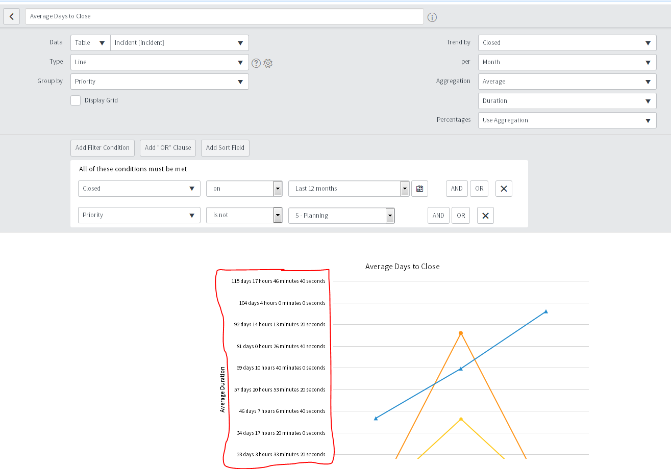
I've created a report based on average duration it takes to close an INC:

This gets us the information we need, but the X axis is ugly. What we'd really like to see is something like this:
120 days
100 days
80 days
60 days
40 days
20 days
We are running Fuji
Is there an easy way to render this cart differently other than what comes 'out of the box'. I've been looking into Custom Charts but can't tell if this is the right solution for us or not
Any help is greatly appreciated!
Matthew
- Labels:
-
Analytics and Reports
- 3,128 Views
- Mark as New
- Bookmark
- Subscribe
- Mute
- Subscribe to RSS Feed
- Permalink
- Report Inappropriate Content
02-27-2018 12:27 PM
Did you ever get an answer to this question? I have the same issue.
- Mark as New
- Bookmark
- Subscribe
- Mute
- Subscribe to RSS Feed
- Permalink
- Report Inappropriate Content
02-27-2018 01:35 PM
Explore Analytics allows you to set a custom Y-Axis if you need it, but one of the things we did to make it less necessary was round to more human-readable durations. For example, in the screenshot below, you can click "custom" if you want to set a specific range, but automatically Explore Analytics shows "35 days" instead of using "35 days 10 hours 15 minutes 04 seconds" which might be more mathematically accurate:
