


Uncle Rob
Kilo Patron
Options
- Subscribe to RSS Feed
- Mark as New
- Mark as Read
- Bookmark
- Subscribe
- Printer Friendly Page
- Report Inappropriate Content
05-06-2015
12:35 PM
PAST EPISODES
EPISODE 2 - WHICH FLAVOR OF KOOLAID?
One hour prior to our first preview to the future ServiceNow users. Lamenting that we'd spend 2 hours demo-ing but have nothing to show for it. Let that sink in a moment. 20 attendees + 1 consultant. Thousands of dollars worth of time in a 2hr sitting. Now think about how many implementations are done with preview sessions, training, etc. It is merely assumed the user understands, accepts, and feel right about what happened. Meanwhile little gold nuggets of engagement info are walking out of that room ever time. We pay thousands of dollars per engagement watching value walk out the door.
With Surveys as my weapon I got busy finding the quickest, dirtiest, easiest way to extract feedback from participants and settled on the following:
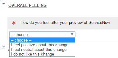
- How do they feel in general. Not think. Feel.
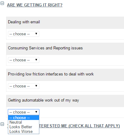
- How do they feel on 4 specific objectives of the project, based on what they saw on the preview
- Of the features we demonstrated, which were of particular interest
- Would anyone volunteer extra hands for other project work (UAT, Training, undiscovered requirements)
At this point I must say, Fuji's Survey Designer is a life saver. Its got some annoying bits, but its FAR faster than building Surveys pre-Fuji. Here's a preview of the finished product:
New fields would be exposed depending on their feeling to help us understand why they felt that way.
No extra fields here. I just wanted to know if the community in general felt we were meeting the high level objectives of the project.
Why !? Why is there so much wasted vertical space on checkboxes!! AAAAAAAAAARG!
Again with the terrible display of checkboxes, but nothing we can do at this point. On the last question a multi-line text box appears asking to provide specifics on work they need flowed or automated.
What I'm Hoping to Achieve
- Overall feeling improves over the course of the project (it will be the top question category of all my preview surveys)
- Are we getting it right allows us to spot areas that are too high friction to be adopted.
- Topics that interested me exposes gaps between project objectives and user behavior AND gives us feed stock for KB Article creation
- Design Engagement gets us some volunteers and undiscovered requirements.
HIGH FRICTION EXPERIENCES
- I tried it on a couple browsers. Minimizing those question sections takes 30+ seconds of processing time before it happens
- In Survey Designer, its not obvious what Description and Details do. See the subtext below "topics that interested" and "design engagement"? That's Details.
- Description just appends itself to the end of your Category title. It sometimes sets itself to Undefined and I can't figure out why.
- Checkboxes are terribad, and we had a TON of them in one section. Needs to be a way to collapse that verticality. It would be even better if check boxes could be in two column format.
KEEP GOING!
2 Comments
You must be a registered user to add a comment. If you've already registered, sign in. Otherwise, register and sign in.
