- Post History
- Subscribe to RSS Feed
- Mark as New
- Mark as Read
- Bookmark
- Subscribe
- Printer Friendly Page
- Report Inappropriate Content
on 11-13-2017 05:30 AM
Now comes the exciting part! You've configured your data sources in Performance Analytics, and you have successfully collected the data. The data are now ready to be analyzed through the widgets and dashboards that come with Performance Analytics. This article will explain some of the common visualizations that are available with the out-of-the-box content and also interpret some of the different curves you might see. To help drive the discussion, the Incident Management process (and dashboards) will be reviewed.
Examining Data in Widgets
The widget is the basic building block for data visualization. You can configure the indicator(s) and breakdown(s) that are displayed in a meaningful way for the people consuming the data. ServiceNow provides many different types of visualizations in Performance Analytics widgets, but it's about understanding and selecting the right kind of visualization to convey the most insight. Here are a few examples and how they can be used. For each type of widget, you will review an example of how the widget can be used to drive a specific type of insight (i.e., directionality, seasonality, etc.).
Single Score Widget
The single score widget is a great widget that can be used to immediately communicate the value of a KPI (leading or lagging). Here is an example of a single score widget relating to resolution time for incidents (also called mean time to resolve or MTTR):

This widget displays the current value of the KPI (4.70 days on November 16) as well as the previous measured value (4.77d on November 15). Additionally, the change between the values is provided (decrease of 0.07 days or -1.5%). You can also see the overall trend for the KPI indicated by the light blue area chart behind the score. Not only can it be seen there was a decrease in the value between the displayed data points, there has been a recent decline in the value of the KPI.
You might also notice a couple of other characteristics of this visualization:
- Time Series Aggregation: This specific widget displays MTTR on a 28-day running average. This helps to smooth out the curve. This does not require any additional data collection for the indicator; the time series aggregation is set in the properties of widget itself and is calculated at the time of display. This makes it easy to tailor the visualization to the consumer. One consumer might want a 28-day running average while another wants a by month average. 2 separate widgets pointing to the same daily indicator can be used to drive these different visualizations.
- Directionality: To drive improvement, KPIs need to have targets and a direction. Is the organization trying to maximize or minimize the KPI? In the case of MTTR, organizations try to minimize this. This directionality is set at the indicator level, but the impact is shown on the visualization. In this case, the downward change of 0.07 days is considered to be advantageous because it moves the organization in the desired direction of the indicator. Therefore, the change is showing in green. If there direction of the indicator had been maximize, the same downward change would have been rendered in red.
Analysis: For an organization that is measured on MTTR, this widget shows something positive for the organization. The recent trend for this KPI is trending downward in the desired direction. However, this is really just a lagging indicator for the Incident Management process. It would be more useful to track a KPI that is a leading indicator allowing the organization to take action to drive the outcome of the MTTR (perhaps something like First Call Resolution Rate). This is where you as an analytics person can provide guidance to your data consumers on some of the better data points to visualize through a widget.
Time Series Widget
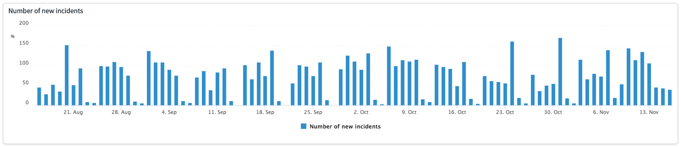
The time series widget is more of the "classic" Performance Analytics widget. It shows the trend of a KPI over time. Here is an example of a time series widget displaying the number of new incidents coming into the process on a daily basis:

This widget displays the last 3 months of data collected for the KPI. This is a daily indicator as evidenced by a data point for every day. You have the ability to configure the time period that is displayed by default, and you can provide the option to the data consumer to select different time periods. Because the Number of New Incidents Indicator is based off of the Incidents.New Indicator Source, you are looking at process intake on a daily basis.
- Seasonality: Time series widgets based on indicators/indicator sources measuring volume on a single date can be used to assess frequency and distribution over time. This is important because it starts to show volumes that can be used to inform action. For example, if Friday is historically the heaviest day for intake, it might be helpful to have additional staff on hand to process the increased volume.
Analysis: As one would expect with this indicator, the heaviest intake days for Incident Management are Monday-Friday. There is very small volume on the weekend. This is indicative of an organization that is seasonal on a traditional work week.
The time series widget is versatile depending on the indicators you display, and the time series widget can display multiple indicators at the same time. In the following example, you can see the incident backlog (represented by the column time series) versus the average age of the incident backlog (represented by the line time series):

By displaying these two KPIs together on the same chart in the same time series, you can see potential interactions between them. The time series widget supports the display of multiple indicators on the same chart (maximum of 7 indicators per the default settings), and it also supports 2 y-axes of measurement. In the example, the volume of the backlog in numbers is the left y-axis, and the age of the back log in days is the right y-axis.
- Correlation: Time series widgets used to plot related KPIs on the same chart can drive visual correlations of trends. In this case, the recent trend of the incident backlog (shown in the red box) is decreasing. However, there is a corresponding increasing trend in the average age of the backlog with the increasing trend shown by the red arrow.
Analysis: It is important to understand the underlying process to correctly interpret this chart, and it is important to understand what the desired outcomes are for the organization. This chart shows that the incident backlog is decreasing at a good pace. There has been about a 35-40% reduction in the backlog in the past 6 weeks, which is indicative of a focused effort on closing incidents. This is generally good. However, there is a corresponding increase in the average age of the remaining incidents in the backlog. This means that continuing to close the incidents in the backlog will result in an increase in the MTTR.
What can be inferred from this time series chart is that workers were given the instructions to reduce the incident backlog without any guidelines. What that resulted in is workers closing the easiest and newest incidents first while leaving the more complex, older incidents to age in the backlog. The overall impact of this approach is that the MTTR will start to increase, which is likely not what the organization wants. The value in creating these visualizations is that data consumers can start to take action as they see these trends develop. The red arrow points to the place 1-2 weeks into the backlog reduction where the increasing trend is evident. This is the point where the process owner can take action to change the way people work with the joint goals of reducing the incident backlog and keeping the average age of the backlog flat, which will result in a stable MTTR for the process.
Breakdown Widget
The breakdown widget allows you to add a dimension of analysis to your visualization. Instead of looking at a monolithic measurement, you can see the individual components that make up that value. This is especially important to identify the best investment for the improvement you need. Below is an example of a breakdown widget that shows the incident backlog by age:

This is actually the same backlog shown in the previous time series chart; however, some additional information about the backlog by age. The colors represent the proportion of the age groups for each data point displayed on the visualization, which is important for segmentation:
- Segmentation: Using a breakdown widget drives insight into the specific elements contributing to the KPI. In this case, it is evident the age of the backlog is getting older because of the introduction of the green color (31-90 Days) in the columns in the most recent days/measurements.
- Proportion: The breakdown widget is critical in showing proportion related to the dimension of analysis. Even though the backlog is aging, the majority of the incidents are still in the 01-05 Days range. This means the age problem is more easily fixed with the correct course of action.
Analysis: The conclusion made in the time series chart is backed up by the evidence in this chart. The left red arrow corresponds to the point where we start to see the increase in the average age of the incident backlog in the prior time series chart. The right red arrow shows the point where the 31-90 Days bucket becomes much more visible in proportion to the columns indicating there is a larger number of incidents that are significantly older.
As of the most current data point, most of the 06-30 Days bucket has been replaced by the 31-90 Days bucket. This is why the average age of the backlog has increased significantly over time; however, it also means that remediating the problem requires a focus on just the incidents in this bucket. The remaining incidents in the backlog are overwhelmingly in the 00-01 Day and 01-05 Days buckets.
Workbench Widget
The workbench widget is a great way to bring many different data points into a single pane of glass. This widget is architected for a process or service owner because it provides that person the instrumentation needed to have control over the process and to take action. The example below shows the Incident Management process by State.

Workbench widgets are ideal for representing process flow (by State) or the age of records in an active backlog (by Age). Each chevron across the top (in the red box) can be clicked on to examine that area of the process in more detail. In a lot of ways, the workbench widget is like a breakdown widget; however, the workbench widget does a lot more.
Underneath the main indicator, the spark line for the KPI is displayed. Underneath that spark line (in the green box) are configurable supporting indicators that are displayed for the data consumer. These are not just static supporting indicators, they respond in sync with the main spark line. Hovering over (or selecting a date with a mouse click) on the main spark line will cause the data in the supporting indicators to also change.
Additionally, there is another breakdown widget at the bottom of the page to go one level deeper into the data. In this example, the Priority breakdown of incidents in the Awaiting User Info state of the incident backlog are displayed. Also towards the bottom of the page, the data consumer can switch between the breakdowns and the actual records that make up the main indicator number.

This allows the data consumer to easily switch between trend related data and record data, which allows them to move from strategic to tactical all on one screen. Also from this view, a delta record comparison between days can be viewed as well as launching into Interactive Analysis by right-clicking on the list header. This means workbench widgets are ideal to help process owners gain insight into their processes:
- Interactivity: Workbench widgets are meant to be interactive. They should be used by people who understand the underlying process to actively analyze trends and the data that make up those trends. This also eliminates clicking back and forth between dashboard tabs to find meaningful data.
- Proactivity: The end result of all useful analytics is to be able to take action. By bringing strategic and tactical data together in the same page, you provide your process owners with the tools they need to control their leading KPIs and drive the organizational goals.
Analysis: In this case, the workbench widget provides us some valuable information about the incident management process. Of all of the incidents in the backlog, 196 of them are in a state of Awaiting User Info. Not only does this number seem high for the backlog, the trend of incidents in this state is increasing (notice the right portion of the spark line towards the top of the page). We know from the supporting indicators that the average age of these 196 incidents is 7.26 days (much higher than our 28-day average MTTR of 4.70 days), and 57.1% of these incidents have not been updated in the last 5 days.
Using the Breakdowns tab, the process owner could see which assignment groups own these incidents and if there is an assignment group that is disproportionally putting incidents in this Awaiting User Info state (perhaps because they have figured out this state puts the Service Level Agreement clock on pause?). Ultimately, the process owner has the data he or she needs to take action and change people's behaviors to ensure the organizational MTTR is met and that customers are happy.
Widgets in Dashboards
Now that you understand how widgets can be used to visualize data, you need to leverage dashboards to organize the widgets for the people consuming the data. Fortunately, there are many out-of-the-box dashboards you can use as a starting point. To view the available dashboards click on Performance Analytics > Dashboards in the left-hand navigation pane. The last selected dashboard will appear in the main content pane.
At the top of the page, you will see a list of dropdown list where you can select the dashboards that were installed with the plugins you activated. Explore these dashboards and determine if they contain the widgets that will be most useful for your organization. Many of them include workbench widgets to help drive interactivity along with a variety of widgets organized by process onto different tabs.
But you can create dashboards that meet your organization's needs. Dashboards are really a blank canvas for you to populate the widgets that are most meaningful for the people consuming the data. ServiceNow recommends that you work with your different stakeholders (Executives, Service Owners, Workers) to build dashboards they can use in their daily work. For example, you can create a dashboard for workers with prioritized records they need to work. You can create a dashboard for service owners with widgets from different processes on the same tab. You can create executive dashboards with red/yellow/green indicators across the business. The opportunities are endless, but always be sure people are using the dashboards you create. And if they are not, figure out what additional data or visualizations are needed. You need to continually improve your analytics program to drive continual service improvement in your processes.
This concludes the Getting Started portion of this site. Return to the Performance Analytics Getting Started Page to explore the Story of the Four Stakeholders and the Customer Adoption Journey as you take the next step with Performance Analytics.
- 7,403 Views