How to create a stacked bar chart?
- Mark as New
- Bookmark
- Subscribe
- Mute
- Subscribe to RSS Feed
- Permalink
- Report Inappropriate Content
05-05-2020 07:45 AM
Hi all,
my client's requirement is to build a bar chart displayed below. It is displaying the number of "cmdb_ci_hardware" records grouped by "DNS Domain" field on the x-axis and stacked by the "Class".
At first, I tried to achieve this with reports, but I'm not able to summarize all other domains and all other classes.
In Performance Analytics, I can display only one part of the chart (blue or orange) using a column visualization for a breakdown widget. But I can't find any possibility to add the second part. When I try to use "Stacked Column" visualization, the x-axis turns to time axis like this: docs
Do you have any ideas how I achieve this?
Thank you.
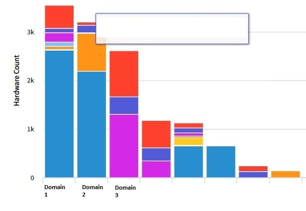
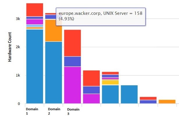
Required result:

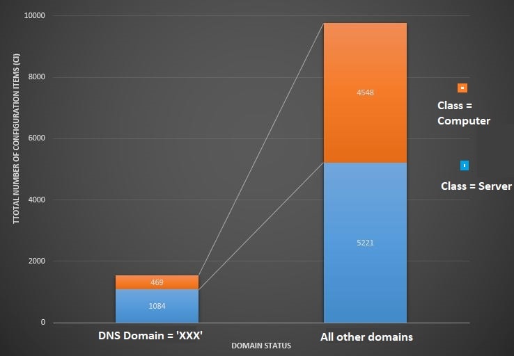
What I can achieve with reporting (all the domains and classes listed):

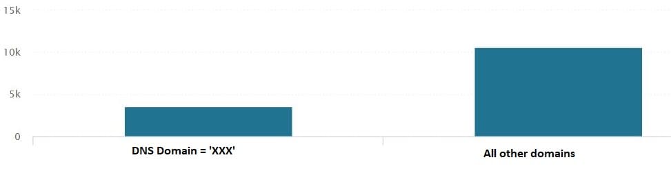
What I can achieve with Performance Analytics (without stacking by class):

- Mark as New
- Bookmark
- Subscribe
- Mute
- Subscribe to RSS Feed
- Permalink
- Report Inappropriate Content
05-05-2020 07:54 AM
Hi Michaela,
Have you tried to do it with Widget indicator?
Please find below link for the same:-
Regards,
Tushar
- Mark as New
- Bookmark
- Subscribe
- Mute
- Subscribe to RSS Feed
- Permalink
- Report Inappropriate Content
05-05-2020 07:59 AM
Hi Tushar,
Yes, I tried that and the x-axis always turned to time axis. I didn't find any way using two indicators and keeping "DNS Domain" on the x-axis.
Thanks for your answer,
Michaela
- Mark as New
- Bookmark
- Subscribe
- Mute
- Subscribe to RSS Feed
- Permalink
- Report Inappropriate Content
05-05-2020 08:02 AM
May be you can try to arrange the order of indicator,
take a try on this
Regards,
Tushar
- Mark as New
- Bookmark
- Subscribe
- Mute
- Subscribe to RSS Feed
- Permalink
- Report Inappropriate Content
05-06-2020 05:26 AM
Thanks, but the ordering is not the issue. I'm struggling with correct grouping/stacking.