How to Properly Use the Map Report
- Mark as New
- Bookmark
- Subscribe
- Mute
- Subscribe to RSS Feed
- Permalink
- Report Inappropriate Content
03-26-2019 08:15 AM
Hi Everyone,
I'm having some trouble with a map report I created and am looking for assistance. I want to look at the total of open tickets per US State and thought a map report might be a better representation than a table. My company is currently on the London platform.
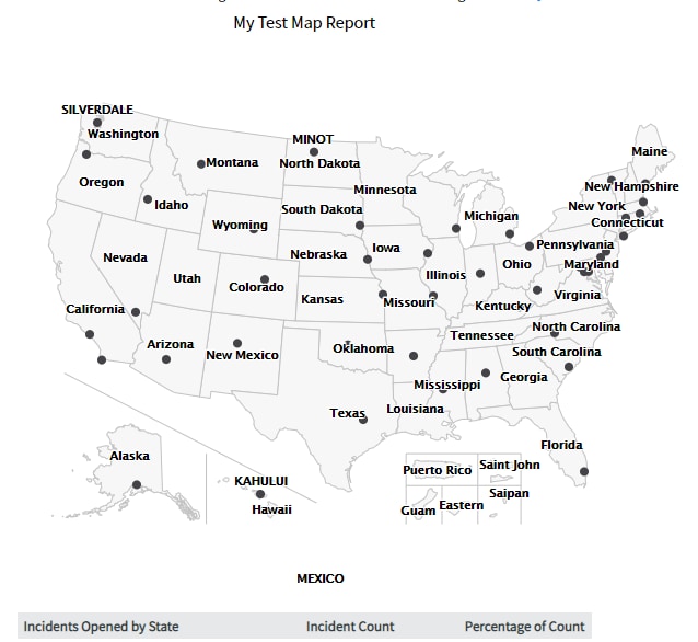
I am using the Incident table and have the condition "State not one of resolved, closed." I have created a new map source called "Incidents Open by State" and map to the affected user location fields, using the OOTB source "Incident open by location" as a blueprint. The report runs, but the output is not what I would have expected, even with the style options I have selected. Here is what I see by default when I run the report:

If I zoom in and pan the report to come into view I am left with this:
I can keep zooming in, but it will only show me one city. For example:
Finally, this is what I have set under style options:
I would have thought that all of the states would be shaded from white to blue, based on their total volume. I thought by default it would be an image of the US map that fits the screen/window size. In addition, when zooming in I would see more than one city, unless that is a function of a drilldown I would need to create?
If anyone could help me have a better understanding of how these map reports work I'd really appreciate it.
- Labels:
-
Dashboard
-
Performance Analytics
-
Reporting
- Mark as New
- Bookmark
- Subscribe
- Mute
- Subscribe to RSS Feed
- Permalink
- Report Inappropriate Content
04-08-2019 08:09 AM
Can you take one of the tickets you expected to see on the map, and post its location, then post the latitude and longitude of the location? Just making sure there are no data quality issues.
- Mark as New
- Bookmark
- Subscribe
- Mute
- Subscribe to RSS Feed
- Permalink
- Report Inappropriate Content
04-08-2019 08:35 AM
Hi Aaron,
I have an open ticket for a user located in Alpharetta, GA.
Latitude: 34.0552184
Longitude: -84.277513
- Mark as New
- Bookmark
- Subscribe
- Mute
- Subscribe to RSS Feed
- Permalink
- Report Inappropriate Content
04-17-2019 11:02 PM
Another validation you can try is look at the records in table sys_report_map. You can compare it to a fresh instance (like a free developer instance). This is specially true if all map reports are misbehaving the same way.