- Mark as New
- Bookmark
- Subscribe
- Mute
- Subscribe to RSS Feed
- Permalink
- Report Inappropriate Content
01-13-2022 12:21 PM
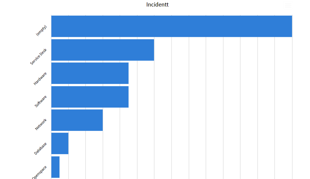
I have a number of Bar Graphs but my boss doesn't like the X axis being at an angle. Is there a way to alter the X axis to be straight and/or make the words go longer?

Solved! Go to Solution.
- Labels:
-
Reporting
- Mark as New
- Bookmark
- Subscribe
- Mute
- Subscribe to RSS Feed
- Permalink
- Report Inappropriate Content
01-13-2022 12:28 PM
Hello
Set the property glide.chart.truncate.x_axis_labels to false in order to show the complete name in the X-axis labels of a report
Please mark answer correct/helpful based on impact
- Mark as New
- Bookmark
- Subscribe
- Mute
- Subscribe to RSS Feed
- Permalink
- Report Inappropriate Content
01-14-2022 01:11 AM
Hello Cammi,
That is just the OOB behaviour as if the names were shorter it will be shown in straight line

But as the names get longer to compensate for that Servicenow slants the name show the labels in the tilted format

Please mark the answer correct/helpful based on impact.
- Mark as New
- Bookmark
- Subscribe
- Mute
- Subscribe to RSS Feed
- Permalink
- Report Inappropriate Content
01-14-2022 07:37 AM
Hello -
Disregard my previous question, as I figured out I had to resize my report widget on the dashboard and then more of the X-axis names appeared.
Thanks,
Roberta
- Mark as New
- Bookmark
- Subscribe
- Mute
- Subscribe to RSS Feed
- Permalink
- Report Inappropriate Content
01-13-2022 02:44 PM

