- Mark as New
- Bookmark
- Subscribe
- Mute
- Subscribe to RSS Feed
- Permalink
- Report Inappropriate Content
05-06-2022 01:59 AM
Not really a question, but the new menu in Next Experience UI is not an upgrade how I see it.
Visually = Improved
Functionally = Huge down grade
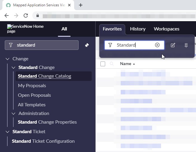
The old filter navigator searched through both favorites AND Applications/Modules. Now with the Next Experience UI, this is what got worse then before:
- In Favorites you can not find non favorite Applications or Modules, just like you could in UI 16. If I then have my favorites pinned and can't find what I'm looking for, I need to do more clicking and searching and that's not efficient.
See Fig. 01 and Fig. 03 - When searching in "All" menu, Favorites are not shown on top, just like they did in UI 16. I then need to scroll down and look for the star icon in order to find what I'm searching for. And that's also not an efficient way to work.
Fig. 02
Please let there be a fix for this. I've been trying to adapt to Next Experience UI, and for the most part I like it, but this will be a deal breaker for me and for many other users that I've spoken too.
Fig. 01 - Looking for a Module/Application that's not in my favorites.
Fig. 02 - All the way down here is my searched Application/Module, and not on top as in UI16


Fig. 03 - Searching from Favorites in UI16 where an Application/Module is not found as a Favorite

Solved! Go to Solution.
- 9,072 Views
- Mark as New
- Bookmark
- Subscribe
- Mute
- Subscribe to RSS Feed
- Permalink
- Report Inappropriate Content
05-07-2022 02:58 AM - edited 11-07-2022 01:40 PM
Hi Brian and thanks for the response!
I did so in this link:
- Mark as New
- Bookmark
- Subscribe
- Mute
- Subscribe to RSS Feed
- Permalink
- Report Inappropriate Content
07-05-2022 06:09 AM
Thanks for creating the idea
- Mark as New
- Bookmark
- Subscribe
- Mute
- Subscribe to RSS Feed
- Permalink
- Report Inappropriate Content
02-15-2024 04:53 AM
I think they may have fixed the issue with favourites as now we have switched to Next Experience (in Vancouver) the Favourites are now listed at the top of the All menu list when you start typing in filter navigator
- Mark as New
- Bookmark
- Subscribe
- Mute
- Subscribe to RSS Feed
- Permalink
- Report Inappropriate Content
04-17-2023 03:52 PM
I would love to find a troubleshooting/debug guide. We just enabled the Next Experience UI for a San Diego instance. We found blocked UI features like the Agile Board displays blank and the Show Column Search Row does nothing.
- Mark as New
- Bookmark
- Subscribe
- Mute
- Subscribe to RSS Feed
- Permalink
- Report Inappropriate Content
10-18-2022 09:46 AM
The missing horizontal scroll bar ruined the whole thing for me. I spend most of my time working with list report widgets on a dashboard. In the new UI you are forced to scroll down to the bottom of the list so that you can scroll over to the right, only then having to scroll back up to the top- all so you can see the fields on the right side of the report... really poor design-
- Mark as New
- Bookmark
- Subscribe
- Mute
- Subscribe to RSS Feed
- Permalink
- Report Inappropriate Content
01-18-2023 01:24 AM
Our uses have complained about the same issue. We contacted support and they said 'that's the way it is now'
Regards
Paul