- Mark as New
- Bookmark
- Subscribe
- Mute
- Subscribe to RSS Feed
- Permalink
- Report Inappropriate Content
05-06-2022 01:59 AM
Not really a question, but the new menu in Next Experience UI is not an upgrade how I see it.
Visually = Improved
Functionally = Huge down grade
The old filter navigator searched through both favorites AND Applications/Modules. Now with the Next Experience UI, this is what got worse then before:
- In Favorites you can not find non favorite Applications or Modules, just like you could in UI 16. If I then have my favorites pinned and can't find what I'm looking for, I need to do more clicking and searching and that's not efficient.
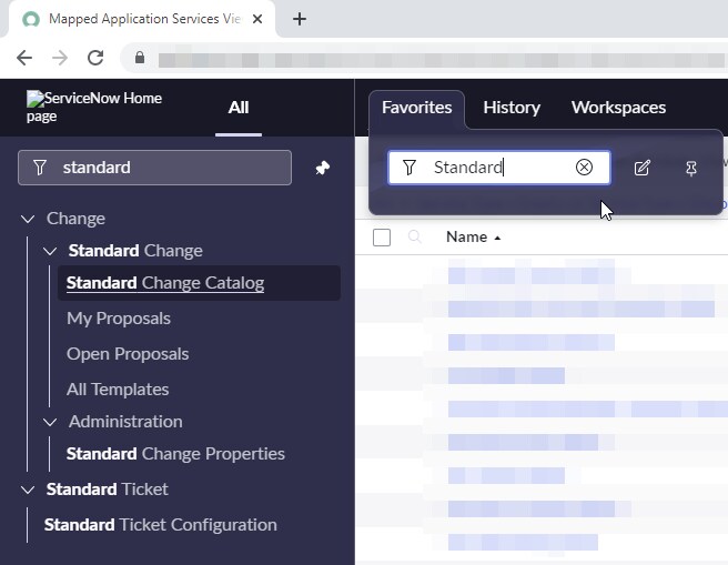
See Fig. 01 and Fig. 03 - When searching in "All" menu, Favorites are not shown on top, just like they did in UI 16. I then need to scroll down and look for the star icon in order to find what I'm searching for. And that's also not an efficient way to work.
Fig. 02
Please let there be a fix for this. I've been trying to adapt to Next Experience UI, and for the most part I like it, but this will be a deal breaker for me and for many other users that I've spoken too.
Fig. 01 - Looking for a Module/Application that's not in my favorites.
Fig. 02 - All the way down here is my searched Application/Module, and not on top as in UI16


Fig. 03 - Searching from Favorites in UI16 where an Application/Module is not found as a Favorite

Solved! Go to Solution.
- 9,073 Views
- Mark as New
- Bookmark
- Subscribe
- Mute
- Subscribe to RSS Feed
- Permalink
- Report Inappropriate Content
05-07-2022 02:58 AM - edited 11-07-2022 01:40 PM
Hi Brian and thanks for the response!
I did so in this link:
- Mark as New
- Bookmark
- Subscribe
- Mute
- Subscribe to RSS Feed
- Permalink
- Report Inappropriate Content
03-26-2025 01:52 AM
FYI: ServiceNow closed the initial idea posted 3yrs ago today. ...works with ServiceNow 😉