


mitchellstutler
Tera Contributor
Options
- Subscribe to RSS Feed
- Mark as New
- Mark as Read
- Bookmark
- Subscribe
- Printer Friendly Page
- Report Inappropriate Content
10-18-2016
09:06 AM
In this post, we are going to build a Service Portal widget with an interactive bar chart with multiple data sets. This is the third post in my series that focuses on using D3js within ServiceNow's Service Portal. If you haven't already worked through the previous posts and are finding yourself lost, you might want to check those out here.
New concepts to the series that we will touch on in this post are entering, updating, and exiting data with D3, working with transitions to change our data in a pleasing manner, and adding basic interactive aspects such as hovering effects. The key pieces of our widget that we are going to be focusing on are our server script and our client script.
Server script
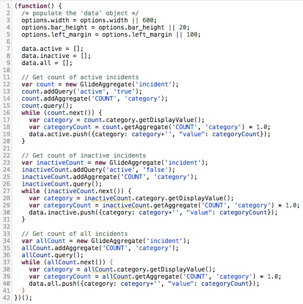
For this chart, we are going to have the ability to view the counts of active, inactive, and all incidents by category. There are multiple ways to get this data from our server script, but for simplicity's sake we are just going to use 3 separate GlideAggregate calls and push that data into one of 3 arrays defined on the data object. Each of these arrays will contain an object for each category returned from the GlideAggregate call. Each of these objects will look like this after our server script:
{category: "Software", "value": 14}
Below is a screenshot of my server script as well as the pasted code:
(function() {
/* populate the 'data' object */
options.width = options.width || 600;
options.bar_height = options.bar_height || 20;
options.left_margin = options.left_margin || 100;
data.active = [];
data.inactive = [];
data.all = [];
// Get count of active incidents
var count = new GlideAggregate('incident');
count.addQuery('active', 'true');
count.addAggregate('COUNT', 'category');
count.query();
while (count.next()) {
var category = count.category.getDisplayValue();
var categoryCount = count.getAggregate('COUNT', 'category');
data.active.push({category: category, "value": categoryCount});
}
/ / Get count of inactive incidents
var inactiveCount = new GlideAggregate('incident');
inactiveCount.addQuery('active', 'false');
inactiveCount.addAggregate('COUNT', 'category');
inactiveCount.query();
while (inactiveCount.next()) {
var category = inactiveCount.category.getDisplayValue();
var categoryCount = inactiveCount.getAggregate('COUNT', 'category');
data.inactive.push({category: category, "value": categoryCount});
}
// Get count of all incidents
var allCount = new GlideAggregate('incident');
allCount.addAggregate('COUNT', 'category');
allCount.query();
while (allCount.next()) {
var category = allCount.category.getDisplayValue();
var categoryCount = allCount.getAggregate('COUNT', 'category');
data.all.push({category: category, "value": categoryCount});
}
})();
Client script
Since we are working with multiple data sets, we are going to set up a function that takes a data set as a parameter and then updates our bar chart accordingly. This gives us the ability to call this function from buttons in our widget so the user can navigate through these data sets. You might also notice at the end of our client script that we are calling this function with one of the data sets so that the bar chart will be present after the widget loads.
When working with multiple data sets in D3, there are 3 major pieces to the process of changing data sets: entering new data, updating existing data that is also present in the new data set, and exiting existing data that isn't in the new data set. For this example, I enter the new data, then I exit any of the bars that are no longer needed, then enter any new bars, and finally update the bars that are leftover from the previous data set.
Something else that is new from the previous post is that we will use a key function when we bind our data set. For this chart, we are going to use our category name as the key value:
var bar = chart.selectAll("g").data(data, function(d) { return d.category;});
What this allows us to do is update a bar that has values in multiple data sets. For example, the category "Software" appears in both the active and inactive data sets. Since we are keying off of the category name value, we will just update the existing "Software" bar to its new size instead of removing it and then adding a brand new bar.
Now that we are able to update existing bars we will use D3 transitions to gradually change from the existing width to the new width. We will also use transitions for entering new data bars.
The last new piece of functionality that we are adding in this post is attaching mouse-over and mouse-out functions to our bars to give an extra layer of interactive capabilities. Our mouse-over function is going to change the color of the bar that is being hovered on as well as show a tool-tip that provides the exact count of records for that given bar. Below is the code for our function:
function($scope) {
/* widget controller */
var c = this;
// Grab our category counts from our Server Script
$scope.activeData = c.data.active;
$scope.inactiveData = c.data.inactive;
$scope.allData = c.data.all;
// Set the width of the chart along with the height of each bar
var width = c.options.width,
barHeight = c.options.bar_height,
leftMargin = c.options.left_margin;
$scope.updateBars = function(data) {
// Set the dimensions of our chart
var chart = d3.select(".chart").attr("width", width)
.attr("height", barHeight * data.length + 50);
// Remove existing axis and tooltip
d3.select(".x.axis").remove();
chart.select(".counter").remove();
// Add a placeholder text element for our tooltip
var counter = chart.append("text").attr("class", "counter")
.attr("y", 10)
.attr("x", width-20);
// Set the domain and range of the chart
var x = d3.scaleLinear()
.range([leftMargin, width])
.domain([0, d3.max(data, function(d) { return d.value; })]);
// Bind our new data to our g elements
var bar = chart.selectAll("g").data(data, function(d) { return d.category;});
// Remove existing bars that aren't in the new data
bar.exit().remove();
// Create new g elements for new categories in our new data
var barEnter = bar.enter().append("g")
.attr("transform", function(d, i) { return "translate(0," + i * barHeight + ")"; });
// Enter new rect elements
barEnter.append("rect")
.on("mouseover", highlightBar)
.on("mouseout", unhighlightBar)
.attr("class", "chart-bar")
.attr("height", barHeight - 1)
.attr("x", leftMargin)
.transition().duration(750)
.attr("width", function(d) { return x(d.value) - leftMargin; });
// Enter new text labels
barEnter.append("text")
.attr("x", leftMargin - 5)
.attr("y", barHeight / 2)
.attr("width", leftMargin)
.attr("dy", ".35em")
.style("fill", "black")
.style("text-anchor", "end")
.transition()
.delay(750)
.text(function(d) { return d.category; });
// Update existing bars
bar.transition().duration(750)
.attr("transform", function(d, i) { return "translate(0," + i * barHeight + ")"; });
bar.selectAll('rect')
.on("mouseover", highlightBar)
.on("mouseout", unhighlightBar)
.data(data, function(d) { return d.category;})
.transition().duration(750)
.attr("width", function(d) { return x(d.value) - leftMargin; });
// Create the x-axis and append it to the bottom of the chart
var xAxis = d3.axisBottom().scale(x);
chart.append("g")
.attr("class", "x axis")
.attr("transform", "translate(0," + (barHeight * data.length) + ")")
.attr("x", leftMargin)
.transition()
.delay(750)
.call(xAxis);
// Define functions for our hover functionality
function highlightBar(d,i) {
d3.select(this).style("fill", "#b0c4de");
counter.text(d.category + ' ' + d.value);
}
function unhighlightBar(d,i) {
d3.select(this).style("fill", "#4682b4");
counter.text("");
}
}
$scope.updateBars($scope.activeData);
}
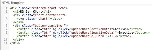
HTML
Below is a screenshot and pasted code for our HTML:
<div class="centered-chart row">
<h1>D3 Bar Chart</h1>
<div class="chart-container">
<svg class="chart"></svg>
</div>
<div class="button-container">
<button class="btn" ng-click="updateBars(activeData)">Active</button>
<button class="btn" ng-click="updateBars(inactiveData)">Inactive</button>
<button class="btn" ng-click="updateBars(allData)">All</button>
</div>
</div>
CSS
Below is a screenshot and pasted code for our CSS:
.btn {
background-color: white;
border: 1px solid gray !important;
}
.chart rect {
fill: #4682b4;
}
.chart-container {
height: 200px;
}
.chart text {
font: 10px sans-serif;
}
.centered-chart {
text-align: center;
}
.counter {
text-anchor: end;
}
.axis text {
font: 10px sans-serif;
}
.axis path,
.axis line {
fill: none;
stroke: #000;
shape-rendering: crispEdges;
}
Finished product
Now that we have everything in place, we can test it out. If you followed along on your own instance correctly, your widget should look similar to this:
If yours looks different, it could be that the data in our instances are different. Otherwise, check out the previous posts in this series and see if you missed a step.
We now have what we need to work with multiple data sets to create interactive data visualization widgets in the Service Portal. Keep an eye out for future posts that will build on these foundation blocks of D3 and Service Portal.
Mitch Stutler
VividCharts Founder
linkedin.com/in/mitchellstutler
Sources
- 6,405 Views
2 Comments
You must be a registered user to add a comment. If you've already registered, sign in. Otherwise, register and sign in.

