- Mark as New
- Bookmark
- Subscribe
- Mute
- Subscribe to RSS Feed
- Permalink
- Report Inappropriate Content
10-06-2022 02:41 AM - edited 10-06-2022 02:41 AM
Hi all!
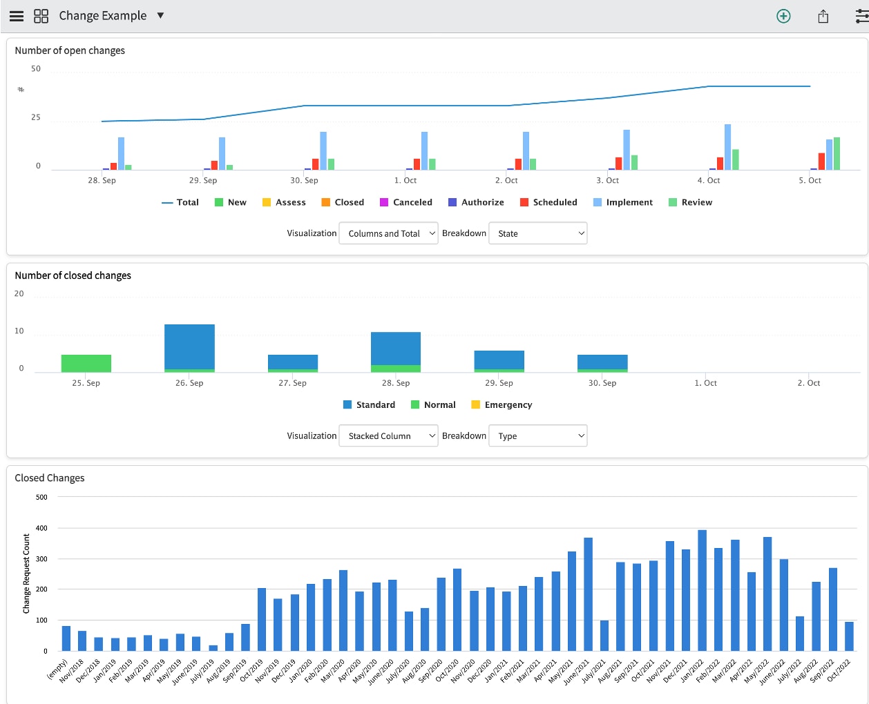
I am working with Performance Analytics with a customer. I have developed a Dashboard for Change and chosen colors for each widget as you can see in picture 1.

However, when I impersonate a user at the customer this person will see a totalt different color chart for the same widgets/dashboard (see picture 2). Im guessing there is some settings for this specific user, but I cant figure out where this is. Any suggestions?

Thanks in advance
Solved! Go to Solution.
- Mark as New
- Bookmark
- Subscribe
- Mute
- Subscribe to RSS Feed
- Permalink
- Report Inappropriate Content
10-06-2022 03:08 AM
Hello
This is based on user preference what he selects.
For more information you can read this article
https://support.servicenow.com/kb?id=kb_article_view&sysparm_article=KB0719426
Please mark answer correct/helpful based on Impact.
- Mark as New
- Bookmark
- Subscribe
- Mute
- Subscribe to RSS Feed
- Permalink
- Report Inappropriate Content
10-06-2022 03:02 AM
You user might have changed their preferences with the option replace colors with patterns in charts and graphs:

Cheers,
Diogo
- Mark as New
- Bookmark
- Subscribe
- Mute
- Subscribe to RSS Feed
- Permalink
- Report Inappropriate Content
10-06-2022 03:08 AM
Hello
This is based on user preference what he selects.
For more information you can read this article
https://support.servicenow.com/kb?id=kb_article_view&sysparm_article=KB0719426
Please mark answer correct/helpful based on Impact.