- Mark as New
- Bookmark
- Subscribe
- Mute
- Subscribe to RSS Feed
- Permalink
- Report Inappropriate Content
07-10-2019 10:44 PM
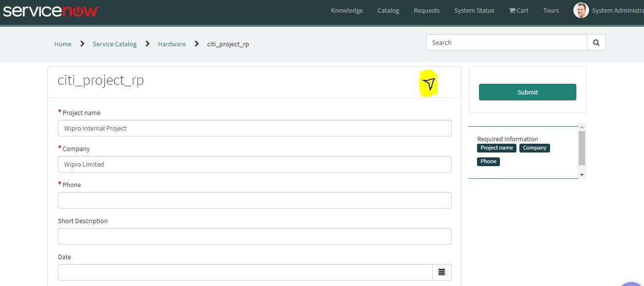
I want to add a Hide/Show button in Record producer.

I want to add these in my Record Producer yellow space.

If anyone can help It will be an advantage for me.
The button should work for toggle.
Thanks
Solved! Go to Solution.
- Mark as New
- Bookmark
- Subscribe
- Mute
- Subscribe to RSS Feed
- Permalink
- Report Inappropriate Content
07-11-2019 01:07 AM
You can do the following:
- clone SC Catalog Item [id=widget-sc-cat-item-v2] widget
- modify the instance of SC Catalog Item widget on sc_cat_item and sw_sc_cat_item pages of Service Portal to use new cloned widget instead of the original one
- modify Body HTML Template and Client controller code of cloned widget as following:
the title section of Body HTML Template
...
<div class="panel panel-default">
    <!-- Title Section -->
    <div class="wrapper-md b-b break-word item-header" ng-class="{true: '', false: 'sc-sticky-item-header'}[!c.data.sc_cat_item.short_description]" style="top: {{stickyHeaderTop}}">
        <h1 class="h2 m-t-none m-b-sm font-thin" ng-if="::data.sc_cat_item.name">{{::data.sc_cat_item.name}}</h1>
        <div class="text-muted sc-cat-item-short-description"
             ng-if="::data.sc_cat_item.short_description">{{::data.sc_cat_item.short_description}}</div>
    </div>
    <div class="wrapper-md row b-b no-margin" ...>
    ...
...
should be extended for example as
...
<div class="panel panel-default">
    <!-- Title Section -->
    <div class="wrapper-md b-b break-word item-header" ng-class="{true: '', false: 'sc-sticky-item-header'}[!c.data.sc_cat_item.short_description]" style="top: {{stickyHeaderTop}}">
        <h1 class="h2 m-t-none m-b-sm font-thin" ng-if="::data.sc_cat_item.name">{{::data.sc_cat_item.name}}</h1>
        <span ng-click="c.onExpand();" style="position:absolute;top:10px;right:10px">
            <i aria-expanded="false" class="fa"
               ng-class="c.expanded ? 'fa-chevron-up' : 'fa-chevron-down'"></i>
        </span>
        <div class="text-muted sc-cat-item-short-description"
             ng-if="::data.sc_cat_item.short_description">{{::data.sc_cat_item.short_description}}</div>
    </div>
    <div ng-show="c.expanded" class="wrapper-md row b-b no-margin" ...>
    ...
...
One can see that c.expanded will be responsible for the visibility of the main (body) part of information about the catalog item. The method c.onExpand will be executed on click on the icon.
The Client controller can contain the following code:
c.expanded = true;
c.onExpand = function () {
	c.expanded = !c.expanded;
};
You can extend the code to test whether mandatory fields are filled or implement other login, but the main functionality, which you asked should be already implemented with the changes described above.
- Mark as New
- Bookmark
- Subscribe
- Mute
- Subscribe to RSS Feed
- Permalink
- Report Inappropriate Content
07-11-2019 10:49 PM
Hi OlegKi,
The toggle button is displayingnow. But I tried to hide the div container in 2 3 ways using ng-show as well as inline css too. But both are not working. every time some USER AGENT STYLESHEET is making Display:block.
If you have any solution to it.
I even tried with <!doctype html> too, still couldn't achieve.
Any more help will be truly appreciated.