- Mark as New
- Bookmark
- Subscribe
- Mute
- Subscribe to RSS Feed
- Permalink
- Report Inappropriate Content
10-16-2015 07:27 AM
Hi,
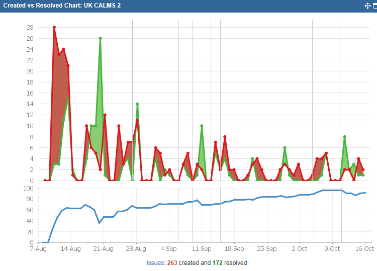
I'm trying to re-created/get something similar to the below graph that I used to create before moving to ServiceNow

I've been playing with the reporting on ServiceNow and I've been able to produce everything I've wanted except a graph similar to this one.
It shows incidents created and resolved over time, with a trend line below showing the total number of open tickets.
Does anybody have any advise on how to produce something similar to this in ServiceNow?
Thanks in advance
Solved! Go to Solution.
- Mark as New
- Bookmark
- Subscribe
- Mute
- Subscribe to RSS Feed
- Permalink
- Report Inappropriate Content
10-16-2015 08:50 AM
The best reporting features in the platform are available in Performance Analytics. You may actually need PA too, since it warehouses data. That'll be essential if your graph is showing "created resolved at this time" and not just the current view of the data created in older intervals (ie. of the stuff created in august, only 3 are currently resolved)
With default reporting capability, you won't get advanced features you've shown, like shared axis, simultaneous totals & averages, etc.
- Mark as New
- Bookmark
- Subscribe
- Mute
- Subscribe to RSS Feed
- Permalink
- Report Inappropriate Content
10-16-2015 11:47 AM
Thanks for the mention, rfedoruk ! (If you're a data nerd looking to get your hands on a reporting tool, you can play with our free trial...)
With Explore Analytics, the report would look something like this:
https://my.exploreanalytics.com/pub/view/7800f9ffe4b04f93a8d6bcc9dac5d427
The report is generated live from ServiceNow; if you were logged in, you'd be able to drill down to the records behind the report.
We have this report and many other pre-built in our ITSM analytical application.