


Dawn Jurek

ServiceNow Employee
Options
- Subscribe to RSS Feed
- Mark as New
- Mark as Read
- Bookmark
- Subscribe
- Printer Friendly Page
- Report Inappropriate Content
12-08-2017
08:55 AM
Starting with the Istanbul release, ServiceNow instances provide a powerful feature available to all users: responsive dashboards. In this installment of our NOWSupport best practices series, you can learn what responsive dashboards are, how to enable them, what you can use them for, and best practices for creating them and optimizing their performance.
Note: this article is written for the Jakarta release. Later releases will be slightly different -- our dev team is busy making this feature even better! Learn more about working with dashboards in this video on our NOWSupport YouTube channel:
Who can use our responsive dashboards, and what can you use them for?
In previous release dashboards were available only to users with Performance Analytics roles. No longer! In Istanbul and all users can create responsive dashboards.
Responsive dashboards are a step up from homepages, which provide only a static page of widgets displaying data and limited configuration options. Responsive dashboards feature an easy-to-use drag and drop canvas that allows you to create, edit, and arrange widgets (such as reports), and then share with colleagues.
Here are a few examples of the type of info you can put on dashboards:
- KPI Overview - Present critical info based on user role to help users work efficiently and see where focus or action is required.
- Analysis - Allow users to explore data and see trends via filters and breakdowns.
- Tell a story - Lead users through information on the dashboard with additional text (such as static html content blocks) to help them understand the data.
When you open a homepage that hasn't been converted to a dashboard, you'll be prompted to convert it. Once converted, you'll be able to utilize the benefits of the more flexible and usable format of responsive dashboards, which allow you to flexibly add, move, and resize widgets.
When converting a highly customized homepage to a responsive dashboard, the layout may not convert properly. Even then, you can simply recreate the homepage as a dashboard. To learn more, see Differences between homepages and responsive and non-responsive dashboards.
Enabling responsive dashboards
If you're not prompted to convert your homepage to a responsive dashboard, that means they're not enabled yet. A user with the admin role can enable them via the glide.cms.enable.responsive_grid_layout system property. If you zBoot your instance, responsive dashboards will be enabled by default. See the article Enable responsive dashboards to learn more.
Best practices for creating dashboards
And now, here are some best practices for creating dashboards.
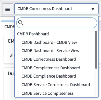
Name your dashboard to clearly define its purpose
When you name your dashboard, make sure the name clearly defines its purpose. This will help users find and understand the dashboard, and help you with future maintenance.
Create a dashboard for a specific role
So that all the content of the dashboard is relevant for the user, avoid creation of one dashboard for different users with different focus or interests.
Having irrelevant content can lead to the following issues:
- Slower performance - the system loads data that the user doesn't need.
- Poor data consumption/readability - users will have to go through irrelevant content to find the information they're looking for, which may slow the adoption of the dashboard.
Test the dashboard before sharing it
Make sure that reports and widgets you put in the dashboard load in a timely manner and the data refreshes as expected. If not, be sure to check the tips below. If there are content blocks or custom widgets on the dashboard, also test exporting it to PDF.
Optimize your dashboard's usability
Optimize the layout of the dashboard by defining the best size and location of the widgets. To do this, choose the visualization type that provides the best readability of the data and gives the user the fastest insight into the data you're trying to show. For example, consider the data/ink ratio of the visual for the best readability—is the widget big enough to display the data clearly? Does the visualization type display trends that you want users to see? Here are some more tips for optimization:
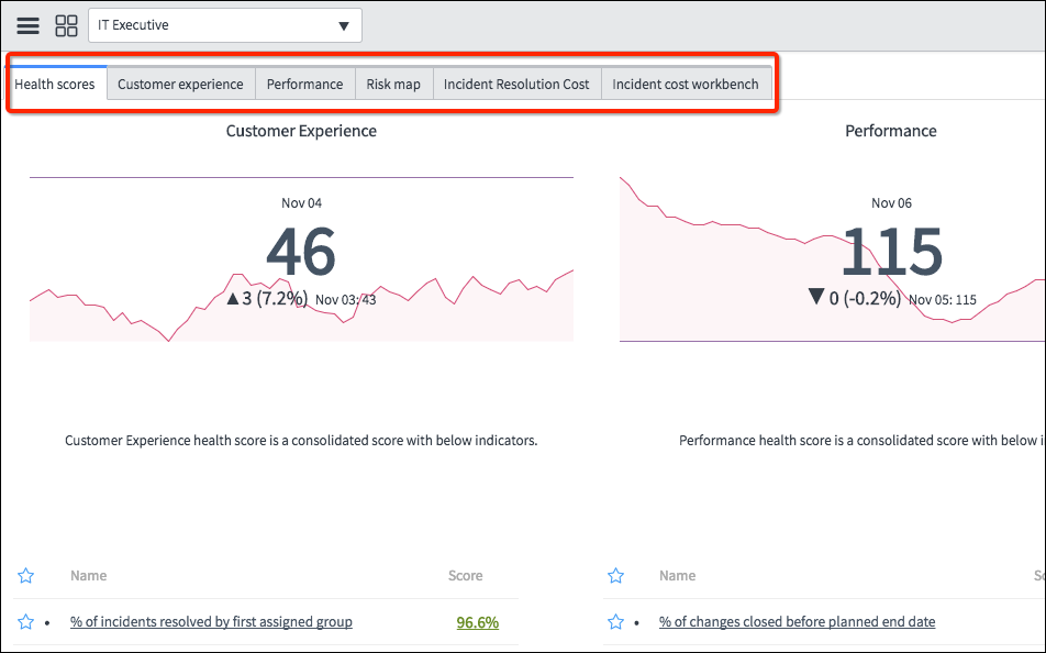
- Create tabs to divide information: For example, you could create a tab for each step of a process. Make sure that the name of the tab clearly defines the purpose. This will help the user find needed information faster and will optimize performance, as only widgets for the required tab will be loaded when the user clicks on it, rather than all widgets in the dashboard.
- Use breakdowns and interactive filters: Rather than creating multiple dashboards with filtered reports, use breakdowns and interactive filters to allow users to filter down the data on one dashboard. This will help to keep the data clean and improve user experience.
- Lay out tabs with important indicators/reports at the top: Users can see most important info first.
- Share dashboards and associated reports with same user groups: Make sure that the reports you put in the dashboard are shared with (or published to) the same user groups as the dashboard to prevent users from having issues viewing them.
- Use dashboard groups: (pa_admins only) Grouping dashboards based on process will make it easier for users to find the required dashboard.
- Optimize widget rendering time: Administrators can also optimize widget rendering time on responsive dashboards with the help of some properties.
In case you did your best to optimize the reports and widgets in the dashboard but it still seems slow, consider doing the following:
-
- If a report isn't used often, put it on a separate tab so users will only open it when they need the info.
- Add a content block/text to inform the user that the report may take some time to open (e.g. Report may take a few minutes to load).
Share a dashboard with user groups rather than individual users
Avoid sharing dashboards with individual users when possible - it's better to share with a user group, so that when new people are added to the group they can immediately access the dashboard. Every time a dashboard is shared with a user or group, an email notification is sent automatically.
Note that only users with pa_admin or pa_power_user role can manage (create new/edit existing) dashboard groups.
Take advantage of Performance Analytics base system content
Be sure to take advantage of base system content available in the Performance Analytics Guided Setup. You can use these applications as they are, or adjust them to align with your needs. Find them by navigating to Performance Analytics -> Guided Setup.
Note that you must have the admin role to access the Performance Analytics Guided Setup.
For more information
Working with responsive dashboards (product documentation)
--
Behind the scenes here at ServiceNow, the Knowledge Management and Multimedia teams work closely with subject matter experts to disseminate critical information to our customers. We've found that certain topics come up frequently, in the form of best practices that can help you keep your ServiceNow instances running smoothly. This series targets those topics so that you and your organization can benefit from our collective expertise. If you have a best practices topic you'd like us to cover in this series, please let us know in the comments below.
To access all of the blog posts in this series, see our NOWSupport best practices series list.
- 10,738 Views
4 Comments
You must be a registered user to add a comment. If you've already registered, sign in. Otherwise, register and sign in.
