Are Stacked Area Charts Possible?
- Mark as New
- Bookmark
- Subscribe
- Mute
- Subscribe to RSS Feed
- Permalink
- Report Inappropriate Content
02-04-2016 07:59 AM
Hello, I'm new to Performance Analytics. I see there is a way to create stacked bars, and to create area charts, but I don't see an option to create a stacked area. For example, I'd like to see Incidents by priority over time and have those stacked in order to also see the change in overall qty of incidents. Aside from using stacked bars instead, another option might be to use an area chart or line to represent the whole, and then additional indicators on the widget to show some of the other data. Any ideas would be appreciated, thanks.
- Labels:
-
Performance Analytics
- Mark as New
- Bookmark
- Subscribe
- Mute
- Subscribe to RSS Feed
- Permalink
- Report Inappropriate Content
02-04-2016 08:02 AM

- Mark as New
- Bookmark
- Subscribe
- Mute
- Subscribe to RSS Feed
- Permalink
- Report Inappropriate Content
02-04-2016 08:51 AM

- Mark as New
- Bookmark
- Subscribe
- Mute
- Subscribe to RSS Feed
- Permalink
- Report Inappropriate Content
02-05-2016 02:44 AM
Hi Jason,
Why would you show your data like this? In a stacked area chart, you can't see the trend over time for the specific value, because there is no 0 (flat) line.
If you really want a stacked area chart, my advice is in this specific case to make a formula indicator to add prio 1 and 2.
You can show in a time series chart all incidents (prio 1 2 and 3) and label this as Prio 3. The formula indicator will be the the priority 2 value as shown in your chart. The last will be the all incidents indicator with the prio breakdown and the prio 1 element. You can label this one as prio 1.
Good luck,
Martijn
- Mark as New
- Bookmark
- Subscribe
- Mute
- Subscribe to RSS Feed
- Permalink
- Report Inappropriate Content
02-05-2016 06:22 AM
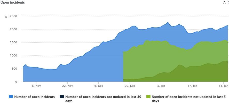
The stacks are useful for showing absolute and relative values simultaneously, and graphing over time allows you to eyeball the trends.