Create Trend Chart with both Bar and Trend Line
- Mark as New
- Bookmark
- Subscribe
- Mute
- Subscribe to RSS Feed
- Permalink
- Report Inappropriate Content
08-17-2017 10:19 AM
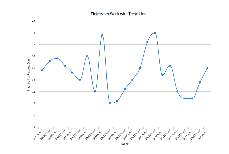
This may be an odd request, but I've been tasked with making it happen, if it's possible. Currently, one of our departments is using a trend chart showing number of tickets opened per week. It looks like this:

I can find one that looks like this:

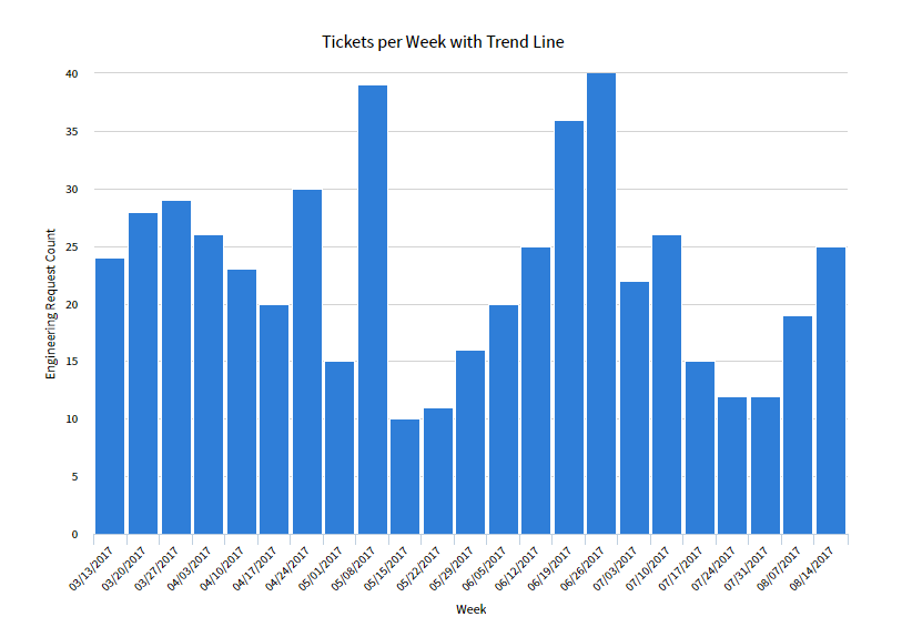
But what they want is a report that looks like this (it includes both the bar AND the line):

Is this possible in ServiceNow? (They're sample report is from another system entirely.)
- Labels:
-
Performance Analytics
-
Reporting
- Mark as New
- Bookmark
- Subscribe
- Mute
- Subscribe to RSS Feed
- Permalink
- Report Inappropriate Content
08-17-2017 11:45 AM
Hi,
Select Report type is Pareto, That is similar to Trend Line chart. Try it once.
- Mark as New
- Bookmark
- Subscribe
- Mute
- Subscribe to RSS Feed
- Permalink
- Report Inappropriate Content
08-17-2017 12:26 PM
Thanks. The only problem with the Pareto chart is that it's displayed in a numerical order, trending downward. The chart that I need is by date.
- Mark as New
- Bookmark
- Subscribe
- Mute
- Subscribe to RSS Feed
- Permalink
- Report Inappropriate Content
09-25-2017 07:49 AM
