How to create a stacked bar chart?
- Mark as New
- Bookmark
- Subscribe
- Mute
- Subscribe to RSS Feed
- Permalink
- Report Inappropriate Content
05-05-2020 07:45 AM
Hi all,
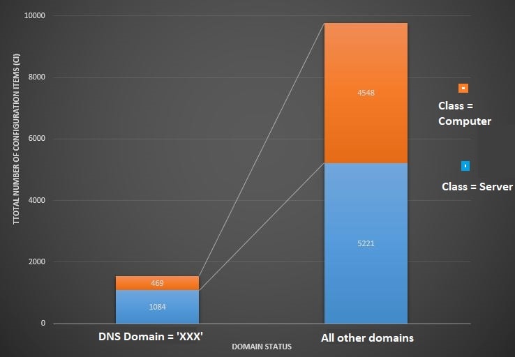
my client's requirement is to build a bar chart displayed below. It is displaying the number of "cmdb_ci_hardware" records grouped by "DNS Domain" field on the x-axis and stacked by the "Class".
At first, I tried to achieve this with reports, but I'm not able to summarize all other domains and all other classes.
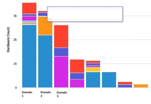
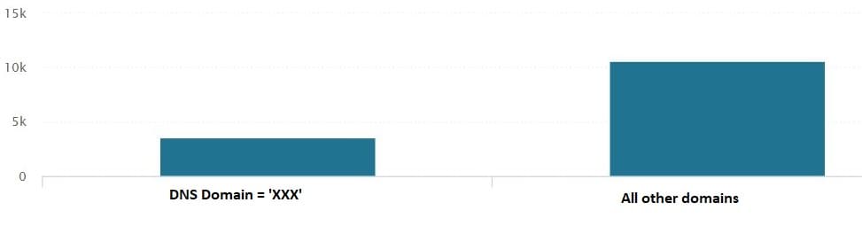
In Performance Analytics, I can display only one part of the chart (blue or orange) using a column visualization for a breakdown widget. But I can't find any possibility to add the second part. When I try to use "Stacked Column" visualization, the x-axis turns to time axis like this: docs
Do you have any ideas how I achieve this?
Thank you.
Required result:

What I can achieve with reporting (all the domains and classes listed):

What I can achieve with Performance Analytics (without stacking by class):

- Mark as New
- Bookmark
- Subscribe
- Mute
- Subscribe to RSS Feed
- Permalink
- Report Inappropriate Content
05-05-2020 01:52 PM
Have you looked at adding an additional Dataset to a report?
If you have the way that you want the data stacked in both datasets, you will be able to group them in the manner that you have above.
- Mark as New
- Bookmark
- Subscribe
- Mute
- Subscribe to RSS Feed
- Permalink
- Report Inappropriate Content
05-06-2020 05:24 AM
Hi Thomas,
but how can I create the the bar "all other domains" and the group "all other classes"? That was my problem in reporting.
I'm not able to "summarize" all other domains to one bar and all other classes to one group. I'm still seeing 10 different domains and classes, even if using multiple datasets.
Thanks for your answer,
Michaela