- Mark as New
- Bookmark
- Subscribe
- Mute
- Subscribe to RSS Feed
- Permalink
- Report Inappropriate Content
03-30-2022 08:30 AM
Hello dear community, I need help:
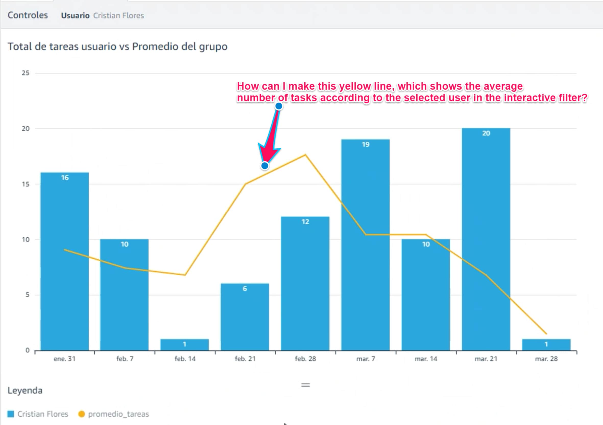
How can I recreate the yellow line (see the picture) so that the yellow line shows, for example, the average number of tasks for a given user?

I hope you can help me. Thanks in advance
Solved! Go to Solution.
- Labels:
-
Dashboard
-
Performance Analytics
-
Reporting
- Mark as New
- Bookmark
- Subscribe
- Mute
- Subscribe to RSS Feed
- Permalink
- Report Inappropriate Content
03-30-2022 11:17 PM
Hi Alessa,
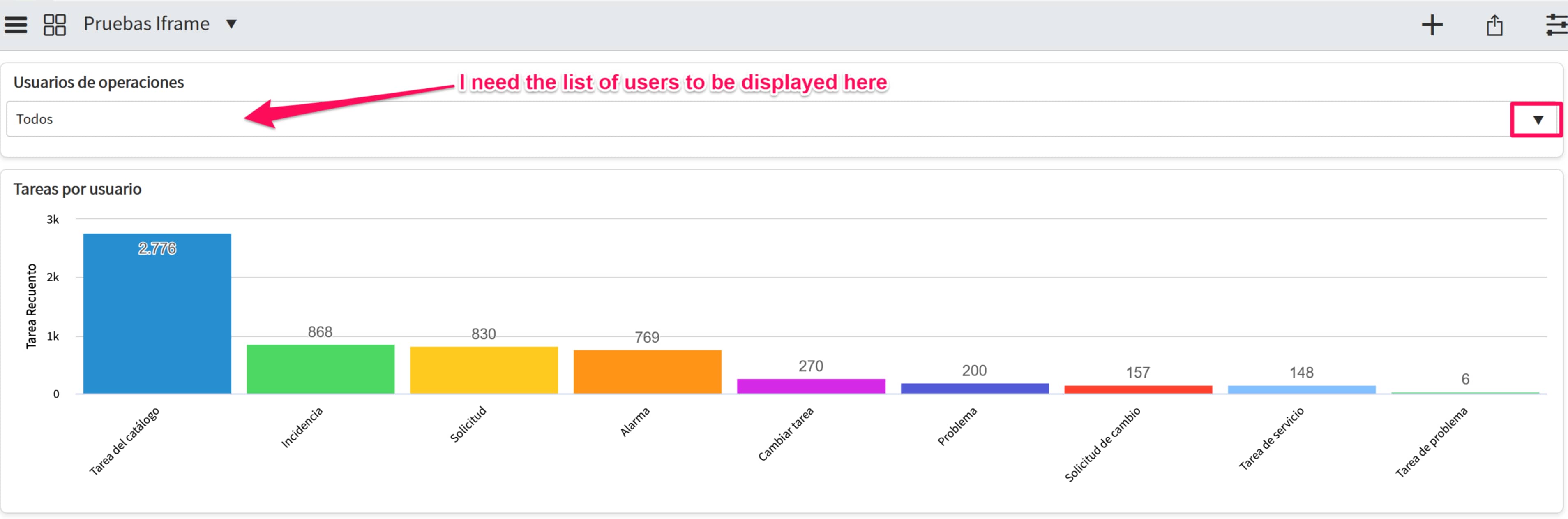
You can create your first report on the sc_task table utilizing the filter:
Assigned_to is firstname_lastname
Then add an additional dataset from the report builder top right cornor:

and press "Add dataset:

if my answer have helped you in achieving your goal, please mark my answer as helpful or correct answer.
Best regards
Anders
If my answer has helped with your question, please mark my answer as the accepted solution and give a thumbs up.
Best regards
Anders
Rising star 2024
MVP 2025
linkedIn: https://www.linkedin.com/in/andersskovbjerg/
- Mark as New
- Bookmark
- Subscribe
- Mute
- Subscribe to RSS Feed
- Permalink
- Report Inappropriate Content
03-30-2022 11:31 AM
Create dataset option can be used to get the line in the graph. (add an additional data set to a report)
You can follow the steps listed in this
- Mark as New
- Bookmark
- Subscribe
- Mute
- Subscribe to RSS Feed
- Permalink
- Report Inappropriate Content
04-01-2022 01:41 PM
Thank you very much!
- Mark as New
- Bookmark
- Subscribe
- Mute
- Subscribe to RSS Feed
- Permalink
- Report Inappropriate Content
03-30-2022 11:17 PM
Hi Alessa,
You can create your first report on the sc_task table utilizing the filter:
Assigned_to is firstname_lastname
Then add an additional dataset from the report builder top right cornor:
and press "Add dataset:
if my answer have helped you in achieving your goal, please mark my answer as helpful or correct answer.
Best regards
Anders
If my answer has helped with your question, please mark my answer as the accepted solution and give a thumbs up.
Best regards
Anders
Rising star 2024
MVP 2025
linkedIn: https://www.linkedin.com/in/andersskovbjerg/
- Mark as New
- Bookmark
- Subscribe
- Mute
- Subscribe to RSS Feed
- Permalink
- Report Inappropriate Content
09-12-2024 11:28 AM
I know this post is old but this guide was extremely helpful, thank you!