How to create/display a Comparison Report of Fiscal Year 19 and Fiscal Year 20?
- Mark as New
- Bookmark
- Subscribe
- Mute
- Subscribe to RSS Feed
- Permalink
- Report Inappropriate Content
04-27-2020 08:08 AM
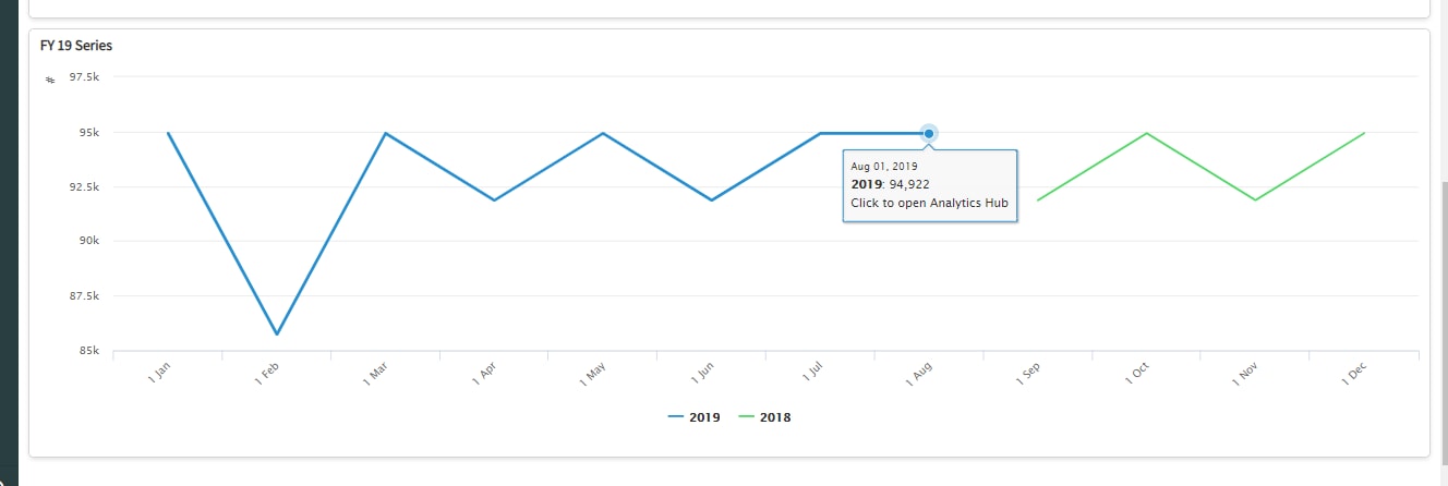
Creating a Comparison Report of Fiscal Year 19 and Fiscal Year 20
I want to create a report or series of reports comparing 2 years worth of data, how would I go about doing that?
At the moment I have created 2 widgets to try and represent the data, in the Incident Comparison widget I am using the Indicator number of open Incidents with a widget indicator with data collected over the past 2 years. In the FY 19 series widget, I am using the indicator source with the 2 years of data with the Previous Period chart selected displaying a period over the past 2 years.
Both widgets display the data somewhat but they don't not layer/display clearly on top of each other like a report with 2 line graphs would by the months.


Basically, I am trying to present the data of the 2 years comparing the number of incidents month by month on one report
Thanks, Garrett
- Labels:
-
Dashboard
-
Performance Analytics
-
Reporting
- Mark as New
- Bookmark
- Subscribe
- Mute
- Subscribe to RSS Feed
- Permalink
- Report Inappropriate Content
05-20-2020 10:19 AM

- Mark as New
- Bookmark
- Subscribe
- Mute
- Subscribe to RSS Feed
- Permalink
- Report Inappropriate Content
08-28-2024 04:06 AM
Were you able to get this report? I'm having a similar requirement? I want to display major incidents count week by week for current year and previous year
- Mark as New
- Bookmark
- Subscribe
- Mute
- Subscribe to RSS Feed
- Permalink
- Report Inappropriate Content
07-30-2025 01:02 PM
I am having a similar issue. I can get the report to show a line graph, however I want the months to overlay each other instead of the graph to continue to add months and years to the left. Any help would be appreciated.
Again, the months should overlay and the years would be represented by the different color lines.
- Mark as New
- Bookmark
- Subscribe
- Mute
- Subscribe to RSS Feed
- Permalink
- Report Inappropriate Content
07-30-2025 09:31 PM
Same issue for me. Service now should update this so we can overlay months and years represented in different colours. In the high-level presentation, the board members want to see these comparisons.
- Mark as New
- Bookmark
- Subscribe
- Mute
- Subscribe to RSS Feed
- Permalink
- Report Inappropriate Content
03-27-2026 03:18 PM
Same here I’m trying to do the same to overlay the data and compare stats for Incident, Problem, Requests and Changes