Incident count report by configuration item
- Mark as New
- Bookmark
- Subscribe
- Mute
- Subscribe to RSS Feed
- Permalink
- Report Inappropriate Content
07-22-2017 08:20 PM
I'm looking to create a chronic report for our 2 groups.
What I'm looking for is Configuration Items that had 3 or more incidents created in the past 30 days.
I can get the below result, but i don't care about the 1s and 2s and there's no way that i found to filter out that criteria.
Note that I am not a board admin and can't change any back end settings.

- Labels:
-
Reporting
- Mark as New
- Bookmark
- Subscribe
- Mute
- Subscribe to RSS Feed
- Permalink
- Report Inappropriate Content
07-24-2017 05:24 AM
Alex,
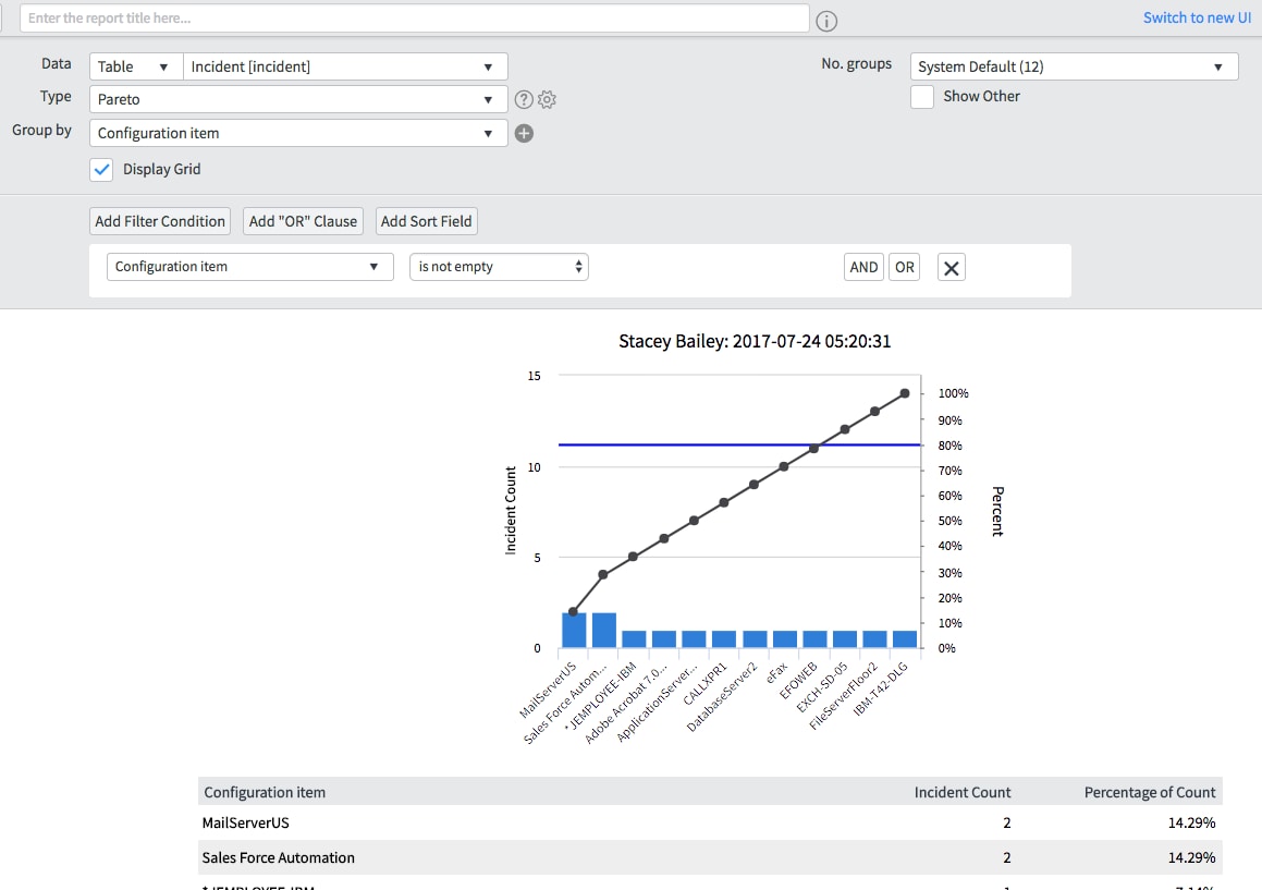
For this type of report, I would tend to use a Pareto chart. It will do a similar type of grouping by configuration item, but stack by frequency. The, where the cumulative count line crosses the blue mark is the 80% mark. You can display the grid below to see the Incident counts and what percent they represent. This will not give you all the details if you schedule and email the report, but you can include a link in the email pointing to the report in the system to be able to easily drill down into the offending records.
Hope this helps.

- Mark as New
- Bookmark
- Subscribe
- Mute
- Subscribe to RSS Feed
- Permalink
- Report Inappropriate Content
07-24-2017 07:36 AM
In my humble opinion, this is ServiceNow's reporting's greatest weakness, the inability to sort or filter on aggregates (sum, average, min, max, etc.). I surely do hope that they'll fix this soon, because it's a common requirement and there are back-end database functions that accomplish this. I'd suggest putting in a feature enhancement request.
In the meantime, Like Stacey mentioned above, about the best you can do without access to the back-end is run an existing report type and visually look for the data you want.
- Mark as New
- Bookmark
- Subscribe
- Mute
- Subscribe to RSS Feed
- Permalink
- Report Inappropriate Content
07-24-2017 08:36 AM
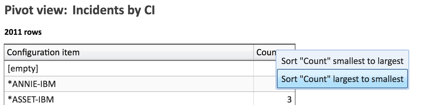
With Explore Analytics you can do both the sorting:


based on the aggregates (count, sum, average, min, max, etc.)... here's the result as a pivot:
or as a chart:
Both are real-time, and if you're logged in, you can drill down, and embed in the ServiceNow dashboard. You can try it here.
- Mark as New
- Bookmark
- Subscribe
- Mute
- Subscribe to RSS Feed
- Permalink
- Report Inappropriate Content
07-24-2017 08:52 AM
