- Mark as New
- Bookmark
- Subscribe
- Mute
- Subscribe to RSS Feed
- Permalink
- Report Inappropriate Content
07-21-2017 08:49 AM
Is it possible to lengthen the column labels that appear on the x-axis of a bar graph? Looks like it's limited to around 17-20 characters OOB.
Solved! Go to Solution.
- Labels:
-
Reporting
- Mark as New
- Bookmark
- Subscribe
- Mute
- Subscribe to RSS Feed
- Permalink
- Report Inappropriate Content
07-21-2017 10:00 AM
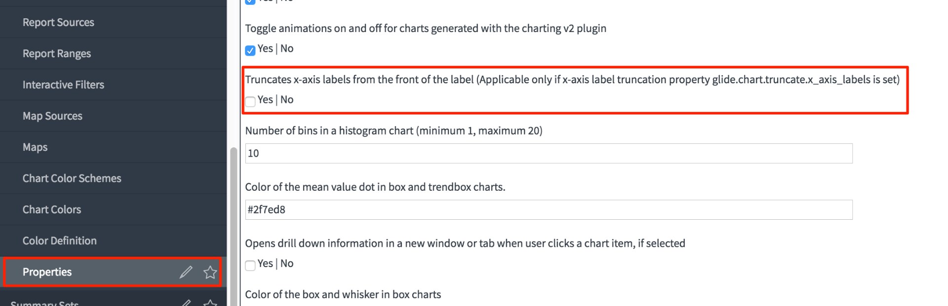
Set your property glide.chart.truncate.x_axis_labels to false in the table sys_properties, or via the reporting proeries page
More info: Reporting properties

- Mark as New
- Bookmark
- Subscribe
- Mute
- Subscribe to RSS Feed
- Permalink
- Report Inappropriate Content
07-21-2017 10:00 AM
Set your property glide.chart.truncate.x_axis_labels to false in the table sys_properties, or via the reporting proeries page
More info: Reporting properties
- Mark as New
- Bookmark
- Subscribe
- Mute
- Subscribe to RSS Feed
- Permalink
- Report Inappropriate Content
07-03-2018 01:50 PM
Thanks for this solution Arnoud Kooi! It does successfully remove the truncation when I view the report in the report application. However, if I add the report as a widget onto a responsive dashboard, the labels are once again truncated. 😞 On the plus side, at least when I hover over them now in the dashboard widget, the hover display shows the full name.
Do you know of any solution for stopping them truncating in the dashboard widget?
- Mark as New
- Bookmark
- Subscribe
- Mute
- Subscribe to RSS Feed
- Permalink
- Report Inappropriate Content
04-12-2021 11:22 AM
I have the same issue with the dashboard widget. Does anyone have a solution for this?
- Mark as New
- Bookmark
- Subscribe
- Mute
- Subscribe to RSS Feed
- Permalink
- Report Inappropriate Content
04-18-2023 04:12 PM
Greetings All,
I was finally able to dig out the property “glide.chart.label.legend.truncate_to” in the SYS Properties and not in the Reporting properties that corrected the truncation for us. Hopefully, this can help others.
In the Filter navigator, enter sys_properties.list and search for “glide.chart.label.legend.truncate_to”. Set the value to the max length you want on the reports.