Contextual search result display on Record producer
- Mark as New
- Bookmark
- Subscribe
- Mute
- Subscribe to RSS Feed
- Permalink
- Report Inappropriate Content
09-19-2016 10:02 AM
Hi guys,
May you can give me some advice. I have a record producer, with a Short description field, then some another (5-6) variables below, I use 1 column layout.
First, I do not want the knowledge result at the end of the form, so I moved context macro under the short description, then the results are displayed under short description.
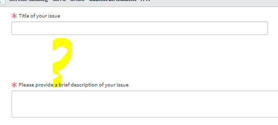
It's fine, but the problem: under the Short Description I have a big blank white space now. Approxomatley 40px high. This could be the container of the context macro and it reserves space for itself. See screenshot.

So it looks strange. As soon as somebody type short description this is OK as the knowledge results display on this white space. But I dont like that white space with yellow question mark above when user load the form.
So I have tried several another options - like:
- have two column layout with 2 sides container, and have the context macro on the right side. The problem here, when the results come I have a big pane on the right side, and all the antoher variables on the left side drops down leaving a big blank space again. See screenshot 2 where context macro is the 3rd element in a container 2 sides one then another.

Not really good
I have tried also to set an UI policy: if the Short description is empty Hide context macro. So when the form loads I have no blanks space, but the results only comes after a user type the short description AND clicks away. Not good.
What I'm looking for:
- remove the blank space context macro keeps as it is on screenshot one somehow.
OR
- I could go with 2 columns layout, but I want the result: every variables keeps on the left side without unneccessary blank space, and the knowledge result displays on the right column.
Any help welcome, and many thanks!
- Mark as New
- Bookmark
- Subscribe
- Mute
- Subscribe to RSS Feed
- Permalink
- Report Inappropriate Content
09-19-2016 10:03 AM
Yeah that's the unfortunate thing about the results macro. It saves itself some space in the order.
- Mark as New
- Bookmark
- Subscribe
- Mute
- Subscribe to RSS Feed
- Permalink
- Report Inappropriate Content
09-19-2016 02:05 PM

- Mark as New
- Bookmark
- Subscribe
- Mute
- Subscribe to RSS Feed
- Permalink
- Report Inappropriate Content
09-19-2016 02:39 PM
Thank you for your suggestion!
- Mark as New
- Bookmark
- Subscribe
- Mute
- Subscribe to RSS Feed
- Permalink
- Report Inappropriate Content
09-20-2016 02:16 AM
Hi guys, I think I could find a solution. I have not recognized that we have a Container Split variable now! With help of that the layout is beautiful:
My setup now:
Container Start - 2 wide, one side then to other
I list all my variables I need.
I put a Container Split.
I add the Context Macro
Done!
The result is:
All my variables at the left side
On the right side the knowledge articles are listed based on Title. I like it now