- Mark as New
- Bookmark
- Subscribe
- Mute
- Subscribe to RSS Feed
- Permalink
- Report Inappropriate Content
05-21-2021 05:49 AM
Hello Guys,
Can anyone help me to solve this please
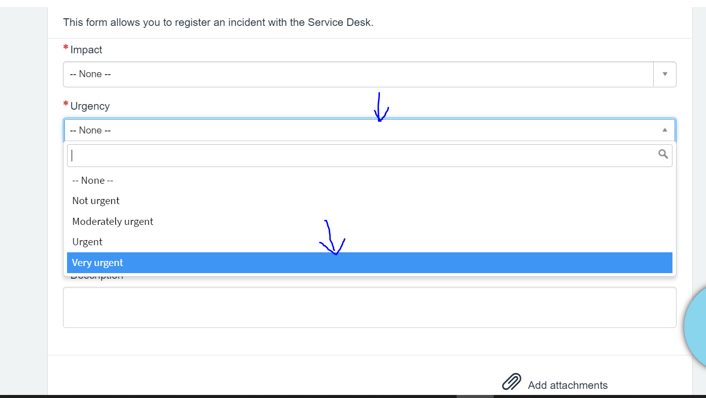
In Portal when we are clicking on fields, it shows the "Blue" border and how to change it to other color we want.


I am not getting how to fix that. Please help me this is bit urjent.
Thanks and Regards,
Bhavana
Solved! Go to Solution.
- Mark as New
- Bookmark
- Subscribe
- Mute
- Subscribe to RSS Feed
- Permalink
- Report Inappropriate Content
05-25-2021 02:55 AM
I changed Theme to "Stock" and added the following CSS rules directly in CSS variables:
.form-control:focus,
.sp-page-root .form-control:focus {
    border-color: #00B9B0;
    outline: none;
    -webkit-box-shadow: 0 0 5px #00b9b0;
    box-shadow: 0 0 5px #00b9b0;
}
.select2-container.select2-container-active {
    outline: 5px auto #00B9B0;
    border-color: #00B9B0;
    box-shadow: 0 0 5px #00B9B0;
    outline-offset: -2px;
}
.select2-container-active .select2-choice {
    border-color: #00B9B0;
}
.select2-results .select2-highlighted {
    background: #00B9B0;
    color: #fff;
}
As the result the colors have been changed like expected:

I think that one should add more CSS rules to change colors for all different controls, but the above example shows that the approach works. Isn't so?
- Mark as New
- Bookmark
- Subscribe
- Mute
- Subscribe to RSS Feed
- Permalink
- Report Inappropriate Content
05-23-2021 09:03 AM
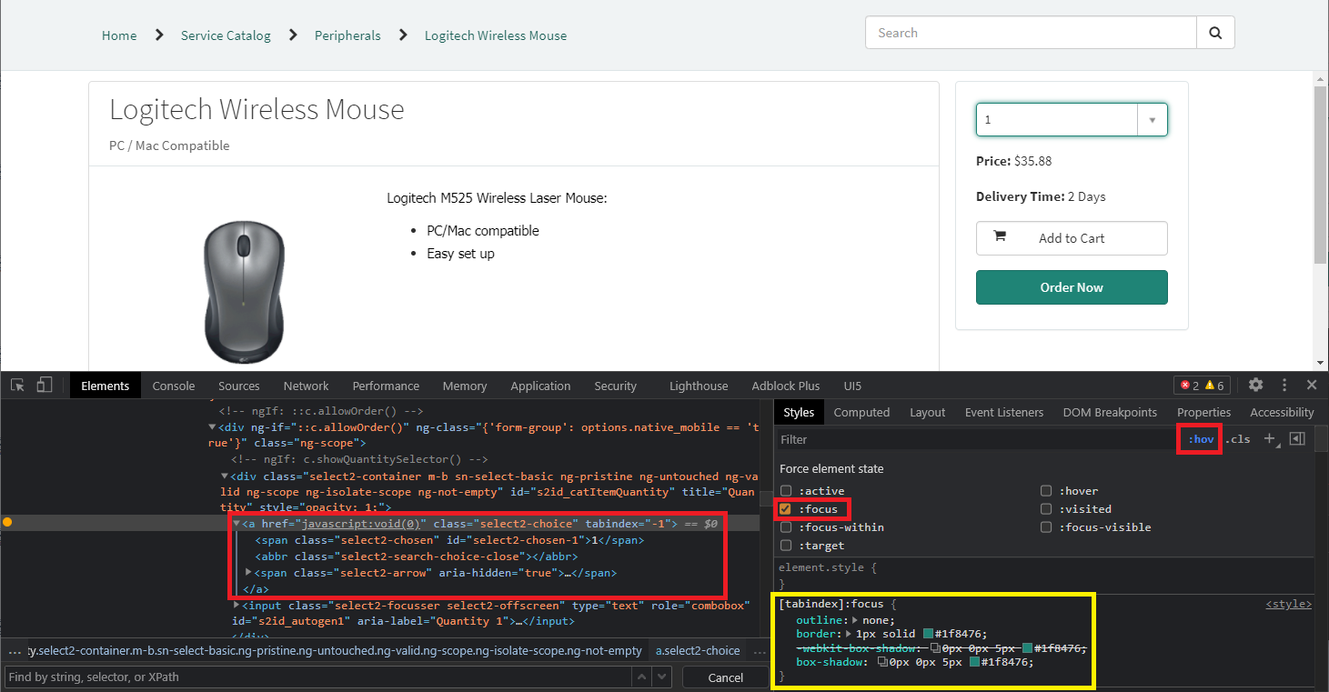
You should set outline, border and box-shadow (one can additionally set -webkit-box-shadow) properties on some CSS selector(s), which uses :focus. The exact selectors depends on CSS applied on your current page. I suppose that the required CSS rule could be the following:
button:focus,
.btn:focus,
.form-control:focus,
a:focus,
input:focus,
select:focus,
.selectize-input.focus,
[role="button"]:focus,
[role="slider"]:focus,
[tabindex]:focus {
	outline: none;
	border: 1px solid #1f8476;
	-webkit-box-shadow: 0px 0px 5px #1f8476;
	box-shadow: 0px 0px 5px #1f8476;
}
where you should change #1f8476 to some other color.
To examine a specific case, which you have, you can use Developer Tools of your web browser. You need select element (input or select), which CSS rules you want to examine, open context menu and choose "Inspect". After that you can click on ":hov" to simulate pseudo-classes like :focus or :hover and check ":focus" for example. If you selected correct page element, then you will see focus effect and you can examine existing the CSS rule of the page, which set outline, box-shadow, border or other CSS properties. The same CSS selector (or other with higher specificity) you should use in your custom CSS rule:

The example on the picture uses [tabindex]:focus selector, for example.
- Mark as New
- Bookmark
- Subscribe
- Mute
- Subscribe to RSS Feed
- Permalink
- Report Inappropriate Content
05-24-2021 05:03 AM
Hello,
I tried to apply the below css in the theme and i works but i dont want the box-shadow property and tried to make it none but it doesnot work
1) .select2-results .select2-highlighted: { ------------> for the dropdown choices background color
background : #00B9B0 !important;
}
2) .form-control:focus{ -----------> other input fields
outline:none;
border-color: #00B9B0;
-webkit-box-shadow: none; ---------> here it works no issues
box-shadow: none;
}
3) .select2-container.select2-container-active{ -------->This is for dropdown fields
outline:none;
border-color: #00B9B0 !important;
-webkit-box-shadow: 0 0 5px #00b9b0; ------->i tried to keep it none but it wont work;
box-shadow: 0 0 5px #00b9b0; ---------> i tried to keep it none but it wont work;
}
Please help me to remove the highlighted text above in 3) to not have box-shadow and webkit-box-shadow property, just the border-color to have the green like shown in 2)
- Mark as New
- Bookmark
- Subscribe
- Mute
- Subscribe to RSS Feed
- Permalink
- Report Inappropriate Content
05-24-2021 12:12 PM
Hi!
The CSS rules, which you tried to set looks very strange. I suppose that your problem is not which CSS rules you set, but where you set the rules.
Select2 results will be placed dynamically directly inside <body> of the page. It means that you can change default CSS rules only if you place/modify the rules on the Service Portal Thema. If you use for example, La Jolla Theme, then you will find the following CSS rules in sp-theme-stock-high-contrast.css:
.select2-results {
  .select2-highlighted {
    background: $brand-primary !important;
  }
}

.select2-container-active .select2-choice,
.select2-container-active .select2-choices {
  border-color: $input-border-focus !important;
}
you will find more select2 CSS rules in sp-theme-la-jolla.css additionally. You can modify the CSS rules directly in the files of create your own Style Sheet und CSS Include and place it after default CSS includes used by your Theme. If your Service Portal Thema uses CSS variable $input-border-focus, then you can modify the value first of all.
It the above advices will not solve your problem then you should post more details about the Theme, which you use and the page of Service Portal, where you try to apply custom CSS rules. It I would be able to reproduce your problem I would be able help you.
- Mark as New
- Bookmark
- Subscribe
- Mute
- Subscribe to RSS Feed
- Permalink
- Report Inappropriate Content
05-25-2021 01:36 AM
Thank you for your response,
I am not using the La jolla theme, i am using the stock theme.
and added the css rule in the theme of my portal.
.form-control:focus{
outline:none;
border-color: #00B9B0;
-webkit-box-shadow: 0 0 5px #00b9b0;
box-shadow: 0 0 5px #00b9b0;
}
.select2-container.select2-container-active{
outline:none;
border-color: #00B9B0 !important;
-webkit-box-shadow: 0 0 5px #00b9b0;
box-shadow: 0 0 5px #00b9b0;
}
when i tried to keep the "-webkit-box-shadow: none;
box-shadow: none; " it takes the default parent css rule.
when i click on the field it should not add the box-shadow, that means it should be none,
Please select the stock theme.
- Mark as New
- Bookmark
- Subscribe
- Mute
- Subscribe to RSS Feed
- Permalink
- Report Inappropriate Content
05-25-2021 02:55 AM
I changed Theme to "Stock" and added the following CSS rules directly in CSS variables:
.form-control:focus,
.sp-page-root .form-control:focus {
    border-color: #00B9B0;
    outline: none;
    -webkit-box-shadow: 0 0 5px #00b9b0;
    box-shadow: 0 0 5px #00b9b0;
}
.select2-container.select2-container-active {
    outline: 5px auto #00B9B0;
    border-color: #00B9B0;
    box-shadow: 0 0 5px #00B9B0;
    outline-offset: -2px;
}
.select2-container-active .select2-choice {
    border-color: #00B9B0;
}
.select2-results .select2-highlighted {
    background: #00B9B0;
    color: #fff;
}
As the result the colors have been changed like expected:
I think that one should add more CSS rules to change colors for all different controls, but the above example shows that the approach works. Isn't so?