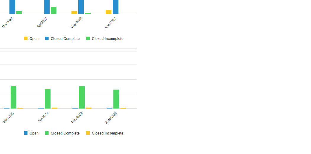
Bar chart colors not consistent
- Mark as New
- Bookmark
- Subscribe
- Mute
- Subscribe to RSS Feed
- Permalink
- Report Inappropriate Content
11-11-2022 11:21 AM
Hello,
I have created reports that I use in a dashboard showing service catalog requests by month by assignment group. It appears that the order for displaying the bars (state of the requests from left to right) is consistent, but the color assigned to the bars is not. This is a trend chart and I do not see an option for sorting. I don't have access to Performance Analytics and the chart color configuration tools are not made available to me. Any suggestions on how I could remedy this?
- Mark as New
- Bookmark
- Subscribe
- Mute
- Subscribe to RSS Feed
- Permalink
- Report Inappropriate Content
11-11-2022 11:40 AM
You can create Chart colors following the instructions here: https://docs.servicenow.com/en-US/bundle/tokyo-now-intelligence/page/use/reporting/concept/c_ChartCo...
Then go to Style and under Chart color select Use chart colors

- Mark as New
- Bookmark
- Subscribe
- Mute
- Subscribe to RSS Feed
- Permalink
- Report Inappropriate Content
11-11-2022 12:28 PM
Hi Mike,
Unfortunately, I don't have access to Reports > Administration, so I can't modify assigned colors. I could ask our admins to assign colors to these three states, but they lean toward using this out of the box.
- Mark as New
- Bookmark
- Subscribe
- Mute
- Subscribe to RSS Feed
- Permalink
- Report Inappropriate Content
11-11-2022 12:40 PM
That's using OOTB functionality so they shouldn't have an issue with it.
Another alternative, is to click Use Several Colors and then in the Color field put in Hex Color codes, such as: #FFFF00,#0000FF,#00FF00

- Mark as New
- Bookmark
- Subscribe
- Mute
- Subscribe to RSS Feed
- Permalink
- Report Inappropriate Content
11-11-2022 01:56 PM
Thanks Mike. I'll talk to our admins. The hex codes did not appear in the order I pasted for both charts, so that didn't help me. Thanks for the suggestion and helping me narrow this down.