

darius_koohmare

ServiceNow Employee
Options
- Subscribe to RSS Feed
- Mark as New
- Mark as Read
- Bookmark
- Subscribe
- Printer Friendly Page
- Report Inappropriate Content
11-23-2016
02:46 PM
The standard point and click reporting interface of ServiceNow is a powerful and quick way to visualize your data. Most individuals, however, stick with bar and pie charts because those are the most common visualizations they most likely had in a previous solution. In reality, there are a number of other visualizations available in ServiceNow that provide powerful insights. The key to good reporting is simply understanding how and when to use these other report types like Control Charts.
The purpose of control charts are extremely important in SPC, or statistical process control. The purpose of a control chart is to identify when a process is out of control. A process can be out of control in a negative or positive context; for example a team of technicians could be solving a smaller or larger than average number of incidents. A control chart would indicate to management when either has occurred, and it will allow them to quickly correct or adapt to the change in process.
Using Control Charts in ServiceNow reporting
Control charts are built to detect unnatural variation in a process that should only be affected by natural variation. What we mean by natural variation is the items that occur no-matter what controls are put in place. What do we consider an 'out of control' process? Well the answer is any data point that is outside our 'upper' or 'lower' limits. In this case, our limits are defined as 2Z and 3Z.
What does 2Z and 3Z mean? Assuming an in-control process, and only natural variation occurring, the points should follow a normal distribution. In a normal distribution, 95% of the data will fall inside the range of 2Z and 99.7% will fall under 3Z. This means that in an in control process using the 2Z mark as the limit, a point will be incorrectly 'out of control' only 5% of the time. Using 3Z it will only be naturally out of the limit .3% of the time!
When the points are outside of the limit, we must have an event that is causing the process to be 'out of control', since the probability of it occurring under natural variation is so slim.
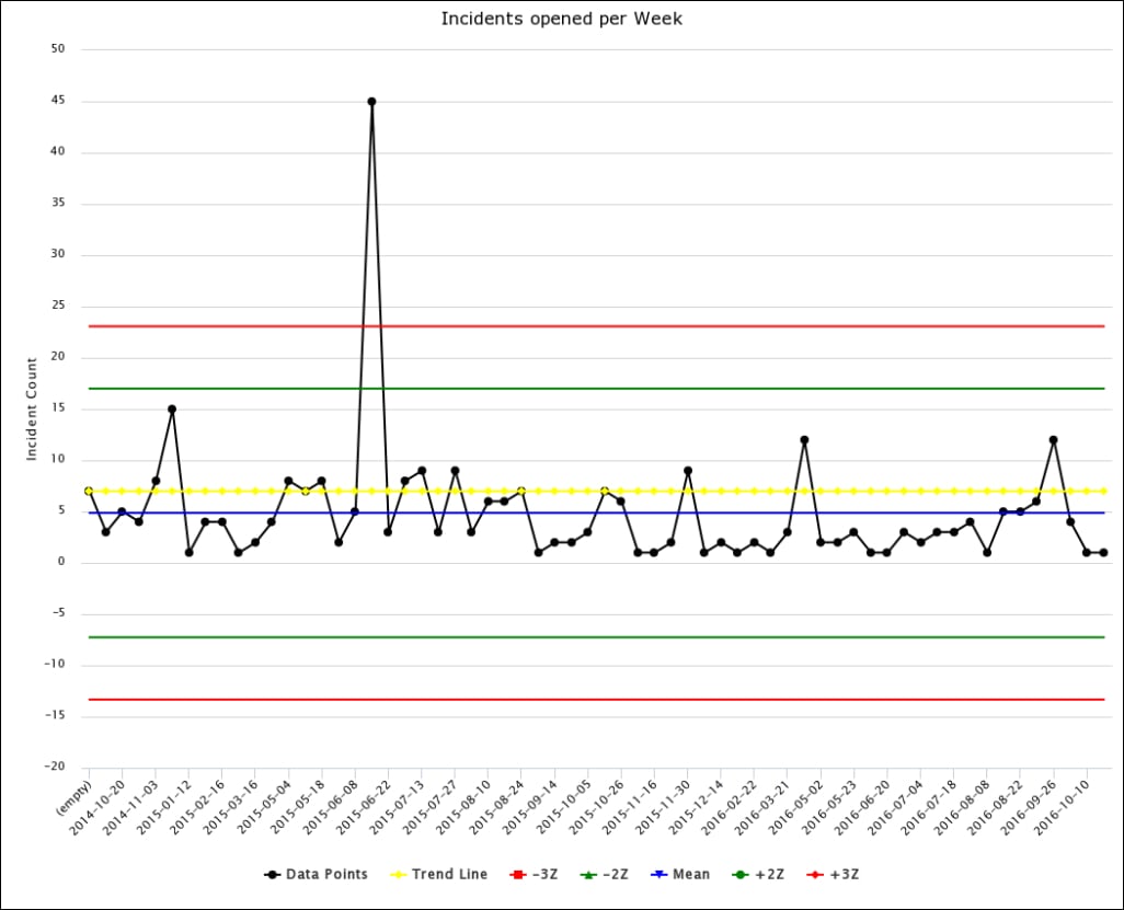
In the example below, we generate a control chart on the Incident table, trending on the opened date. We can observe a point that is severely out of process around 2015-06-08. This is most likely a outage or other unexpected event, as the rest of the process is relatively in control.
Each week is a sample of data. For the sample, the total count is plotted in black. The mean of all samples is taken, and depicted as the blue line. The +2Z and +3Z lines are depicted in green and red respectively.
Are you using the Control Chart in your instance? Show me in the comments!
Labels:
3 Comments
You must be a registered user to add a comment. If you've already registered, sign in. Otherwise, register and sign in.
