Need Help: Consistent Colors in Dashboards + Rename Breakdown Values + Tooltip Behavior in PA
- Mark as New
- Bookmark
- Subscribe
- Mute
- Subscribe to RSS Feed
- Permalink
- Report Inappropriate Content
12-01-2025 03:03 AM
Hi All,
I am working on a High-Level Ticket Dashboard in ServiceNow (Next Experience dashboards), and I have a few issues I need help with:
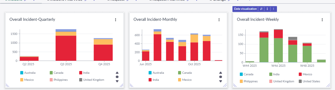
1. Consistent Colors Across Multiple Visualizations
I have three bar charts (Quarterly, Monthly, Weekly) showing incidents by country.
All three use the same breakdown field (Country), but the colors are not consistent.
Example:
India appears as red in two charts
But shows as green in the Weekly chart
I tried checking the “Visualization → Breakdown color mapping,” but each widget seems to have different mapping.
Is there a way to set a global or shared color scheme so the same breakdown values always have the same colors across all widgets?
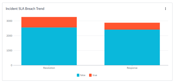
2. Change Breakdown Labels (True/False → Breached/Not Breached)
In an SLA breach widget, the breakdown values appear as true and false, but for business users this is confusing.
Is it possible to rename these labels to:
true → Breached
false → Not Breached
I didn’t find any option for “Display value override” in the visualization settings.
Any workaround or recommended approach?
3. Tooltip Behavior – Show All Data on Hover (Like Stacked Bar)
In one of my stacked bar charts (Category-wise Incidents), I have to hover individually over each color segment to see the data.
But in another stacked chart (Country-wise), the tooltip shows the complete breakdown (all country values) together when hovering on a bar.
How can I enable that same tooltip behavior on all charts, so the user can see the full breakdown values in a single hover
- Mark as New
- Bookmark
- Subscribe
- Mute
- Subscribe to RSS Feed
- Permalink
- Report Inappropriate Content
12-02-2025 11:36 AM
For the #2 Q, do you mean to have show different labels like this Filter widget configuration?

- Mark as New
- Bookmark
- Subscribe
- Mute
- Subscribe to RSS Feed
- Permalink
- Report Inappropriate Content
12-02-2025 08:31 PM
Yes, I need labels for True and False. I have used the vertical bar here. I cannot find any option to add breached instead of true and Not breached instead of false
